Video není dostupné.
Omlouváme se.
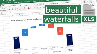
How to Excel Waterfall Chart with Accumulated Values | Easy to Compare Categories

Vložit
- čas přidán 10. 08. 2023
- In this Excel video tutorial, we gonna learn how to make a Waterfall chart in Excel, but it's not a common chart, it's a segmented and stacked waterfall chart.
The waterfall chart in Excel shows the cumulative total as values are added or subtracted. This Excel Chart is very useful for you to make comparisons and analyzes with several different categories.
A waterfall chart is a type of chart that shows cumulative changes over time. In this practical and free Excel example, I show a sales spreadsheet where I need to analyze the regions that sold the most in each of the months and also which region sold the most in total, that is, the general accumulated.
We can use the waterfall chart in excel with other practical examples, such as:
In finance, to show how stock prices change over time. We can thus identify trends and patterns in stock prices.
In marketing, to show how sales change over time. We can thus identify marketing campaigns that worked, for example.
In sales, to show how revenue changes over time. We can thus identify important patterns.
#JopaExcel #Dashboard #Excel


Great video presentation.
Very well explained.
This is absolutely brilliant ! Thank you !
Thank you for this. This is exactly what I wanted and very well explained. I was trying to do this in Microsoft Power BI but how you laid out.... It's excel for the win!
Glad it helped you, James! To be honest, even though Power BI has a lot of visual stuffs, I prefer Excel. If you have a bit of creativity, you can make a lot of cool stuffs. 🙏👍
@@JopaExcel👍🏾. Also I agree with your comment. I find excel more flexible. I use Power BI when there is loads of data and I need to put onto some slides or a dashboard for senior executives (like a 40 page pack so it’s useful for mass data analysis) however…
It is interesting that Power BI is there to share insights but I find it easier sending with excel as excel allows people to see where the data came from and can easily be edited by others if you are not around.
Thanks again and I’ve subscribed. Look forward to all your tips.
Thank you! How would it work if I have negative values? decreases.? Please let me know if it is possible, thank you!!
Thank you very much you are great
Appreciate it 🎉
Super video!!! 🤖
Thanks you
Great video. Very helpful explanation.
Thank you, Bob! 👍
hi@@JopaExcel
Does it work with negative values?
this is perfect.. but i have a negative number in my column, in which the stack is showing below zero line. how to show it in the top.Kindly help
cool✌😸😀😃😄
Thank you! 🙏👍