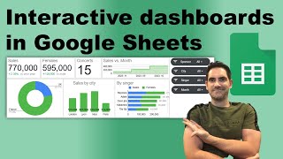
Interactive Google Sheets Dashboard Tutorial: Company Sales Data

Vložit
- čas přidán 17. 07. 2024
- In this video, I'll demonstrate how to create an interactive Google sheets dashboard.
Here's the link to my etsy shop where you can purchase my templates: makudata.etsy.com
If you want to follow along, here's a link to the dataset: docs.google.com/spreadsheets/...
Contact me for custom dashboard requests at makunadata@gmail.com
Timestamps:
0:00 Introduction
0:31 Preparing the dataset
1:56 Preparing the dashboard
2:30 Heatmap
6:08 Doughnut charts
10:34 Vertical bar chart
13:02 Infoboxes
14:21 Map chart
18:45 Line chart
20:08 Horizontal bar chart
22:40 Custom icons
23:59 Slicers - Jak na to + styl


Thank you for sharing this!! Excellent job narrating through each step and breaking it down in a way that was easy to follow. Great work!!
Thank you for the kind words, means the world to me!
+1
NICE! WAITING FOR MORE!!!
Awesome content! More google sheets dashboard please. 😊
It's impressive. Thank you for sharing this!
My pleasure.
Thanks sir for teaching lots of things 🙏🇮🇳
Great. I learned a lot from this✨️
Glad it was helpful!
Good job bro!
Thank you for sharing and your effort
My pleasure!
Nice desing. ¡Great Job!
Thank you! Cheers!
Amazing
Video was very helpful! 🤌
sir can you make a video on bookkeeping of accounts in Google sheets
Even though sheets is a little less elaborate than Excel - it compensates by providing a user with a possibility to write custom functions (scripts) in Google Apps Script (Javascript) to extend what it can do! Give it a spin :)
Thanks for the remark. It might be an interesting topic for a future video. The purpose of this one was to demonstrate how a person with zero-to-none scripting knowledge may achieve a decent dashboard. I'd say your idea lands somewhere in the intermediate-advanced user's domain.
Nice! It would be even better if you shared the database so people can follow along. Will have to try this out with one dataset of my own and see how it turns out !
Thanks for the comment!
I've added a link to the original dataset in the video's description and made it public. Tell me if it works.
Soylent Green : What is good for people, is people ;) and I am upset that I did not hear one kurwa once or a can of beer opened !!! work looks fantastic, will come back here druga
Thank you friend. The reason why you didn't hear any kurwa's is simple - I'm not polish, just your northern neighbor :)
@@MaKuData oh you are from srbija? nema problema :) hey i am going to be a data analyst, starting my education end of summer. any recommendations what to learn now before it starts, u know I want to focus now. excel/goo.sheets -> sql -> tableau/powerBI -> python is that correct? peace
Amazing,!!!!!!!
Cheers!
Can I lock the charts to prevent movement to other place.
I'm having trouble inserting slicers. If I filter a value in the slicer, it filters those rows from the sheet and affects the charts in the sheet. Please help.
This is great and I love how you break it down. How do you lock the dashboard so that users are only able to change the slicers and unavailable to delete the charts?
Thanks for the kind words.
That's actually pretty simple. In the data tab, click protect sheets and ranges. Then add a sheet or a range. Here, you can select to either protect a specific range or the whole sheet. I would recommend clicking the whole sheet option.
From there, select the "Except certain cells" and select all the cells that the slicer is a part of. Everything else will be locked.
25:30 onward proved entire exercise futile (what a nuisance adding slicers and then changing all cell ranges in dashboard tab ... basically re-doing a lot of work).
At the end, the rounded rectangle is eclipsing my slicers totally again and again i.e. when I drag and drop all slicers on the rectangle and click outside the rectangle anywhere, the rectangle comes to the fore hiding all the 4 slicers underneath itself.
are you copy pasting pivot tables from pivot table sheet to dashboard as values or pivot table?
If you are doing it as values, how this dashboard can be dynamic when the data is static?
I'm copying them as pivot tables, otherwise it would be as you said.
I was looking for actual interaction like multimedia, where it moves with mouse over.
This sort of interaction can only be observed when hovering the mouse over the visualizations. It will display the exact data labels and points hover over.
This seems useful but I can't follow anything on the screen because the font is too small.
Sorry to hear that. I made another similar video where I create a Google Sheets dashboard from scratch, it's more zoomed in there.
Does the dashboard update with new data entries or its just static?
It's live. Whatever new data is populated in the data table, Google Sheets automatically updates all related pivot tables and their linked visualizations.
Even in fullscreen mode at 720p resolution setting, I can not clearly see what you have been inputting in the cells. :(
Hate to not reap this fantastic video fully.
Hate to hear that. Noted. If you have any specific questions, feel free to either to ask them here or contact me directly at my email.
@@MaKuData You've explained everything excellently. No questions or doubts about the content. :)
Actually the onus is on me to get a bigger screen but I can't afford one so making do with my laptop.
Also, I am not getting Poland's transparent map free online. Do I have to download a regular map and then try to remove its background?
EDIT: I solved the map issue but had to abandon watching after 18:40. Way too rushed to keep up. Screen nowhere zoomed in for clearer view. There are tons of other similar good tutorials that are 40 to 50 minutes long and are very lucid. You have great content but the rushing ruined overall experience especially when you dealt with map portion. Whatever work you have covered in this video, it was certainly done in more than 28 minutes (the length of video) by you. Anyway good luck for your future videos.
Thank you for your honest critique@@echodelta7680 . I am trying to be more elaborate in my future videos!
@@MaKuData Rest of your videos are all cool. I guess it was just a bad day for me yesterday, though I did manage to accomplish 99% of what you explained in this video. Forgot to subscribe yesterday, but now you've gained one.
Honestly, when I began watching this video, I was surprised you didn't already have hundreds of thousands of subs, but then I guess it's been only a short while for your content here.
@@echodelta7680 The thing is, it's the only video that is viewed. All others are more on the data analysis side. But anyways, appreciate your sub and I hope you'll check out my other videos.
Google sheets has a function that shows a number of a weekday
Thanks for pointing that out!
Sir please make it inventory
Could you elaborate?
Like for manufacturing unit
@@shivusagar1059 Feel free to contact me via my email provided in the description for any custom inquiries.
You skipped over he most important and interesting part. How did you determine the X/Y coordinates.
You just "prepared them" how? Trial and error on the live map?
Exactly.
1. I paste the whole scaled map, the same size as I want it to be in the visualization.
2. On top of the map, I paste over the bubble chart with 4 color points to have distinct colors.
3. The 10/10 on the X/Y axes at the bottom are there to set the upper limit of the scale (so it goes from 0 to 10)
4. The -5 does the same thing, determines the lower limit.
5. For each city, I just keep increasing the value on one axis, until it reaches the correct position, then I do it for the other axis.
6. Rinse and repeat for all points.
can you provide videos for this pls? thank you
Just released a video on this topic, you can go check it out: czcams.com/video/XZgMZFxo49o/video.html
.
"PromoSM" 🌺