Make Impressive McKinsey Visuals in Excel!

Vložit
- čas přidán 28. 06. 2024
- Make McKinsey Charts and Visuals in Excel from scratch.
🚀 Take our PowerPoint Course: www.careerprinciples.com/cour...
🆓 DOWNLOAD Free Excel file for this video: careerprinciples.myflodesk.co...
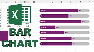
In this video, I make 3 McKinsey visuals in Excel. McKinsey & Company is the most prestigious consulting firm in the world, so they're known to make some of the best visuals in the industry. That’s why I want to show you how to replicate three of their most popular visuals, in Excel. First, we create a radial bar chart, which is like a mix of a pie chart and a bar chart. You can find this inside of the pie charts section in Excel. Specifically, next to a doughnut chart. Second, we make a bar chart to compare one column of numbers inside of the other. This is similar to a budget vs actuals chart. Lastly, we make a stacked bar chart to showcase the demographics in each step of the corporate ladder.
LEARN:
🔥Power BI for Business Analytics: www.careerprinciples.com/cour...
📈 The Complete Finance & Valuation Course: www.careerprinciples.com/cour...
👉 Excel for Business & Finance Course: www.careerprinciples.com/cour...
🚀 All our courses: www.careerprinciples.com/courses
SOCIALS:
📸 Instagram - careerprinc...
🤳 TikTok - / career_principles
🧑💻 LinkedIn - / careerprinciples
▬▬▬▬▬▬▬▬▬▬▬▬▬▬▬▬▬▬▬▬▬▬▬▬▬▬▬▬▬▬▬▬▬▬▬▬▬▬▬▬
Chapters:
0:00 - Radial Bar Chart Part 1
3:05 - Eyedropper Trick
4:07 - Radia Bar Chart Part 2
6:33 - Unnamed Bar Chart?
12:02 - Stacked Bar Chart
This video is for educational purposes only. Find out more about the charts used here: www.mckinsey.com/featured-ins...


🚀Take our PowerPoint Course: www.careerprinciples.com/courses/powerpoint-for-business-finance
These “recreating visuals” videos are super useful. Thanks. Part 2 and part 3 please
Noted thank you :)
Keep them coming!
I have just started learning excel and your video are giving me confidence and ample knowledge to go in this path
Please keep the "re-create" series going! I re-made the financial times charts in Excel for fun...such a great learning experience
Would love to see that!
This is incredible! Many thanks for sharing your expertise with us!
Nice work packed inside an instructive video. A part 2:and 3 would be a perfect roundup of more charts in the McKinsey arsenal. Cheers …
Definitely a part two and three!!! These dashboard videos are the best on CZcams!
Glad you like them! More to come hopefully
@@KenjiExplainsplease waiting for the part 2
Thank you soo much Kenji you have made this excel topic easy with your explanations. Yes we want part 2 and part 3 ❣
Downloaded Excel today, literally found your page yesterday and the quality of content you create is amazing, more visuals please!
Awesome, thank you! more soon hopefully :)
One of the best videos ever! Please prepare part2
Really appreciate these recreating visuals walkthroughs. They come in handy, thank you! =)
You're very welcome!
Fantastic examples. You explain making charts in an easy to understand way.
Yes we want a part two. These videos are very helpful for me.
Noted thank you!
Yes, looking forward to part2 and 3, thanks Kenji!@@KenjiExplains
Super useful Kenki, thanks so much. FYI the second chart is a Stacked Bar Chart, to compare frequencies over a 2 parameters of a variables, let's say freqs of Yes and No over a variable like "Hold a bachelor degree" over a range of years or age population ranges. It would be nice a video like this but making some ppts in McKinsey style as they recently changed their branding a bit
Thank you so much. It's very helpful ❤
Great visuals!! Super helpful
I would also like to see a Part 2. Thank you!
Thank you. This is so helpful.
Can't help it admiring this guy!
Thank you for sharing!
In the Unnamed chart, --> Alternatively you can also create a horizontal range of the values of Year and Quarter, create a linked image through the excel's built in Camera tool and then Format and Resize it as convenient and finally place it on top of the chart, saves a bit of time!!
Very innovative, thanks for sharing.
Great vid again! Isn’t it so that when you want to change something you don’t have to do the right click on the bar and then go to change data series but instead you just use ctrl+1 that works almost anywhere?
Great vid as usual ❤❤❤.
amazing. thank you
What's very cool is that you go for these text labels..I can spend hours assuming they can be automatically done in the chart data..not any more
Kenji this was excellent
Awesome! I’m going to copy for the dashboard I’m building at work.
Thank you!
Awesome...So well explained..thank you!!
Glad it was helpful!
I like the video very much, it would help me in my scientific research papers
Great video!
Awesome, thanks
You are literally the GOAT
You make awesome content. Thank you so much !
Glad you enjoy it!
Hi, do you know how to change the Data sequence in a Sunburst Diagramm? Normally its sorted by size. I'd like to sort it my myself. For example, Sales in a year: Inner circle are the quarters, outer the months. Should be Q1 to Q4 und Jan to Dec and not most Sales sorted. Thanks
Que versión de excel usas?, es que no me aparecen algunas opciones, como el primer gráfico
saludos
Thanks a lot.
Now that some interesting thing.
.😮. can't wait for more this type of videos...🙏
Glad you liked it! More to come hopefully :)
Can I also create all these designs on the Mac with Excel? - I can't find the pie chart (first draft) there. Many thanks in advance!
Concerning the eyedropper tool, there's a system-wide one in the Powertoys tool developed by Microsoft, it'll save you some time.
@KenjiExplains. Great video. Are any of your courses available on Udemy?
I am assuming that the 'more charts' option is only available to windows and not mac?
powerful !
Bar in bar chart for the second one 👍🏽
Firstly, I like the tutorial and the tonality + pace, all good and an excellent learning opportunity. However, these examples are for static presentations. I am using dynamic graphs in Excel that include slicers to filter results. As you've built these to replicate existing material, I see how the need is flat or static. The challenge in making these dynamic is the labelling. Any suggestions? Especially the radial bar chart, the first one. It could be a big hit if the labelling issue can be resolved.
Another great video! The chart is called a Stacked Column or Stacked Bar Chart.
Thanks for the info!
Does this work on all the office versions?
Did anyone recreate the Radial Chart on their MacOS ? I have the paid MS Excel version on my Macbook but I couldn't find the 'More Pie Chart' option.
same
Excel for MacOS sucks.
McKinsey uses as Ppt add in called Thinkcell. With such tool it takes you 30 seconds to build charts. Doing it in Excel is really inefficient.
Well, it costs starting €250/year. If one needs to just draw a couple charts, it’s Think-cell that’s not cost-efficient.
250/yr for mckinsey is nothing lol@@violentfox
What about
π racy @@violentfox
Exactly, with Think Cell it’s a piece of cake!
Usually when McKinsey comes in a company is at the end of its run. Departments go away, property is sold, layoffs happen then the company is sold off in divisions usually to the competitors. I’ve lived through this several times at several companies.
Please keep making these re-creating videos.
I don't know if I am doing something wrong but I only get a single option for doughnut chart in Excel (M365), which is has 2 rings. I don't get the one shown on the right, which is used, with a ring for each row in the data. Anyone know how to fix this?
Query abt radial bar chart - am unable to select the helper bars to delete. In my case both the helper and percentage are being selected together. Even data series is showing them together.😢
How about the bump chart?
Part two please
Is there any way we can export these visuals to Excel?
I need part 2
More pie charts unavailable in Excel. Could you tell on how to enable this?
How do you add all 3 things together - the chart, numbers and text. When increasing size of chart, text and numbers remain there.
More than 29k views but still 1k likes? Come on guys, let’s like & subscribe. He is teaching us freely.
mi version of excel mac don`t have the option of more circle graphs, it's s no license version
how can we do meeko bar charts in excel?
We want part 2
I’m need of this badly but need a 60% discount on the course
the Unnamed bar chart is called as thermo-meter chart
Awesome thank you for the information!
Thanks for the video but I feel these are time consuming and should only be used for external presentations.
Damn, thought you were going to show us the mekko chart in the stop left of the thumbnail
Great doughnut chart but if the value changes the text box will not be at the end of the doughnut curve (or am I wrong ?)
yes you're right, it would just be a bit manual there :/
Nice
Thank you
For the first chart - Am sure there may be a way to avoid manually adding the percentage numbers and names and save time
I'm using a MacBook Pro and I can't find the same doughnut chart that you are using in the video. I have the most current version of Microsoft 365 installed. I am not able to reduce the center of the doughnut either.
2nd chart is "Manhattan Towers"
Guys, do you know why my Excel version doesn't have all the charts available ?
BTW, Amazing content man ! 🙂
it's possible that you're on an older Excel version that doesn't have all the features. In my case, I'm in Microsoft 365.
I can't find more charts on excel, could someone help please..
Why do I not have All charts
part 2?
2nd chart is bar in bar chart
Can we have a a discount before the end of the year please
The secomd chart is called a bullet chart😊
I think the unnamed bar chart is called a bullet graph.
We use Think-cell to do our graphs, not Excel
👍
thanks for watching!
It's called stacked bar chart I guess
...or not
🎉🎉🎉🎉🎉🎉🎉
It could be so easy to misrepresent data with a radial bar chart. Anyone using this needs to be aware of the story you're telling to anyone who sees your visualization. The more columns (or "rings"?) you have, the more skewed the inner and outer rings can seem. Keep this in mind! You really shouldn't use a donut chart or something resembling one unless you're showing parts of a whole.
So many manual adjustments with shapes and text boxes. If you these charts once per year, it may be bearable, but it's inefficient.
There's no point in making the labels dynamic as the positioning won't shift automatically....
second
lets go
1st
haha thanks for watching :)
This donut chart isn't even dynamic. Another example of McKinsey making something pretty without being practical.
It would be great if you could do this in power bi too!!!
i dont have that donut chart in office 2023
I dont appear to have it either