MICROFLAKES Over Black Base vs White Base (Myth Busting Experiment)

Vložit
- čas přidán 27. 08. 2024
- 🚗 DipYourCar Kits - www.dipyourcar...
🎥 Dip Your Car Complete Video Guide- • Dip Your Car - The Ent...
📙 Learn how to dip here - www.DYCUniversity.com
💦 DYC Detailing Suite - www.dipyourcar...
👕 DYC T-Shirts and Merch - www.dipyourcar...
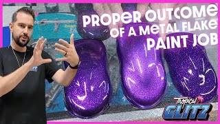
Every time we spray MicroFlakes over a colored base, people ask to see those flakes over white. I was always under the impression that MicroFlakes don't work over White - so today we find out for sure. We hope you like it! Thanks for watching.
❤️ Please Subscribe to DYC!- www.youtube.co...
👍 Join our FB Group - / dipyourcarcommunity
👍 Follow Fonzie on Instagram! - / fonzie
👍 Follow DYC on Instagram! - / dipyourcar
DipYourCar.com is world famous for peelable car and wheel paint. You can change the color of any part of your car by yourself! A do-it-yourself product that you can use at home and is totally affordable. Contact CustomerService@dipyourcar.com if you have any questions about DipYourCar or Plasti Dip Products. Spray and paint your wheels, your car, your emblems, your trim - basically anything. Peel it off and go back to the original color when you are ready. Durable, easy to clean and maintain, dipping your car is something almost anyone can do!


What do you think.. Flakes over white hit or miss?
Miss. This should stop the requests, that's for sure.
I LOVE THE GLASS BEAKER MIXER TY FOR ANSWERING MY QUESTION ABOUT THIS I SEE IT DOES WORK BETTER OVER THE BLACK COMPARED TO THE WHITE I CAN SEE SPECKS BUT NOBODY THE SAME AS THE BLACK TY
AND HAPPY NEW YEAR FONZI AND CREW
I didn't expect white to work. But thank you for pointing it out so clearly.
Fonzie... :) i have an idea: Have you tried flakes over gray? :) as gray, as middle ground as possible. Still small scale ofc.
As a legit test: Start with white speed shape, go through a gray scale, end up on black. Where is the point of grayness where flakes stop making us want to wipe the "dirt" off ?
PS: Keep up the bloopers :))
you were right, it doesn't look good. thanks for doing it though ! cheers
@@IcecalGamer GMORNING HAPPY NEW YEAR I WONDER THE SAME QUESTION
NOT YELLING ALMOST COMPLETELY BLIND 🙂🖖🏻💯
I always wondered why I never saw any flakes over a white base, and I agree it just makes the paint look dirty.
I don't know if I'd say dirty. I'd say it looks more like the paint's chipping off.
Looks dirty or peppered by tar
Hi; ALL new cars that are painted with pearls are painted with "3" stage paints. White base; the pearl and the clear.
Also I do not understand why these guys mix the tints (like in other videos) with the clear. The tints are applied then the clear over.
could maybe look cool if you tape off a certain area in a pattern and hit that only.
The only difference, compared to a dirty white car, is the consistency of the coverage. What a plus!
I love the clear beaker you’ve been using. The visualization of mixing the colors and elements is really fun to watch.
Definitely looks better over the black!
It pains me to say this, but Fonzie is right (j/k). Definitely better over black base. Not only does the flake make the white base look "dirty", but the brightness of the white base washes out any effect of the flake.
These flakes would never have turned out well, but transparent flakes would actually work extremely well! You should try to get your hands on some transparent flakes and do a white base vs black base comparison!
They did something like that when they did a dark vs white base with white powder hypershifts
@@gofigure84 Pearl powders have been quite the staple of the channel and they definitely look good. I don’t believe Fonzie has ever used a transparent metal flake however and I think he’ll be blown away by how good transparent metal flakes look over both a white and black base, considering that transparent metal flakes usually contain holographic/colour shifting properties!
@@CoolsyNitro the hyper shift line is color shifting. Like chameleon green to blue to purple. Red to black. Probably over half or white base powder that over white give a subtle shift that resembles pearls. Over black you get the full color effect. Not quite transparent metal but still.
You were right. It’s a fail.... looks like skillfully sprinkled on dirt, but it was worth the experiment.....
I actually think it makes it look more like the paint is cracking.
I can't say I'm surprised by the results. It's very similar to putting holo over nail polish. It ALWAYS shows best over a dark base.
Yeah the Flake over a white base is not a good idea. Try a Flake Pearl combo. Love the content as usual !!!!!
i agree, pearl flake is sick, this? a lot better over the black
IMO, the white side just looks dirty and I couldn't see any difference between the 4 different flakes on the white. I thought the silver and gold looked the best over the black and would love to see the gold flakes on a black base on a car. The blue and green flakes were hard to see their dominant colors.
Other than that, keep up the great videos!
You were definitely right about that 👍🏼 great content, love watching these episodes 👌🏼
I did a gold glitter baseball bat with a white base. I think you need a much higher concentration and maybe even more coats to get a white base to work, but the result is actually not that bad. I still believe the best base will always be a darker shade of the flake/ glitter color. That way, the base accentuates and complements the flake, giving it a little boost. White overpowers the flake and black may take a little away from the sparkle.
I want to grab a towel and clean it!
Nope none of them work
Is it me or do microflakes just look bad to anyone else, it's like someone spilled glitter all over their car. I agree with him though that the white base looks especially bad. More pearls and candies please.
I don't mind the glittery look on the car, but I do have to agree; it looks terrible on a white base.
Yea I'm not a fan of these.
You're right Fonzie! All the white look bad. But that blue on black base looks so good!!! Like a whole other Galaxy!
Wash out on the white base. You were right. I do Love the Royal Blue. Would love to see that over a Blue base color. Would look incredible!
Definitely better over black. This could be an entire series testing several different base coats the same way. I would love to see a deep dark purple with the silver flakes
Yup, I think you were right, Fonzie, just looks like grey specs on white, unless the camera just doesn't pick up what the naked eye can see. Looks great on the black, though, very subtle.
ROYAL BLUE ON THE BLACK LOOKED THE BEST.
THE HOLOGRAPHIC ON THE WHITE BASE LOOKS TRIPPY CAUSE IT MAKES IT LOOK LIKE THERES IMPERFECTION FLAKES OR DUSTY BUT ONCE U TRY TO LOOK CLOSER IT MOVES TO A DIFFRENT SPOT.I LIKE IT.
You are 100% correct! It looks like dirt over white. Ugh! I'd love to see some kind of paint that would provide the rainbow like shimmer my sister's vinal bike seat from the 70's had over white. I think it was 1976 bi-centennial themed bike with long seat & chopper style handle bars. Could pull wheelies so easy on it. Lol. Had red white blue hassles coming out of white handle bar grips. 🎉
I want to see a mix of one of everything,solid base, one pearl, flake, hypershift, juice, candy etc. Even if you keep same main color in all products it still should be different in a way
That would be real expensive and a real thick layer of paint. This stuff was designed specifically, for the person that really wants to change things every 6 months to a year. Making it budget friendly vs a real paint job, that's the purpose of these. Throwing the kitchen sink at it (What you are proposing), would be expensive as hell for something that might last a year. It'd probably last less as the thickness of the paint would make it practically fall off on it's own. This is going on each additive (over base) getting it's own clearcoat
@@crazylarryjr did you miss all the other videos like the blackest paint or mood ring. Experimentation is fun they can be mixed not all layered
how about a video similar to this but with the 4 types of interference pearls? wanting to know how purple interference would look over a black base
That royal blue over the black base is honestly so good.
LMAO your bloopers were the best part of the show!!
I'd love to see the micro flakes over their coresponding color base... Silver holo over Avalanche Gray, Gold Holo over Dessert Tan? (or similar)... Emerald over and Army Green.
On the plus side, if you go with the flakes over white, you can drive through mosquito and fly swarms in summer and nobody will notice afterwards.
Also please do Mandarin Orange base and Burnt Copper Alloy mixed with ZTU HyperShift on top. :)
I want to see what it would look like if you use 5-10grams of a colorshift into 20 grams of a solid pearl that matches your base coat. Will the solid pearl + base coat give you a nice pearl and the colorshift add some accents to it? Or would you be better off putting down a base pearl and 2 5 gram colorshift coats on TOP of the base pearl. Have you ever tried this out in a video?
You were absolutely right, Fonzie
I agree with you, none of them look good over the white base. My favourites are the silver and the gold over black base. Thanks for doing the experiment and sharing the video. 👍
Yes they do look better on a darker base,your Right
I didn’t notice any downfall of it on the white other than the contrast of the sparkle. I actually enjoy it on the white. It’s subtle.
As a fractal artist, the results of this did not surprise me ... even in the digital world of small pixels, most often things darker than white on a white background look like a pattern of dirt, whereas on black, the colors pop.
Over the white was a huge miss, but man that Gold holographic over the black popped beautifully
Thank you for doing this video, I have a white convertible and have been interested in dipping my car.
Chef: I use White Pepper
Peon: Why?
Chef: Black Pepper looks like fly poop
You were right Fonze. They look much better on the black which makes it look 3D but on white it just looks like over spray 🥺
It's like STAR'S in the night sky , imagin STAR'S in the sunny day . Stars looks nice in the darkness of the night
I have to admit Fonzie was right. I think I got a faint shimmer from the gold holographic on the white side, but mostly it was unimpressive. I wouldn't say it made the white look dirty, because the application was so even it definitely looked looked deliberate. It looked almost like a faint granite pattern. Not much of a difference from solid white, but okay.
yeah pure white just washes out any effect the flakes would have you'd have to do a bunch more coats and it'd probably still not work right and black can be too dark and hide some of the effects maybe try it with either a slate or gunmetal gray and see how that works
I was surprised that ALL of them over white, just looked so 'dirty'...and really I only liked the silver holographic over black..it stood out the most. I mean the others were subtle, but teh silver stood out the most, reminded me of the 'galaxy paint job'
Definitely right, over white is a miss looking at this sample.
Yup. Some of the white base looked like "dirt". You are right.
You were RIGHT !
That first one that was sprayed I couldn't stop thinking how is he not getting over spray on the other ones lmao...took me a min
I would love a bright purple flake over a vibrant blue base
You were right. On the white side just looked like dirt. I would like to see emerald green full scale on a black base. Thanks for this comparison.
Definitely looks good on the black base, and nothing good on the white. You were right!
The silver holographic over white is like the aftermath of a little girls bday party… glitter everywhere
so you was right it just looks like an even sprayed dirt coat on white base and all of the holographic effect just seems to me to dissapear into nowhere
You where right. And they all look similar
You got it this time Fonz! I personally think they all look grainy, I'll stick to pearls
Great demonstration, Royal Blue or Emerald on black all the way for me.
You were absolutely right white base looks awful, like you have been driving down the yellow, blue, green road Whatever color the road it was dusty.
Best on black
I do definitely agree with you they just look like a thick layer of dust on the white but the blue and silver look great on the black
Have an awesome new year
At what shade of base "grey" do the flake colours pop? Is it a gradual change or do we get it all highlighting at once?
Nord grey with black interference please! I really want to paint my truck with this. I don’t know how it will turn though. That grey with black at angles I feel like would be killer but have no idea if that would be the result. Any ideas? Great videos. I’ve been binge watching for the past 2 days
I paint my race bicycles. For a gravel or mountain bike, the flake on white would be SICK
Well you are 100% right this time every single one of those colors doesn’t look good with the white base! you can barely tell it’s there and it just looks like a dirty white paint job
Can you achieve a candy marble effect with dip using a silver base, black with grocery bags, and House of Kolor Candy as a topper?
Only good thing is the flake over white would b good for like a special edition paint like old Halloween or another barn find or something on those roads.
Could you please do a video covering how you recommend to clean the gun and dip canisters
HEY! I got notified! YEAH! Did you do anything different with the stirring portion? Normally I skip through it but this time I was transfixed. Different music, anything? On white they all reminded me of Chicago winters, dirty snow. Thank you for your time and energy. Peace and Love
Just using a clear beaker instead of a bucket.
I think your right about the white base it does look dirty looking.
But the black base looks pretty sweet 👌.
You are brave using that beaker an that mixer I've never known that style of beaker to be durable
I really need you to use these shapes for all your pearls!!!! Trying to find something for a white base 🤔
Sometimes it helps to show why you shouldn't do something before someone goes spending money on something that won't turn out the way it looks in their head.
thank you for dropping the flakes into the jars differently, very soothing. Now dip over an engine and start it up, for science!
Wow... I am not thrilled with any of these colors over white or black. That is shocking.
I think it looks fine over black, but I like the holographic look anyways. It over white, though... yeah, huge miss.
You were right because I tried it but mine came out on the white but I may have had more pearl added. GOD BLESS
Ain’t gonna lie Fonz, the flakes over white weren’t effective at all, they looked dirty as you’d suggested. Over black though, the silver and the gold really took me. They blue and green were nice close-up but that silver especially just popped. That’s just my opinion, other folks may prefer the subtleties of the coloured flake and I respect that. But that silver crushed it far as I saw
Kinda the same thing I've learned with this. Base should always be darker than pigment. Otherwise you do get stunting that doesn't look great... However when painting with crushed glass it's a little different especially if you're mixing the color into the glass
Gold on Black, looks like one of that Hubble space pictures with 1625538363 stars and galaxies
Ha, this was literally a question I just asked on a different flake video!! Perfect video
The real experiment would be white powders over different base colors. Their ability to be translucent, but have the colors show over the base is what I’d like to see.
I couldn't even tell which color was over the black side. Thanks for the label at the bottom of the video. Lol. Also, you should get a little RC car and drive around with the speed shape as the body. Would be interesting to see.
It may be a camera effect, but... clearly the white was a fail across the board, but the only one that worked on the black was the silver. I thought the emerald, royal and gold were fails against the black as well - not really enough contrast or something...
Well I'll be damned, Fonzie knows that he's talking about. You win this round👍
If I did this in white it just means I'd never have to wash my car ever again and no one would know any different.
I wonder what it would look like if you were to cover a whole car, in micro flakes, and pearls?
If you like the look of brake dust all over your paint then microflakes ove white is à goid choice
Silver on white has the best chance. A snowy look from a distance
On the white couldn't even see the flake but on the black looks good
You are 100 percent right flakes completely wash out on the white
You were right.
gold was my fav, would have been cool if you could have only flashed the black with a very small amount of glitter. this method overwhelms the base.
IMHO, I don't think it works on either the black or the white. Your first assertion was correct that it just makes white look dirty. The reason why I don't think on either one is because the purpose of this stuff is the holographic effect and color shift. You don't see the shift on either base color. Part of that might be the medium, though. For the color shift to come through, you need long flat panels to give a broader color sweep. You don't get that effect on the models because there aren't any real flat spots on them.
You were right
definitely looks like dirt on white base. Go full scale Blue. :)
Serious question, what guns do you guys use and how do they compare to the traditional gravity feed spray guns most of us have? Are they better when it comes to orange peel, do they spray smoother?
I gotta agree with you on the white not looking too good. I wonder, would larger flakes like the silver superflake from a few videos ago make a difference? I still don't think it would look better than it would on the black anyway, but I'm curious
Absolutely right. All look like dirt.
If you want subtle ,use small flakes over white. The gold and the silver works the best.
Thank you for sharing your journey with us. Your combination of colors and flakes are insightful. Wishing you and your family another blessed new year filled with peace, continued prosperity, good health and opportunities for happiness (on camera and off). Greetings from NE Ohio. Peace.
I like the silver and gold on the black side we're the blue and green look good on the white side. I would really like to see if you could do the gold and silver on your amethyst or grap purple base
Experiment with the loading. Id increase the loading, then gloss clear afterwards.
You were right, Fonzie - over white doesn't look good at all. And, I like the Breaking Bad beaker you're using for the mixing. Looks cool! You should play their theme while mixing!
Happy new years everyone!
I find they are looking like trash on both base. In my opinion, you should only use similar color flakes to base coat. Ex: mid to dark green on lime base or vise versa. Too huge of a difference between base and flake will always bring that grainy/dirty look. Keep it smooth!