How to make a Dumbbell Dot Plot in Excel (100% dynamic) | Excel Off The Grid

Vložit
- čas přidán 4. 07. 2024
- ★ Want to automate Excel? Check out our training academy ★
exceloffthegrid.com/academy
★ Get the example file ★
exceloffthegrid.com/dumbbell-...
★ About this video ★
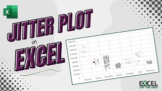
Dumbbell dot plots are an excellent chart style for presenting comparative data. These chart styles quickly show the difference or progress between two data points.
Often, Excel tutorials for dumbbell dot plots create charts that require manual updating for new data. But using the right Excel techniques these charts can be fully dynamic.
So, in this video, we will create a dumbbell dot plot in Excel that updates automatically when we add new data.
0:00 Introduction
0:28 Data
1:11 Calculations
5:20 Named ranges
6:56 Create chart
8:34 Error bars
9:44 Format dots
10:48 Data labels
11:41 Category label
13:29 Delete the junk
13:49 Add new data
14:19 Conclusion
★ Download 30 most useful Excel VBA Macros ebook for FREE ★
exceloffthegrid.com/
★ Where to find Excel Off The Grid ★
Blog: exceloffthegrid.com
Twitter: / exceloffthegrid
#MsExcel


Brilliant video Mark- an overwhelming task broken down really well 👌
Thanks 😁.
The Dynamic Array / Named Range piece is the basis of virtually any advanced chart. So, master it once, then go have some fun.
Good tutorial.
One simplification: you only need to calculate the column for positive error bars, but instead of NA() for negative values, just leave the negative values. You'll get a negative number which will be drawn in the negative direction. When adding error bars, add the positive (including some negative values) as before, and enter a zero for negative.
Another trick is to change the formula for Position from =SEQUENCE(ROWS(E4#),1,ROWS(E4#),-1) to =SEQUENCE(ROWS(E4#),1,1-1/(2*ROWS(E4#)),-1/ROWS(E4#)). Then set the Y axis min and max to zero and one. You've removed all gridlines and axes, so it's not necessary for your chart, but if you need to keep them for any reason, this makes the vertical spacing come out uniformly, including the spaces above and below the plotted data.
Thanks Jon - that's a good tip about the Positive/Negative error bars.
I like your spacing with SEQUENCE. At first I thought you were just placing as 0.5, 1.5, 2.5. But actually you're spacing all of them between 0 and 1. Nice. 👍
Amazing! What are the limits I wonder...
Excellent video. I consider this graph to be indispensable for the data analyst. Thanks for sharing, Mark.
Thanks Ivan. It’s one of my favourites.
One of the best videos 🎉
Thanks Guy 😁
Great way of explanation. Thanks a lot for your video.
You are welcome!
Superb🎉
Thank you! Cheers! 😁
what a great friend :)
👍
Dear Excel Off the Grid
Thanks for all your great and instructive videos.
There is a point never covered (not only by you) regarding Power Query: how to access data located in the same place as the Excel file itself?
- a parameter table in an Excel tab containing "=CELL("filename")", and then imported in PQ.
- a SharePoint.Files or Folder.Files depending on whether the Excel file is in a SharePoint.
- the resulting table needs to be normalized (e.g., replacing \ by / in pathname)
This way, you can move the Excel file with associated folders, data... from one place to another and everything will work correctly.
Isn't this a good topic for a future video?
This is so good, thank you Mark. I have a question. When I faced a similar scenario, I opted to have only 1 dynamic array (in this case it would be your Label column) and I created a table right next to it. The first column of the table had a simple fixed formula (= A2) and it would replicate the content of the dynamic array next to it. The table had all sorts of other columns that had formulas based on its first column. Then, whenever new data arrived, the dynamic array got refreshed and all I had to do was to manually expand the table down until it reached the final dynamic array value. This of course is not fully automated but it was much more simple than creating named ranges for all columns, especially when the table had more than 100 columns. Does this make sense? I am wondering if I ever change it as you did and create all the named ranges, if it is faster (and requires less memory) for Excel to have a huge composition of dynamic arrays than to have a huge table. Any thoughts? Txs again for you wonderful videos.
I believe your method would be marginally more efficient from a calculation perspective.
But it does require you to update the range manually. That’s the thing we want to avoid most of all. The time it takes to do manually update would outweigh any performance gains.
I use Tables told hold data. Then after that it is all calculation. My flow never goes back into a Table, otherwise it will never be 100% dynamic.
By using named ranges, what you lose in setup time you gain back very quickly as you know it will update automatically.
Can we use the same chart to show shift in dates instead of numbers
Yes, it will handle dates.
Am still wondering what was the use of such long an exercise where we can do a clear easy comparison with bar/line charts
The dumbbell dot plot is already quite a popular chart style. I'm simply trying to show how to create it (and keep it dynamic) using Excel.
Unfortunately the more chart styles that people decide to use, the more we have to force Excel in different ways.