Video není dostupné.
Omlouváme se.
Analysing Survey Results with Power BI
Vložit
- čas přidán 5. 08. 2024
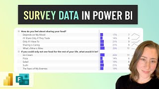
- We analyse the results of a recent survey to rate four topic ideas for future events (schools, elections, COVID and crime) to see what insights we can draw and decide which of these topics to run - and which not.
The datasets and course materials used in the examples are atgithub.com/MarkWilcock/lbag-o...
Details and signup for events at www.meetup.com/London-Busines....
Music: bensound.com


Fantastic thank you. I love working through real world examples.
Glad you liked the video.
Great video, helped me out a lot. Thanks a lot Mark.
Thanks Mark for the video. There is not a lot of PowerBI on this specific topic. Your video is a great resource.
Glad it was helpful!. Thanks Brian.
Thank you! This helped me so much!
Hi Heidi, Glad you enjoyed it. - Mark
Maybe this video is a little outdated being 2 years ago and Power BI have changed their fields but I found this difficult to follow or unable to replicate with the survey dataset I am currently using.
Life saver video!
HI Sheenal, Really glad it was helpful. - Mark
thanks for the video Mark, it helps me a low. One question, how did you sort topic by largest to smallest of the Fascinating response? Thanks,
This video has been great to get me started as I'm new to PowerBI, but I'm still stuck on how to show multiple response question results on a table. I figured how to show the counts and the %, but not the percent of cases which is what I really need to report. Any tips? Thank you.
Hello, thanks for sharing its very useful. I am also creating something similar for a survey and i want to create something to see the average response per topic can you please confirm how i can do that?
Hello and thank you very much for the helpfull content. i solved a same usecase. my problem is, that icant use the columns of the survey table to filter the visuals of the response. do u have a hint to solve such a case?
Great video, however, i do not understand how you got to the 'Response' long table. Does this need to be build manually?
Hi Michele, to get the data in 'long' format, In the Query Editor, unpivot the the 'wide' format table. - Mark
How did you create Number of Respondents?
Will you be holding any more topics this year regarding surveys ? I would like to come/ attend.
Hi Abdul, we will do another session on qualitative data this year - the video on surveys has been very popular. - Mark
Fantastic video!!!, is it possible to weight data?
Hi Marcos, Yes, it is possible to weight data, or do any calculation, using DAX, Power BI's language for calculations. - Mark
@@LondonBusinessAnalyticsGroup Many thanks!! I want to represent in a Dashboard survey data with multiresponse questions and with weighted data. Is there any example how to do this things?
Hi sir,
Want to ask.
How if we slicer by score number or sentiment, not the category.
One pie chart is filled by sentiment (Very boring, Interesting, fascinating, etc)
Then if we choose/click "very boring" on the pie chart,
All category which is set on another pie chart will generate depends on the sentiment that we choose / contains "sentiment very boring".
Thank you
Hi Ivan, In Power BI, use interactions between visuals on the same page so that the first pie chart filters will filter the second pie chart. - Mark
How the score sentiments is set?
Either I use Number of respondents or Count of Score I get the same values (whole numbers representing number of respondents in that sentiment category) even If I double checked everything :(
Hi Loredana, Best to download the sample PBIX and compares with what you have got. Hard to answer this question in another way.
How do you get number of respondents under the response sheet ?
In Report move (first vertical icon on the left table) you right click on the "Response" field, select "new measure" and you type after = COUNTROWS(Response)
tell me more than 2 measure slicer
hi there is something i want to ask. may i know, how to break down the sentiment category?
You would need another related table or column in your data to do this