Hi Alan.. great chart trick.. love the use of multi data series to get different effects like this. Your explanation was clear and concise. I was able to build my own version immediately after viewing the tutorial. Thanks and Thumbs up!
Hi Alan, Do you have a Basic Chart and Graph tutorial? I have never done one before and need to know it for my Business Course I am doing online. I only ask because you explain things so well.
Hi Tracey, I have one on creating Radar charts and one on a Step chart. I don't have videos on the basics of common charts such as column, line and pie though. I have lessons for these on my Ultimate Excel course - Beginner to Expert.
WARNING: The gap width does not work when you have a date column (say, you're taking daily/weekly/monthly measures) where the values are entered as a date (e.g. 3/10/2023 or whatever your date format is)...then the gap width=0 setting in the series no longer "floods the area"; as a result you don't get a solid range bar across (only separated bars with gaps)...I think it should be considered a bug in Excel unless someone has a good reason why date differerence should forcibly cause a gap between bars. If you want a workaround, change the date values to a different format or label them as text. Hope it helps.
Hey, Wondering if anyone can help me : How do I change the order of the X axis. My X axis has the values inverted. I want it to display left to right from cell 28 to cell 6 , but he is displaying from cell 6 to cell 28. How can I invert ?


Hi Alan.. great chart trick.. love the use of multi data series to get different effects like this. Your explanation was clear and concise. I was able to build my own version immediately after viewing the tutorial. Thanks and Thumbs up!
Thank you Wayne.
Simple, Short and clear. Thank you very much for the work presented. Really appreciate
You're welcome, Sepehr.
Thank you for the tutorial, it is clear and simple to understand and has been a big help! 👍
Great to hear. Thanks!
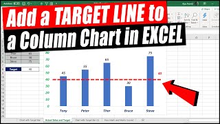
Thanks a lot sir this video was absolutely helpful, I had no idea how to apply a target range in my graph. Really appreciate it 👌👌👌👍👍👍👍
You're very welcome.
Another great idea, very well explained, thanks Alan
Thank you Glenn.
thank you so much. just what I was looking for.
Great! 👍
thank you so much this video was very helpful
Glad it was helpful! 😀
Thanks for sharing! Cool combo tricks! 🔥🔥
Thank you 😊 👍
Awesome! It helped me a lot! Thanks!
Fantastic 👍 Thank you, Eduardo.
Great video. Thank you
Thank you Jeromy.
Thanks for well description :)
You're very welcome 👍
Respect for you sir
Thanks to shearing this useful video
You're very welcome.
Bravo... thanks for sharing
You're welcome Haider.
It is useful!
Glad to hear that!
very useful....keep it up👍
Thank you 😊
Hi Alan, Do you have a Basic Chart and Graph tutorial? I have never done one before and need to know it for my Business Course I am doing online. I only ask because you explain things so well.
Hi Tracey, I have one on creating Radar charts and one on a Step chart. I don't have videos on the basics of common charts such as column, line and pie though.
I have lessons for these on my Ultimate Excel course - Beginner to Expert.
Thank you Alan, l will check it out, l am so happy to have found your channel 🤗
Thank you Tracey. I hope you find what you need. You can contact me for help directly through the course also.
Thank you for the tutorial, but i have a few ranges not one !
WARNING: The gap width does not work when you have a date column (say, you're taking daily/weekly/monthly measures) where the values are entered as a date (e.g. 3/10/2023 or whatever your date format is)...then the gap width=0 setting in the series no longer "floods the area"; as a result you don't get a solid range bar across (only separated bars with gaps)...I think it should be considered a bug in Excel unless someone has a good reason why date differerence should forcibly cause a gap between bars. If you want a workaround, change the date values to a different format or label them as text. Hope it helps.
Hey,
Wondering if anyone can help me :
How do I change the order of the X axis. My X axis has the values inverted.
I want it to display left to right from cell 28 to cell 6 , but he is displaying from cell 6 to cell 28. How can I invert ?
Double click the axis to open the options. In the Axis Options there is a check box to put the categories in reverse order
@@Computergaga Thank you very much for the help and the video.
No worries.
how to do the same in google sheets
Don't know. Probably very similar but don't use it enough.