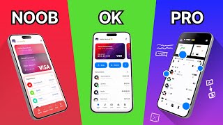
Are you making those 5 button design mistakes?

Vložit
- čas přidán 4. 08. 2024
- You've asked for this, so here is my top 5 rules of designing better buttons! As buttons are arguably the most important element of an interface, there's still many problems with the buttons out there. Here's how to avoid them and become a button master!
The free chapters on buttons and objects are NOW AVAILABLE. Get them here: gum.co/freeui and MASTER button design!
#uidesign #uitips #buttons
☝️ Watch next and be awesome!
4 Reasons NOT to become a designer: • 4 reasons to NOT becom...
How We Work on Real Client projects: • How we REALLY work on ...
Reasons FOR becoming a designer: • Become a UX Designer i...
🏆 Master design with me
✅ 100+ designers got a job with: gum.co/uicasestudy
✅ 3000 people improved their skills: gum.co/uicourse
✅ Best book about UI (5000 sold): gum.co/uibook
✅ Learn UX cheap and easy: gum.co/guidetoux
🎉 See all my books & courses hype4.academy
🐦 My Twitter: / michalmalewicz
👨🏻💻 About me
I'm a designer, entrepreneur and startup founder. I started back in the late 90's and currently my main goal is to share my knowledge, both paid and free. This channel is one of the places where I share my tips on design, user experience, growth, marketing, life and mindfulness. Subscribe to stay in touch. ❤️ - Jak na to + styl


Clarity in passing information is the best way to learn and you michal have done a good job. 👍
great video ! i'll join your course!! you are a great teacher!! thanks Malewicz!
Thank you this is really helpful ❤️🔥
Thank you! I appreciate to you for this video
Thank you for the video! ❤ It helps a lot when one feels stucked 😅
Thank you so much for this! The tips were awesome I was looking for an insightful video that easily explained everything! :)
happy to help 😊
Thanks for the capital letter alignment tip! I always struggle with that.
Thanks for the content you provide for the community, it was really helpful since i started learning about UX
My goal is to change the world for the better - one new designer at a time. 🙂
Thank you so much Michal, I can't imagine how CZcams could be without you ✌🏻😄
My pleasure!
Thank you so much
Thank you so much! It was beautiful and informative!
Glad you liked it! :)
Dziękuję za super kontent będę zaglądać regularnie :)
🙏🙏
thx!
This video is awsome and i speak english very... basics and understand EVERYTHING you say! its incredible! really thanks for this, you help me with the homework with your tips 🥰
Happy to hear that! :)
amazing sir! It was really heplful.I want more!❤️
There's quite a lot of videos similar to this one on my Channel :) Hope that helps!
cool one!
Thank you! Very useful
Enjoy!
Very Informative !
Thanks! 🙏
Thank u.
thanks for the tips!
You bet!
I personally like the button height as 46 or 48 px so I could you the same button on both mobile and web. What are your thoughts on that?
Nice video...thank you so much bro :)
No problem 👍
@Malewicz which font did you use for the underlined "click me"? Zhx in advance, Stephan
I love you video. its very helpful for me.
Glad you liked it :)
Thank you for your helpp
Happy to help
Hi Malewicz, I recently found- and bought your book after having tried to learn about UI design for months now to complement my skill set as an interaction designer. Your book along with RefactoringUI by Adam Wathan & Steve Schoger is by far the best resources I have found for people trying to learn about UI design. I especially enjoyed the chapters on the various design styles to create consistency in my designs.
One thing I've been struggling to understand though is how you're able to create these smooth looking shadows on cards and buttons. In the book you suggest, for buttons, to create the shadow from the button colour itself, by adjusting saturation and lightness. However, if the colour of the button or card is white on a white background, e.g., page 16 of the UI design styles book, per the suggestion to use the button colour, the adjusted shadow colour will be a light grey tint. However, in the example, the button is white on a white background and looks to have a blue hue. Is the shadow derived from the text colour or do you just prefer to accompany a white design with light blue tint shadows?
I tried to dissect some of the examples from your book, trying to understand the colour treatment, but it's hard to use a colour picker as some colours have an opacity to them. If you get the chance in the future, a walkthrough building a soft-UI design like the examples from the book could be an interesting video. If not, it would be great if you could share some of your design files so that it's possible to go in and understand each layer of the design, given that colour pickers can't be relied upon to pick out and understand opacity or gradient treatments.
Cheers!
Hi! First of all thanks so much, I'm happy you liked the book :) As for the soft shadows - there will be a (paid, but rather inexpensive) course on soft-design basics, and at least one video from it will be free (likely the shadows one). I need to finish a couple of other things first this year though :)
As for your question: if the button is white, then use the primary project color (if it's blue then the shadow should have a hint of blue under it). That usually works best :)
Thank you for your quick reply :) Great! I'm looking forward to your upcoming course on soft design and will be on the lookout for it.
Thank you very much for the clarification around shadow hues with white buttons, that helps out a lot on my current project! :)
Try writing small comments. U wasted my precious 4 minutes.
@@rajeevmishraa no one asked you to read all of it
Thank you.
You're welcome!
I found a gem creator, nice work 😎👍🏻
Glad you liked it 👋
man,, u forced me to suscribed at the end,,,,
*cant even resist*
Well I only asked politely 😉
@@MalewiczHype joke
Hello, thanks for the tips! Was wondering, whats the rule of thumb for font size for the labels?
14-16p is often good, for bigger buttons can be larger. It's good to use the x / 2x rule - you can calculate the label size by knowing the button height :-)
Awesome tips, thanks for that.
By the way do you use auto layot option in figma? I really like it, but one thing gets me confused - it measures pixels not directly from letters but from font's bounding box. So it makes hard to do proper alignment as that bounding boxes are kinda random in every font.
Yes, that's the main issue with auto-layout that makes it a bad idea to use for buttons. It's best to still align them manually, until a better version comes along.
@@MalewiczHype so I should never use an auto layout in a figma? I see in the course that you do everything manually using the "red squares" method.
The bounding box around text is the line-height. You can actually set particular line height to get the exact measurements you want.
Hello Malewicz,
When designing buttons, what do you think about the width? Should it be fixed? Or always based on the text-size (responsive design)? Will it be weird having the buttons in all different widths since the text is not the same length? I'm designing for web/mobile applications mainly (not so much websites).
Best to do fixed with minimum padding
I have a question regarding button layout best practices. So let's say I have a design that has a button for "save as draft" "back" and "next". On desktop, I have them oriented next to each other. My problem is the mobile view. I'm not sure how to arrange the buttons. Do I just stack them on top of each other? I'm not sure how else to do it.
In this case you should probably have your main button "save as draft" labeled as it is on desktop, colored with a drop shadow or whatever you want to make it feel like it's the main call to action. Even if he said the opposite in the video, you should probably only use the < chevron as the back button and > for the next one. If you dont have enough room to labels these buttons I guess that it is the best and most understandable option, stacking them will just be weird. But I guess you found out a solution cause its been 5 months you posted this comment lol
5:20 "So we're not kind of l i k i n g the button we're kind of HATING the ENTIRE interface because of that" - Malewicz on not centering labels inside of buttons. (I'm dying)
Please don't die! I'll make a crooked button just for you on some future video ;)
Hello @malewicz! what do you think of Buttons with emojis inside of it? Sometimes I use emojis (colorful) and the Label both contained in a button and I think they look just great if you use them right.
If it's not overused it can be pretty great. We actually used it in one of the recent client projects (a B2C app). Of course it depends on the theme / style of the product - but when it comes to emojis I'm definitely a fan 💪
@@MalewiczHype yes! me too, there is also a secret way to add them with ( WIND+ " . " ) that usually works everywhere 🐱👤
Great insights, can you recomend a book about psychology AND buttons ?
Not really, most of them are very outdated. However check THIS out: gum.co/freeui - it has over 20 pages on buttons alone.
You're on fire with this informative content 👏 thank you! Quick question though: You mention on mobile a minimum touch point size should be 44-48p, is this unit the same as pixels? On mobile to desktop I use pixels so I'm curious if I need to be using points instead 🤔 keep up the good work!
Yes and No :) But to answer you a bit more precisely: when you're designing for mobile or desktop, you should always design in 1x, so at 1x points and pixels are the same thing. 2x, 3x and more is only how the phones render the designs, so generally if your iPhone screen design is 375x812 (for example) then use 44 pts on it. If it's 1125 x 2436 use 132 pixels. But generally don't design in higher resolutions, always do it at 1x - that's what the default artboards are sized at.
Also the WW rule is auto layout +28.5 horizontal padding + 11.5 vertical padding according to the new figma feature. Let me know if its correct?
It'll depends of your font's size
About the Button Alignment: I wonder how it should be possible to align the button based on the capital letters once the interface will be developed in HTML and CSS.
We create a 1-2px nudge in paddings for coders so it's optically correct - whenever we can.
2:05 the same rule applies to other icon before the text? Something like "[CartIcon] Buy"
This is actually tricky - it kind of works with the cart icon on the left side as we quickly associate it with the checkout. But in nearly all other choices I think it's best to just use the chevron on the right :)
How is figma for UI design?
It's a good tool overall. I don't use it for my professional work, but many people do use it and like it :)
Thanks for some really good tips, Michal! What do you think of the fact that more and more digital products are jumping on the "very-rounded" buttons trend? It looks like suddenly everybody wants them.
Hey! So the roudness has some merit in many cases, as they are considered more friendly than sharp corners. There is however an alignment issue (I can't add an image to the comment, but there's a page on this exact problem in our free ebook chapters). The more rounded a shape, the harder it is to left- align any content over or under it as the double-left-edge of a rounded corner keeps clashing with said content. Work great for "standalone CTA's" though, but it all depends on the brand itself, doing rounded buttons for a brand that only uses sharp corners (in their logo, or everywhere else in the product) is a bad idea : )
Great Video thanks
but still no clarity about the height and width of the button for website or app
ideal size for button in-app in height x width
Everybody writes in pixel format which not understood.
😂 W should be called double V cus when we put it together it looks vv haha
Is it not a quadruple u?
You can try that as well ;)
im more of a fan of the double M
..and I clicked the button
Isn't that the point? ;-)
Why bother with padding, just use display: flex; align-items: center.
some buttons need to be small - so it's more about finding out how small can they be without making the text less readable. For larger buttons - sure, your way is the right one.
man you sound like that crazy russian hacker dude 😵
He is Polish
who isn't polished these days.