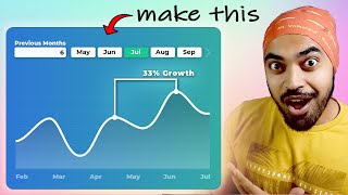
COMPARE TWO PERIODS NATIVELY using Power BI // Beginners Guide to Power BI in 2023

Vložit
- čas přidán 5. 08. 2024
- Follow Gustaw Dudek for more genius solutions: / gustaw-dudek
In this video were going to cover how you can compare two periods, visualise them and their variance using no custom visuals in Power BI
🕓 TIMESTAMPS
0:00 - Intro
02:31 - Setting up the Inputs
05:10 - Setting the DAX
10:01 - Customising the visuals
11:20 - Adding Variance
18:21 - Adding Colours
-
📣 Get Demo Files HERE
bit.ly/3dJE2O7
🔍 Looking to get started in data? Check out this COURSE to get the essential skills you need. No experience required.
solutionsabroad.thinkific.com/
📰 Sign up to our FREE Weekly Newsletter for Power BI news, community updates and more
solutionsabroad.co.uk/newsletter
🛒 Power BI TEMPLATES and more at our digital shop
solutionsabroad.co.uk/store
ko-fi.com/solutionsabroad/shop
❤ Other ways to SUPPORT us
/ solutionsabroad
ko-fi.com/solutionsabroad
📧 GET IN TOUCH
Website: solutionsabroad.co.uk/
Email: fernan@solutionsabroad.co.uk
LinkedIn: / solutionsabroad
Facebook: / solutionsabroad
Instagram: / solutions_abroad
🤝 SOLUTIONS ABROAD
Hi Power BI fans, my name is Fernan. In 2018 I founded Solutions Abroad to help fellow data enthusiasts learn Microsoft’s tool, Power BI. I’m currently based in London with over 8 years of experience working with data and business intelligence. In this channel I provide educational videos about Power BI including tips and tricks, step by step tutorials, news, and all of it for FREE. I also provide some paid content such as courses, templates as well as consultancy services.
If you like what we’re doing here and would like to support, consider purchasing something or donating through our Patreon, every little penny helps us keep the channel going.
🙏 THANK YOU
Thank you so much for checking out my channel and my videos. You, the community, have been instrumental in growing the channel to where it is now. Hope to see you again on my next video!
#PowerBI #DataAnalytics #BusinessIntelligence


I have been waiting for this video since I saw Gustaw's post on Linkedin. Thanks a lot for sharing it!
this is great...always love and appreciate your walk throughs.
Thank you for the video it's amazing to see what we can do in power bi. Well explained 👏
Man I wanted to really understand this tricky dax behind this awesome trick. You are truly amazing ❤
I just made something like this with small multiples and stacked an invisible column chart with my custom data labels on top for a sudo multi card effect with line graph. Great video 👍🏾
super impressive!!
Finished watching
awesome
Very impressive. Thank you. I want to ask a question, what procedure should I follow to create a calendar with "Month" as a Date/Time data type as your own. My regards.
Buenazo !
Hi, I have been struggling to change the data source of my exile file in Power BI service and was wondering if you could please show me how to navigate through it.
Hi, is it possible to get sample files without being patron?
The sales expression in your dax is from which table?
Thank for the video, I'm sure it something obvious but when I add the start end to Y axis I'm getting too dots over each of the time periods and not a line. What am I doing wrong?
I have name cases on X axis and Value in Y axis. I need this approuch between every point or bar. How can something like this be done without dates. Jsut comparw two bars. And filter by different categories
In my pbi i can't find these options dude, which version are you using..?
if am interested in finding the total cumulative sales between the points i.e. (start Month - End Month) how would do that i.e. total sales between the points
Hi. while watching a question popped in my head, would be gratefull for a little help. The sharp decrease at the end of the line chart is a pattern handling error where the "last date with value" is not the same as "last date in selection" thus the sales measure drops to 0.
On the same note. Noob in PBi pls no flame
Thank you for sharing this video. It was really helpful. I encountered a small hurdle when implementing previous period values greater than 1. In such cases, the start-end line only gave me 2 points instead of a straight line, but when the value was 1, I got the line. I'm not sure if this is a Power BI bug or if I missed something. Any advice you can provide would be greatly appreciated. Otherwise, I may have to stick to 1 year variance. Thank you.
I'm getting two dots also. Did you find a resolution?
@@tinaflemons263 change the x-axis to continuous instead of categorical and the line should appear. That is if you are using a date field on the x-axis
@antonycatella5901 I got it to work. I ended up adding a calculated month column, so the month could be a date data type. Thank you
i am facing a unique issue , on exactly following the same steps, instead of horizontal line, i am only getting pointers at selected month and previous month. Resulting the visual to look odd.
I'm getting two dots also. Did you find a resolution?
You have watched a similar video from the Goodly channel and made yours 🤣🤣🤣