hi, I have 95% confidence intervals for positive B coefficients which have negative values and positive values, but the negative values are not appearing at all on excel on the forest plot I created. Do you have any idea how to correct this?
Hi Steven. Thank you for your informative forest Plot. I would like to ask one question: I would be very happy if you could share information on how you can create a forest plot for categories with multiple subcategories. For instance, I plan to create a forest plot for Odds Ratios &95%CI for nine countries, with subcategories such as total, urban, and rural. Your guidance on this matter would be greatly appreciated.
To add a solid line into the graph without manually drawing and lining it up. Create a new column and put 1 as the value for each line. Select Data -> Add and then for x axis select the row of 1s, for the y axis select the position column. Then change chart type to scatter with line. You can then remove the marker and change the line to solid black. Thanks a lot for the video!
Thank you for this! Here's another way to add the vertical axis line - right click the vertical axis (labels)>format axis (fill and line), and change the line to solid black. Then right click on the horizontal axis>format axis, and under 'vertical axis crosses' select 'axis value', and input '1'. You'll also need to make sure 'label position' (for the y axis) is set to 'low', as mentioned.
For me, it was formatting the right y axis so that minimum value was 0 and maximum value was the nearest whole number above your highest position (i.e. top position of 19.5, make maximum 20)
Hi there. Great video!!! I have 14 variables, unfortunately, the lines are squished so that the top label doesn't have a line beside it. How can I fix this. Do you know? Also, can I add labels between study one etc. I have variables such as age, clinic etc. So I would love to add variable titles. thanks for the vid!
Good step-by-step. But.. It doesn't work well. The OR's don't align and sometimes the CI's don't actually correspond to what it's supposed to. I spent over 8 hours working on this and I am confident I did it right. I think having too many studies is the issue perhaps?
I had the same problem but I figured we can fix it by changing the value of the second Y axis on the right hand side (he mentioned about deleting it at 4:19). You should set the maximum value of this axis equal to the number of the studies you have. Good luck!
@Future President Yes, Phuong Pham is correct. With a large number of points some will be lost unless you set the maximum on the vertical axis to the number of categories (I had 94 and lost the first two without the change). His answer is worth a pin.
Really great tutorial! Question: When I add a new series and change it to "scatterplot," all of the scatterplot points appear off-centered compared to the bars (see 3:40). Have you encountered this problem before?
Hi Aidan When selecting the position data (with effect size), did you highlight the cells in the same order as you did when creating the bar chart? If not, then this may result in the points not aligning with the bars. Hope that helps, Steven
@@StevenBradburn Hi Steven, thank you for the great video! I also have the same problem as Aidan with all the scatterplot points appearing off center compared to the bars. The order is correct, only the points are not well aligned with the name. I tried to change the value of the position to move the points and it seemed work until the last point (appear on the top the graph), no matter how big the value I entered it could not reach the position of the top bar..
I realized what the bug is. in the video we have 8 studies. and the step is 0.5. I have 4 studies, and if the step is 0.5, then the points are not in the middle. You need to have a step of 0.625 for 4 studies. Moreover, the first point will have half a step - 0.3125. then the numbers 0.3125, 0.935, 1.560, 2.185 are obtained. I think there is a step for each number of studies. I picked up the first point myself. then I already understood how to build others. !!! and here's another thing: when I did 4 studies, and deleted one, the dots remained in the middle. thus, I think that you need to do 8 studies first, and then delete the extra lines and another thing: if one indicator is too big (I had 770), and the others are small (2-10), then you need to choose a logarithmic scale in the legend.
Very useful, just want to know if the difference between upper and lower 95% is very small, the plot hardly shows. How do u enlarge the plot size? I hope i am clear in my question.
Thank you so much!! Very helpful! I have two questions: 1. How do I make the caps longer (at the end of the error bars)? 2. For me, the studies are too spaced out. How do I get them to be vertically closer together? I tried decreasing the interval of the numbers in the Position column (e.g., 0.25, 0.75, 1.25.... instead of 0.5, 1.5, 2.5...) and that did not work.
For me, it was formatting the right y axis so that minimum value was 0 and maximum value was the nearest whole number above your highest position (i.e. top position of 19.5, make maximum 20)
Hi Noah, I had the same issue with 12 studies, I fixed it by changing the secondary y-axis maximum to 12. Would probably work for you if you updated the y-axis maximum to 14.

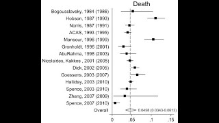


ONLINE GUIDE
toptipbio.com/forest-plot-microsoft-excel/
hi, I have 95% confidence intervals for positive B coefficients which have negative values and positive values, but the negative values are not appearing at all on excel on the forest plot I created. Do you have any idea how to correct this?
Hi Steven. Thank you for your informative forest Plot. I would like to ask one question: I would be very happy if you could share information on how you can create a forest plot for categories with multiple subcategories. For instance, I plan to create a forest plot for Odds Ratios &95%CI for nine countries, with subcategories such as total, urban, and rural. Your guidance on this matter would be greatly appreciated.
To add a solid line into the graph without manually drawing and lining it up. Create a new column and put 1 as the value for each line. Select Data -> Add and then for x axis select the row of 1s, for the y axis select the position column. Then change chart type to scatter with line. You can then remove the marker and change the line to solid black. Thanks a lot for the video!
Excellent! Thanks for sharing George!
Thank you for this! Here's another way to add the vertical axis line - right click the vertical axis (labels)>format axis (fill and line), and change the line to solid black. Then right click on the horizontal axis>format axis, and under 'vertical axis crosses' select 'axis value', and input '1'. You'll also need to make sure 'label position' (for the y axis) is set to 'low', as mentioned.
Such an informative video......I can't imagine making forest plot without this video
Great tutorial, thanks. Unfortunately, scatterplot points are not aligned with the bars. Do you know what is the problem ?
For me, it was formatting the right y axis so that minimum value was 0 and maximum value was the nearest whole number above your highest position (i.e. top position of 19.5, make maximum 20)
@@tomphillips88 Yep that fixed it, thank you!
Thank you for this - I watch it probably every 4 months when I have to do these!
Loved this tutorial, I used it step by step to make the plot
I was worried that I wouldn’t be able to do it. Someone helped me before, but they forgot to do the line at the one marker. You made it easy.❤
This is amazing, thank you so much! You have helped a poor soul's thesis!
Thank you. You solved my problems. I learn many thing from this video. Long live brother.
Thank you. That was a great tutorial and I learned a lot. Great stuff. Looking forward to other tutorials from you.
Thanks so much, Steven for this tutorial. It was straightforward to follow and do the graph with your instructions. Congrats!
Hi there. Great video!!! I have 14 variables, unfortunately, the lines are squished so that the top label doesn't have a line beside it. How can I fix this. Do you know? Also, can I add labels between study one etc. I have variables such as age, clinic etc. So I would love to add variable titles. thanks for the vid!
This was amazing! Something i would have never figured out how to do on my own. Thank you so much!!!
Beneficial video. Made my task easier. Thanks a ton!!
wow. someone needs to buy you a beer friend! lifesaver
Thank you for this, you have just saved me a panic attack lol
Thank you for making this video! Very helpful👍
Really useful imformation. Thank you very much.
Good step-by-step. But.. It doesn't work well. The OR's don't align and sometimes the CI's don't actually correspond to what it's supposed to. I spent over 8 hours working on this and I am confident I did it right. I think having too many studies is the issue perhaps?
I had the same problem but I figured we can fix it by changing the value of the second Y axis on the right hand side (he mentioned about deleting it at 4:19). You should set the maximum value of this axis equal to the number of the studies you have. Good luck!
@@PhuongPham-gi2fl Thank you, kind soul. This saved me hours of frustration.
@@PhuongPham-gi2fl Thank you 🙏
@Future President Yes, Phuong Pham is correct. With a large number of points some will be lost unless you set the maximum on the vertical axis to the number of categories (I had 94 and lost the first two without the change). His answer is worth a pin.
@@PhuongPham-gi2fl Thank you! Helps a lot!
Thanks! OMG I wish you all the happiness in the world!
Thank you! SAVED me on my group on our school project :)
Thank you for this. Very straightforward, very clear, and very helpful. A tad fast when talking. Need to slow down.
Thanks for the feedback Blaise. I will take that on board for the future :)
Really great tutorial! Question: When I add a new series and change it to "scatterplot," all of the scatterplot points appear off-centered compared to the bars (see 3:40). Have you encountered this problem before?
Hi Aidan
When selecting the position data (with effect size), did you highlight the cells in the same order as you did when creating the bar chart? If not, then this may result in the points not aligning with the bars.
Hope that helps,
Steven
@@StevenBradburn Hi Steven, thank you for the great video! I also have the same problem as Aidan with all the scatterplot points appearing off center compared to the bars. The order is correct, only the points are not well aligned with the name. I tried to change the value of the position to move the points and it seemed work until the last point (appear on the top the graph), no matter how big the value I entered it could not reach the position of the top bar..
I realized what the bug is. in the video we have 8 studies. and the step is 0.5. I have 4 studies, and if the step is 0.5, then the points are not in the middle. You need to have a step of 0.625 for 4 studies. Moreover, the first point will have half a step - 0.3125. then the numbers 0.3125, 0.935, 1.560, 2.185 are obtained.
I think there is a step for each number of studies. I picked up the first point myself. then I already understood how to build others.
!!! and here's another thing: when I did 4 studies, and deleted one, the dots remained in the middle. thus, I think that you need to do 8 studies first, and then delete the extra lines
and another thing: if one indicator is too big (I had 770), and the others are small (2-10), then you need to choose a logarithmic scale in the legend.
It would be helpful to show how to do this on the log scale because the OR is the log odds
Currently looking for any resource to get this done.
Hit the x axis, format axis, scroll down and click logarithmic scale
This was very simple video, nicely explained
Thank you
Great tutorial, extremely useful! Kudos!
This was so helpful! Thank you so much!
Thank you so much! I managed to make the graph.😉
Very useful, just want to know if the difference between upper and lower 95% is very small, the plot hardly shows. How do u enlarge the plot size? I hope i am clear in my question.
You saved my day!
Most grateful to you! This is so helpful : )
Really nice tutorial. Thanks! If i use Hazard ratios however can i Use the same forest plot? Thanks in advance
Excellent. Superb.
This was amazing. Thank you!
Thank you! Great tutorial..Really helped!
this is great tutorial and it's worked for me,,,by the way, can we calculate pooled OR in excel with only OR (95%CI) data from several studies?
Thanks for this! It's helpful. Can you also show how to do this in R?
THIS SAVED ME!
Thank you very much for this video!
Great tutorial, followed with ease!
Nice tutorial. thanks, learnt easily
Really impressive, amazin!
Thank you so much!! Very helpful! I have two questions:
1. How do I make the caps longer (at the end of the error bars)?
2. For me, the studies are too spaced out. How do I get them to be vertically closer together? I tried decreasing the interval of the numbers in the Position column (e.g., 0.25, 0.75, 1.25.... instead of 0.5, 1.5, 2.5...) and that did not work.
For me, it was formatting the right y axis so that minimum value was 0 and maximum value was the nearest whole number above your highest position (i.e. top position of 19.5, make maximum 20)
Very useful, thank you!
Thank you!!!!!!!!!
The line added at x=1 disappears upon saving the chart as a picture.
Thanks!
Can you calculate 95%CI if I know the Standard Deviation and add these in excel?
better than doing it in R or SAS or Stata
Really awsm
wow, this was very helpful =)
How can I add a label to the OR on the forest plot?
Gracias!!!!!
Does this generate an adjusted or unadjusted 95 % CI?
Grazie
Hi, how do you manage that numbers like "1.9" will not automatically change to "January 9th"?
I know that move with the apostroph, but then the data will not show in the bar chart anymore
do you have excel file to download?
How to interpret results?
Have a look at this vi czcams.com/video/Pxs0gl3hRKE/video.html
👍
Is it possible to have too many “studies”? My scatter points aren’t aligning with my bars. I have 14 studies.
Hi Noah, I had the same issue with 12 studies, I fixed it by changing the secondary y-axis maximum to 12. Would probably work for you if you updated the y-axis maximum to 14.
@@mahmoudel-yousef4151 THANK YOU SO MUCH
why is this working for everyone but me
The dots are not lining up
why a 10 min video for something that can be explained in 2 mins?