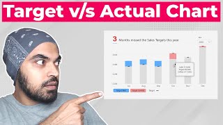
How to make variance chart in Power BI to measure performance

Vložit
- čas přidán 3. 06. 2020
- Do you want to create a variance chart (or visual) in Power BI to measure actual vs. target performance? This video explains how to create such a chart with synchronized sorting and interactions. We will use conditional formatting, visual grouping to achieve a cohesive, simple, clean & elegant variance chart in Power BI.
For a sample workbook and more visit
chandoo.org/wp/variance-chart...
#VarianceChart #PowerBIVisuals #BudgetvActual #ActualvTarget - Věda a technologie


Chandoo - you the Man once again!! So many people owe you for your kind expert assistance. ME TOO!!
THANKS MUCH AND BEST WISHES!!!
Glad to help. 😍
Beautifully explained :) Thanks for sharing!
You are absolutely awesome Chandoo! Thank you for your direction - brilliant video
Thank you! Great explanation!
This really saves the day, thank you, Chandoo and more power!
Glad to hear that!
Best solution for a semi-custom visual in power bi. Thanks !!
Thanks Moroni...
Thanks Chandoo.. interesting video with some good techniques. Thanks for sharing them. Thumbs up!!
Glad you liked it!
You the man. Well done, cool simple charts
Thanks Kevin :)
Thank you Chandoo
Cool idea.
Very helpful thank you!
You're welcome!
Thanks good info
thanks chandoo!
You are welcome.
Very good tricks! Simple but effective.
Do you have any visual for OEE?
Great explanation. Thank you.
Glad it was helpful!
Thanks for the good content!!
Glad you enjoy it!
Hi Chandu... Ur new look is awesome
thanks for the video. I was tasked to show the variance over 4% and tooltips option doesn't work in this case for sorting(
Is there a way to include drilldown capability on both the visuals on single click ?
Great Tip Chandoo
Thanks Sukhomoy...
Thanks chandoo ... Useful information of power IB ... NEW FRIEND HERE
Thanks and welcome
thank you, really appriciate it
You're welcome!
Thanks..
Can you compare the actuals Month-Over-Month variance by product? Ex: Product FHEJ actuals Month-over-Month increased/decreased by $ and by %.
Hi Chandoo. From where can i find the data set to work on this project?
👍🏻👍🏻
Hi Chandoo,
Thanks for the great contents as always.
I just wanted to understand how to plot values against secondary axis in PowerBI?
Any solution for it?
Hi Aaditya… you can use secondary axis in a few types of visuals in new version of Power BI. Give it a try.
super
useful variance chart where preference not to use marketplace visuals thank you
Glad it was helpful!
at last! i saw the master face!
Can I plot a (ShareMarket) Stocks candle chart with volume.
Hi Chandoo,
For chart title, it has two different font sizes, is this title a text box, or the native title property for the visual?
Thanks
It is a textbox. You can select parts of text and apply different colors, sizes etc.
I am calculating varance in % but for me it is giving value as 151.00%
Instead of 1.51%
I am dividing delta/actual setting to percentage
Because on the actual basis I want to calculate variance
But getting 151.00%
Hi Chandoo
Nice video. Regarding Zebra BI has amazing visuals even for Excel. Can you please create something in excel same like Zebra BI visuals. Because zebra bi is very expensive.
Thank you
Thanks for the comments Luke. I will try.
Hi Sir, I see the issue when I scroll on graph1 the graph2 variance is not moving. Since I have huge data in my dataset. Can ou suggest,
Unfortunately, synchronized scrolling is not possible with this technique. I suggest using a table when you have such large data.
Hey, can you share the excel data file, for practice. Would really help
Hi! Please share the formula used for both Variance and Variance%. Thank you
Please refer to the sample workbook. Link is in the description.
@@chandoo_ Can u pls help me on how to use two columns frOm different tables againsT month?
@@chandoo_ to visualize them in 1 graph
Hi
I Have question that
Min Or Max
In table haveing
highest Discount
or
lowest Discount
Which supplier have
min Discount
I want ans like below
Mohammed
1
I want ans
Min Discount and Supplier name
That into CARD Visual
When we display same ans on card visual ans should be asc
hmm... see this video for an example - czcams.com/video/n7gAJMBdJ8k/video.html
What's with the sudden beard