How to Select and Pair Fonts in your Design - Design Tips

Vložit
- čas přidán 1. 07. 2024
- Video Series: In this episode I will show you with easy-to-understand visuals and a couple of clear examples so you can start pairing fonts like a pro in your presentations, infographics and pretty much any other visual you intend to create in the future.


The final practical example really helped.
I found this video very helpful. Thank you very much for such an amazing video
Great tutorial thanks, clearly explained, great examples.
Thank you very much for great tutorials! These are the best I've seen thus far.
The examples throughout the video helped a ton!
Shows the impact of the visuals on the reader, mood, etc. and importance of choosing fonts. Very cool, thank you.
You're welcome!
Great video, thank you. Love the last section, very informative. :)
Very concise and clear. Great tutorial 👌
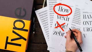
San*S* serif (from the French word meaning "without").
Yeah, if I were them, I’d redo the video just because of this mistake. It’s glaring and cringy.
great tutorial! thank you.
The last example was pretty amazing👍😍
ای والله
That was really cool bro!!
THX 4 sharing.
Really helpful content! Like the way you present the information. Thank you. :)
I am Pinaki from India... Thank U Sir.... Mighty God Bless...
Great job; Very helpful! Thanks much.
This is the *best video* about choosing font.
*I LOVE IT*
you cant understand this video untill you repeat it again and again , thumps up visme you saved us
Thank you very much, great tutorial.
Clear explanation Clear explanation. Great job.🤩🤩
I really like the example at the end.
Lots of value in this video . Please keep creating similar vids please & ty 🤩
Thank you very much - very helpful
Very useful tutorial, thank you sir! 🙏
thanks a lot learn many things love you from Bangladesh.
practical examples are key this was eye opening
Loved it, thank you!
Cheers! The practical example was really helpful :)
You're welcome!
Very informative. Thank you
Thank for sharing this knowledge!
Beni you’re welcome. Checkout our latest videos !
Superb presentation! ❤
Thanks coach!
Nice vid, keep your good works
thanks, i have learnt new things
Very helpful. Thnx
Great content. Its really help me.
Thank you very much for this video
What I was expecting from "pairing fonts" is how to choose 2 fonts that goes well with each other considering the mood that I want to create, not the composition or contrast
You're right, there are two aspects to everything in design. The visual and the feeling it inspires. This video is about visual things, sorry to have misled you.
Very well explained!
Thanks for your video. Very nice
I like making the font smaller with more text. That's something I definitely didn't know.
Great video.
For presentations with slides like this with a large background picture...what do the other slides in the deck look like? Would they all have to have similar large pictures? It's hard for me to visualize what the other slides in such a presentation would look like but I really like the style
Amazing video.
Great tutorial
informative video, thanks...
چه سوپرایز شدم وقتی گفتی پیمان موفق باشی 💙
very good explanation
Thank you!
Wow! Love this video! Easy to understand. Great explanation and examples. Thank you for sharing! Already subscribed! ^^
Love it
Excellent
I can't seem to find what I'm looking for.. What do you call the banners, shapes and other elements you need in every design job, not sure how to even describe it lol..
but great video btw!
thanks so much
TQ. VERY INFORMATIVE
Muchas gracias :) thanx
very nice.. fantastic.. Thanks a lot..... keep it up.
You're welcome.
Thank you
awesome
Wow!
Can you give more examples on contrast using style?
When it comes to making a professional-looking layout, it’s important to not only consider the colors and images you use, but also the fonts! A2 Design Lab has compiled a list of the best fonts to use on your graphic designs. Visit our website at a2designlab.com/ to learn more.
tnx sir
Is there any software you can choose fonts when you design logo or something? rather than going through thousand fonts
Thanks
GREAT
useful
great so useful
Glad it was helpful!
Anh đức phúc hát hay quá 😍😍❤❤
Sorry friend, you've got it mixed up; Verdana, Lato etc are typefaces. Verdana Italic, for instance, is a font...
whoisathome He’s also wrong about there being only two types of typefaces.
What are the fonts used at 10:34?
Is it legal to use fonts that are provided on a program like adobe illustrator?
Great question scott. It depends; often those programs come with a set of default fonts; Although you want to check with the provider; often those default fonts can be used; but other fonts you may need to purchase and license when uploading to your font library.
You were cruising until you put the small cursive script font on top. It is too small and fragile for the theme . Very good explanations.
is there any other video which actually gives an idea of which font should be used for which mood .. as you change the fonts in your practical example in this video ?
Hi Medha, we have a lot more resources about fonts and design in our Blog. :) www.visme.com/blog
What should I design first? The typography or the style? Sometimes I'm having a hard time thinking the style that matches the typography. Give me some tips!
Know your concept and vision for your composition
Hi I like your video could you give me some advice on my logo font?
Sure, where's your logo?
@@VismeApp could you send me your email so i can send it to you?
Man your intentions are good but you really had no idea what font and typeface are.. you had one job..
I am sure your video is well-intended, but I lost interest as soon as I saw "San Serif" written on the slide behind you. San Serif reads as Saint Serif; it should be Sans Serif, meaning without serif. Anybody who teaches typography should know that.
God, what a pedant.