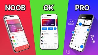
Amateur vs Pro: Advanced UI Design Examples (Before & After)
Vložit
- čas přidán 22. 07. 2024
- Onboarding and Sign-up screens are one of the most popular examples of UI Design that most UI and UX designers use to showcase their skills. That is especially true for novice designers, because it is relatively fast and doesn't require a lot of work.
But, it's really hard to stand out with those designs because onboarding and sign-up screens are the most overused way to showcase UI and UX design skills. Especially at services like Dribbble where you can see them everywhere.
Today I've selected for you 4 examples of mobile app design screens from that category, prepared by novice and more experienced UI and UX designers with the intention of improving them.
Watch more of my UI/UX design tutorials here: • Figma Tutorials
Chapters:
00:00 Amateur vs Pro UI Design Examples
00:40 1st Example
02:43 2nd Example
03:25 3rd Example
04:03 Final example
05:00 Outro
#uidesign #uxdesign #uxtutorial #designtutorial #graphicdesign #mobiledesign #productdesign #ui #ux - Jak na to + styl


I plan to make more of this kind of videos and start a new series, potentially where I would do a reviews and redesigns of your works, but... I need to know if you like it, so hit that thumbs up button. I will give it back after 10k subs :D
Good stuff man. Keep it up.
Thank you Ivan, I'm glad you liked it!
Great idea !!
Are Grid Systems used in APP Design too? And if yes how do we use them .
Short answer - yes. I think I covered that in the videos related to responsive design: czcams.com/video/Mco_Qfs1BgU/video.html, let me know if you were able to find answers there.
First video i've seen of yours, i really like this before and after style. Short and sweet
Glad you liked it! :)
This is awesome! It's educational for beginners like me to see the thinking behind each design. Love it!
I'm glad you liked it & found it useful - check other videos from this series ;)
Thank you Kerev! Its very clear explanation for the improvement. 😊
Thank you for finding it useful! :)
Wow, I love this. I'm going to apply them while working. Thanks
Thank you, check the other videos from this series if you liked this one ;)
That was a great video man, really well made 👏
Thank you! Check out other videos from the series ;)
Hats off to the creative mind behind this design - it's a true reflection of innovation and style."
Not sure if it was a citation or a praise for the video, either way thank you! :)
This is Gold for me Kerev, excellent analysis 🤩
Thank you, I'm glad it was useful for you! :)
Make more videos like this. It will be very helpful for us. Thankyou 🙂
This was really helpful. Thanks!!
Thank you! Check out other parts from the series ;)
thankyou so much! this video needs more views..
More happy viewers like you will get us there :) Glad you find it useful. This will be a reoccurring series so expect more of this type of videos!
Thank you very much! I think it's important for learning design to not only see outright bad examples, but also good or viable ones, as well as how to improve them further. Wouldn't have thought to make the buttons have short and consise text, for example. Or the stage tracker. Or text buttons instead of logos. Very interesting
Thank you for watching! :) I really recommend one of the latest episodes from the series, where I'm redesigning items available for sale (!) - Meaning they went through and were approved by "experienced" designer...
@@KerevDesign Currently binging your UI/UX Design Course, think I'll watch your entire library:)) I've got three days to design as much of an app as possible, and your vids are the perfect bite-sized guide to figure out what I'm doing
I would really like to finish it ASAP, currently I was able to make 5 parts, another 5 to go. Idea behind was to allow anybody to enter the field and present only what is necessary. Then I will start working on more advanced course, but, it will take a while ;)
the details make or break a design awesome video
Thank you, glad you liked it! I'm working on the new one, I hope to publish it before the end of this week :)
Awesome! 🤩
Thanks
I'm glad you like it!
Awesome! 🤩
Thanks! :)
3:35 Honestly, it’s kind of complicated to define the primary action (the action we want to be made by the user). The white one grabs much more attention just because of it’s brightness. Therefore, it would be better to swap the colours of those buttons. Always take care about what attention hierarchy.
Looks like both of them are primary
Well, we are in the context of creating of account though email - which means, corresponding CTA button should be primary. Registration through social media are secondary actions in this context. You can see it very often the other way around (where sign up through email is a secondary option) - But I'm glad my video got you curious to think about it :)
On the first example (0:56) I think there are couple things that could be improved.
First there is still odd space between "Create account" and top of the screen, it makes me feel that something hasn't loaded. Maybe there should be a logo or something.
Then it looks like that "Create account" is on a separate card that can be pulled up from behind this sign up screen. So from the first look I'm wondering if I'm creating account or is this login for existing accounts. Of course the buttons itself gives the answer but this isn't consistent.
Sign up with Google/Facebook buttons look better after modification but contrast in those buttons are so much bigger than on "Sign up" button that those steals my focus.
As I said, this is my approach, your ideas are absolutely valid! There are at least couple of ways of doing it :)
Im surprised by how well you understood the "failed" designs. I wouldn't have understood wtf "01.03" was about (date?? Wtf)
Well, if you want to improve something you need to understand how it works & what was the intent in case of simple projects like this. Typically there is a lot more of details like this in the bigger projects.
The first one is pretty brave without password confirmation
You are right! I totally didn't think about it :)
thank you! it was an awesome video, may i ask the fonts you're using in the first design.
"Nunito" - you're welcome, and thank you :)
Amazinggg
Thank you :)
Really nice. 1+ sub
Thank you very much, check out other videos from the series :)
Nice episode ✌️
Thank you! Check the other ones :)
interesting videeo thank you
Thank you, I'm glad you liked it :)
Do you use Premier Pro to edit your videos? I love the animations!
Yes, as well as After Effects :)
In the Second Example , You put the linear Gradience in FIGMA ? Or PHOTOSHOP
All was done in Figma, yes, the gradient fill is available in the dropdown menu in the fill option of design panel.
i like it really
I'm glad you liked it! :)
Please make more videos like this
Thats the plan, you can check out other videos from the series, right now there is 6 more on my channel :)
Hi! If i want to ask for feedback to my design, how should i reach out to you?
You will find my email address in the about section of my channel.
Nice, but for the first design, I'd also color the Google and Facebook icons.
In this case I did that to reduce visual noise. I really doubt it would make or brake that design tho. In real world considerations individual preferences are typically subject of validation with real users and A/B testing to discover what version performs better.
@@KerevDesign Haha yes. User testing is all 💯
Kerev is right in removing that noise. He is also right about the user testing. But the way he has redone the design is absolutely correct and looks much freshers. Adding different colours negates his intention of removing the noise
@@StayUnited12 Thanks! :)
I love the video, but I still do not understand why we do not prefere to add (Facebook) or (Google) icon at the first design, to be in one harmony ?
As I explained, there are many ways that you can do in order to improve the designs. I simply selected this one :)
@@KerevDesign oh cool, i loved your videos👏🏻👏🏻👏🏻👏🏻
Can you suggest me a book, tutorial or website for learning about info noise, contrast etc... Kind of stuff like the fundamental... Actually I'm in love with full stack but i also love about the aesthetics...✌😎
Nielsen Norman Group, Coursera - Interaction Design Course, Google Course, other creators from this field on CZcams (especially Malewicz) - there is a ton of it out there. For now I really recommend Malewicz courses and channel - I'm simply not just there yet in terms of content :)
@@KerevDesign thx brother for the reply you are very hard working and kind...😎
Nothing about this is advanced. This is basics 101.
Well, some of the examples (eg 1 and 4) were prepared by "experienced" designers and they still contained a lot of, as you described "basic" errors :)
In your view, what do you see as advanced?
All were good except the first one in my opinion.. the secondary buttons looked a bit too much like the input forms..and the use of fb and google colors made it clear on landing what that section would do..I also find that the cta got more attention in the first one because of the white space.. also the header popped more because of the placement of it above the block..
Well, that's something I came out with during the redesigns - I'm glad that everyone has their own approach; typically in the daily work those opinions would be a part of discussion ;)