Video není dostupné.
Omlouváme se.
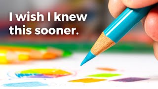
6 WAYS to Choose a COLOUR PALETTE for Adult Colouring Pages 🎨✨

Vložit
- čas přidán 12. 08. 2024
- Hello all! Today I'll be showing you how to create a color palette for adult coloring pages via six different methods. I'll be coloring in a page from johanna basford's small victories so feel free to color along if you also have the same coloring book! If you love adult coloring tutorials and content centred around adult coloring for beginners, feel free to subscribe to see lots more from me in the future!!
SOCIAL MEDIA ACCOUNTS:
Instagram: / apicturedpurpose
TikTok: / apicturedpurpose
TIMESTAMPS:
00:00 - how to choose colors for adult colouring (intro)
02:06 - method 1: reference images
04:14 - method 2: premade color scheme
06:06 - method 3: AYG method
07:35 - method 4: analogous color theory
09:33 - method 5: complementary color theory
11:00 - method 6: triadic color theory
12:25 - how to make a color palette for adult coloring books (outro)
SUPPLIES I USE:
- Brutfuner 160 Coloured Pencil Set
- Derwent Watercolour Pencils 12 Pack
- Born Watercolour Pencils 36 Pack
- Born Acrylic Paint Markers
- Pentel Hybrid Dual Metallic Assorted 10-Pack
- CRAF-T Decorating Chalk 24 Color Set
- Prismacolor Pencil Colorless Blender
#colouring #adultcoloring #colouringpages #coloringpages #johannabasford #ritaberman #smallvictories #roomsofwonder #colorpalette #colortheory #coloring


Awesome video. I like how you did colored the the tiny flowers by putting down some fine liner first. Can't wait for color alongs!
I just discovered the fineliner technique! It's a lifesaver for tiny details
Fabulous suggestions! I think this video will be helpful to a lot of people! To anyone struggling with color wheel techniques, physical color wheels at the art store are so so so helpful. They're cheap and interactive and give references for triad color schemes and even quadratic color schemes! It's convenient to be able to twist the wheel to one color, and then the wheel gives you all these options for possible color pallets that all would look good.
I color main subjects as I go, but other elements i typically color based on what they are in real life. I really like to emulate photos too. I've got this sky I'm working on, and I've been using this pic i found on google of a sunset to use as a reference.
Thanks for such a fun and informative video! I love how your vignettes turned out!
Yes I’ve seen those physical color wheels! They definitely look helpful as well. Thank you so much for watching, I love that your using real life images for references 😍
Great video! I’d love to see more details about combining fine liners and pencils.
I second this suggestion of seeing more about how to use fine liners etc. in your pages!
For sure! I can definitely touch on that in future videos 🥰
So many good tips 😄 I sometimes struggle with picking a color palette, even though I’ve been coloring for years 😅 So it’s great having different ways of finding a color palette or inspiration. The page turned out beautifully 🩷
I totally agree that sometimes the inspiration doesn’t strike straight away so it’s always good to have a few colour-picking tricks up your sleeve 🥰❤️
Thank you for another great video! I absolutely loved this one!
Although I don’t have the Brutfuner pencils, I do have a 300 set of Kalour (not sure if that’s how they’re spelled) and think I can find similar colors.
I am going to try to follow how you colored your vignettes - I hope mine come out as nice as yours!
I tend to color my pages without using a color palette (just coloring each item whatever color it would be in real life). But I love how color palettes pull the pictures together and make them look more streamlined I guess.
So, I have really been wanting to practice using color palettes for my pages. I actually was struggling so your video really helps!
I’d never heard of the triangular method (I don’t think that’s what you called it but I’ve forgotten now 😂). That is one I would particularly like to try.
I know you said you’re working out your recording setup, but when you have worked it out and if you have time, I would really love for you to do a video on how to pick where you place your white gel pen highlights and/or embellishments. I really struggle with this and haven’t been able to find a video that really explains how to know where to put the white gel pen.
Thanks again for such a helpful video!! I literally stop whatever I’m doing to watch your videos whenever they come out!
I’m so glad this video was useful for you! I can definitely do a dedicated video for how to use white gel pen in the future but in the meantime, check out my how to colour in Small Victories video! I briefly touch upon how I use white gel pen and paint pens at the end of that video ☺️❤️
You’re so amazing I learn loads from you… thank you so very much….. love to see your further vlogs
I am so glad! Lots more coming your way 🥰😘
The color wheel method was my favor because you made me see how easy to pick my colors and they would not clash😀
Right? I used to be so intimidated by the colour wheel but it’s actually such a helpful tool!
Great tips! This was a very helpful video, thanks for posting!!
I’m so glad you found this helpful! Thank you for watching ✨🫶🏻
Thank you is much!! This is great, really useful 🙏🏻
I'm so glad ☺ Thank you for watching x
Very informative and helpful. Thank you.
I’m so glad you found it helpful 🙌🏻✨
Thank you💕
Uauu, belíssimo ❤❤❤❤
Thank you for sharing your invaluable knowledge. A special thanks for using your Brutfuner pencils. I'm amazed more colorists don't use them on a regular basis. Looking forward to your next video. Peace!
I LOVE my Brutfuners! ☺️ I’m so happy you enjoyed the video ✨
Great video ❤
Thank you! 🤗💖
Great Video ❤
Thank you!! 🤩
❤
🥰🫶🏻
Love this video. Thank you. The thing I struggle most with is choosing a background color for a project. Any suggestions?
Ah, the eternal struggle of choosing the perfect background color! I'm still learning this myself, but I would suggest either using the lightest or darkest colour in your chosen colour palette. That way, the illustrations will pop off the background. Hopefully that helps!
@@apicturedpurpose Thank you so much. This is really helpful 🙏👌🏻🩷
Awesome tips! Colour combos have always been a pretty natural thing for me too. But I definitely have my go-tos that I love. Which is why I started my palette challenge each month to challenge myself (and anyone else who’d like to) to use colour combos I don’t usually gravitate towards. I’d love to invite you to join in if you’d like. Details are on my channel and Instagram account.
I've seen your colour palette challenge! I'll definitely try to join in next month 😸💘
@@apicturedpurpose that would be so fun!
I would want to see how you choose colors for picture on miniature of this video
That one was using Rita Berman’s page as a reference ☺️