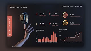
Overlaps, Bullets and Target Charts in Power BI
Vložit
- čas přidán 4. 11. 2023
- A walkthrough on how to take your viz to the next level and create overlap, bullet and target style data viz charts in Power BI using native visuals with some creative DAX, formatting and trusty error bars, so you can include in your next dashboard creation
PBIX file is available for download below, and walkthrough includes both horizontal and vertical versions of the visuals
Subscribe for more Power BI advanced tips and tricks.
📱 Download PBIX File:
drive.google.com/file/d/1rJFW...
📱 Original LinkedIn Post:
/ urn:li:activity:712170...
📔 Accompanying Medium Post:
/ 0dfb4cc0d1e0
📱 SOCIAL MEDIA
LinkedIn: / gerard-duggan-15420a55
Twitter: @DGAnalysis
📔 BLOGS & WRITING
Medium: / duggangerard
DG-Analysis: dg-analysis.com/
Maven Showcase: mavenanalytics.io/profile/Ger...


Thanks Gerard! Great Tutorial keep uploading!
Thanks Gerard for this great tutorial. Audio improves too, nice!
Cheers, thank you Jay...
Nice video Gerard! Some upgrades with the intro - great stuff :)
Cheers Injae 👍
Really thank you!!!!!!
Best and simple tutorial on this topic, Thank you Gerard
Thanks, glad it was helpful
Amazing one again. Have been waiting for your video. Thank you.
Thanks, apologies for the delay, needed to sit down and shoot the intro...
Hi Gerard, thanks for your insighful video! Keep inspiring!
Thanks, appreciate the feedback and support 🙏
wonderful creativity, thank you for sharing
Thanks, my pleasure 👍
thanks for this video , really helpful and creative
Glad you liked it!
Nice work Gerard
Walid
Thanks Walid 👍
Amazing tricks ❤
Thanks 👍
Really a nice one❤
Thank you
You're welcome
Very creative
Thank you! Cheers Sergiy
how do you get your power bi to show those options (like axis and tooltips) next to the visual and not on the panel to the right ?
Are you using the latest version of Power bi?
Pleas help I'm trying to create an Overlapping Bar Chart for our Company Vehicles, Comparing Budgeted_km vs Actuals_km Fixed_Fuel_effecincy vs Actual_Fuel_effecincy Bugeted_Diesel vs Actual_Diesel...How can I use your DAX Function to perfom this for my Vehicle Anaylises...Thanks Gerard.
Did you download the file for this video?