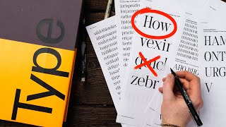
Make Your Own Font in Inkscape

Vložit
- čas přidán 23. 07. 2024
- Here’s how to make your own font in Inkscape.
I will also be showing you how to use FontForge to turn your new SVG font into a fully functional font that you can install on your computer and use in other programs. I’ll be looking at how you can correct your spacing, make automatic ligatures (Glyphs that combine more than one character) and I’ll be using the same process to create and call up special or stylised letters.
I run through the whole process of designing your characters or Glyphs, turning them into an SVG font in Inkscape, then with the help of FontForge I show you how to turn them into a True Type Font.
In this tutorial, I’ll be using a custom made template to make the transition between Inkscape and FontForge pain-free. Watch the video below to create your own template.
• Typography Template In...
To help you fix any problems when you validate your font, check out the link below and find out exactly what the faults are and how to fix them.
fontforge.org/docs/ui/dialogs...
Both Inkscape and FontForge are free and can be downloaded from:
Inkscape: inkscape.org/
FontForge: fontforge.org/en-US/
A little bit of knowledge can go a long way - so let's get creative.
Follow along with ‘Create For Free’ to create your own artwork - for Cricut, print on demand good, low content publishing with KDP, T-shirt designs, etc.
In this tutorial, I’m using the latest version of Inkscape - Inkscape 1.1.2
For more tips, tricks and tutorials, visit Create For Free at:
/ createforfree
#createforfree #inkscape #font
Inkscape logo by Andrew Michael Fitzsimon - Jak na to + styl


The current power-stroke path effect also makes making fonts even easier as well. Really good control over lines and weighting. (It might make the bezier better than the pencil or calligraphy tool for some really clean flowing glyphs.) The stroke width modification even allows making serifs to some extent.
Might make a good addendum topic for this process.
Thanks for the tip, I've pinned your comment. If I make a video on creating glyphs, I'll put it in :-)
Wow,your channel is a pure gold!
Thanks, glad you're finding it helpful
Fantastic tutorial, exactly what I needed as a beginner. Thank you for posting this.
You're welcome
thanks, super clear video!
An excellent explanation. The task of creating a whole font must take many hours.
I created this video in response to a request. I wanted to give people the tools and enough knowledge to create a usable font, I've not actually created a full font myself, but I think you're right it would a long time. Thanks for your comments
Brilliant. So well explained.
Thanks, I hope you find it useful.
this is awesome , thank you so much .
Glad you liked it!
this is awesome , thank you so much . i had alredy like and subscribe. and now it is a comment) TU very match.
Thanks, hope you find it helpful
Thank you. ❤
You're welcome
This has really helped me. Thank you so much. Now to do it ....😁🥑
You're welcome
@@CreateForFree that font forge is VERY difficult!
Inkscape has the tools to create SVG fonts, which are not so widely supported as other font formats. Using Font Forge allows us to create other formats as well as ligatures, if you follow the steps in the video you should be able to create a working font that can be used in other programs. But if an SVG font will do then it is easier to stick with Inkscape. I will at some point make a video on Inkscape 1.2s updated font editor, but for now, inkscape.org has some tutorial you can follow to create an svg font.
@@CreateForFree Thank you. I've been using birdfont. It's good, but the kerning is wrong on MS Word. However, the kerning works in Power Point and Inkscape. Weird.
@@EBBING2003 I've not used that before, is it easier to use than font forge? I'll have to have a look.
I have been having trouble using this tutorial for Inkscape 1.2. In Inkscape 1.2 under Global Settings in the Font Editor, units per em is 1000 and ascent, descent, etc are non-zero by default. Did you set them to zero? Also I have been trying to make a font where every letter is a character from an existing font but with a square around it. I do the conversion to path for the square and the character but when i take a path union, for some reason the character disappears. Any idea why? Thanks.
The template I use in the video is one that I show you how to make in this video:
czcams.com/video/fTTq6of99tM/video.html
I set the guides to make moving your font to FontForge easier, it lines up better.
When you convert a square to a path, you need to use Stroke to path, that way it will union to give a square border around your letter. If you use Object to path it will Union the whole square and the letter resulting in a solid square. Hope that helps
@@CreateForFree Thank you. I discovered that after a bit of trial and error.
I have a really simple question how did you add the letters phD in the beginning I want to do that for referencing the original font please help
I probably just put the text on a different layer, so that I could turn the layer's visibility on or off depending on if I want it visible or not. In 1.3 you can also vary the opacity of a layer so you can have it partially visible. Locking the layer is also a good idea, so you can't select it by mistake.
Hey, so i crossed with a problem, when trying to export the glyphs to fontforge, none of them seem to have the stroke there, like theres only a blank space but when i click on the glyph editor the glyph is there but theres no outline, is there a way to fix that ? or am i jus doing something wrong on inkscape
If you are using the Stroke to create your glyphs then you will need to convert the strokes into paths as I don't think FontForge will recognise the path's stroke. You can select the glyph in Inkscape and go to Path - Stroke to path to convert it.
I prefer to develop letters on paper. Can a scanned in sheet be used to create the glyphs in inkscape?
You can design you glyphs on paper and scan them in. You can then convert them into paths using Trace Bitmap, I haven't done a full tutorial on Trace bitmap as yet, but I show you how to use the single scan option in the following video:
czcams.com/video/Vbb2qc9I9xg/video.html
Once you have converted your designs into paths, you can use them as your glyphs following the same process as in the 'Make your own font' video.
I am expiriencing a problem, where my letters in the preview text are incredibly small with large spaces between them, the letters fit into the typography template, I made sure the advance is the correct width for my letters, but they appear in the text preview, with more than twice the letter's width in space between them. And their size is barelly visible.
Am I doing something wrong? What could I do to fix this?
Sounds like something is either wrong with your template, Inkscape's settings or there is a glitch.
If at any time you mess up Inkscape's settings and find you can't get things to work correctly you can reset Inkscape back to it's default settings by following this video:
czcams.com/video/R0Hm1kHpMk4/video.html
I think to start with I would open a new document using Inkscapes original Typography Template - so you know the spacing is correct, then go through and create a single glyph (You can leave the Horizontal advance X at 1000 - this is just a test), putting your letter quite close to the left side of the page. go through the process and add the Name and Character, then with everything selected press 'Get Curve'. you can then check how your character looks by typing it in the Preview text box. Hopefully, it will look the right size, if it is still coming out tiny then reset Inkscape by following the video above. If it does look OK then you can change the advance and correct the spacing to check that is working correctly.
Sometimes starting a new document and copying and pasting your work across can fix some glitches, if it just won't work correctly, you could try uninstalling Inkscape and reinstalling it.
Hope this helps
@@CreateForFree It took me 2 months to get the courage(and free time) to attempts making another font. And it seems like that this time following your advice the new (and simpler) font I worked on is the correct size!
I do have some questions for advice though.
The font I am working on is a bit fantastical and I want the lower case vowels to overlap the previous letter, I thought I could do this with the advance in inkscape but that just ended up messing up the whole thing, would it be best i do every possible letter+lowercase vowel combination with kerning or is there a simpler way I could make that work?
EDIT: I figured out, that I could just, move the glyphs in font forge more to the left so now they are appearing in their correct positions! :D
Thanks for your help :3
I have Inkspace 1.2 on Windows, but I don't see the FontForge template. Am I missing anything?
I showed you how to make the template in the video before this one. I think I put a link to it in the top right corner - it's one of the cards. Or you can find it on my channel.
Which version of inkscape r u using?
I am getting a million errors in a second
My version does not have font forge typography and the interface is missing a lot of things
It was a 1.1 release - should say in the comments. Inkscape doesn't come with the FontForge template, it's a home made template which I show you how to make in this video:
czcams.com/video/fTTq6of99tM/video.html
It's quite simple and will make your Glyphs lines up better in FontForge
I know they have changed the font editor in Inkscape 1.2, unfortunately I haven't used it, so can't offer much advice at the moment. Perhaps I'll take a look in the not too distant future and show how to create an svg font.
using inkscape 1.3, and following this tut, i just cant make it work properly; i did make sure layer and letter names are a match. anyway, thx for sharing, have fun, aum
EDIT: figured it out, need to convert 'stroke to path' for circle, and 'object to path' for an existing letter / text, then select layer ... union ... get curves ... takes some trial & error, which is, btw, my middle name. lol
Glad to hear you got it working in the end. Using predifined shapes instead of paths can cause issues with a few of Inkscapes tools and functions. As you said, using Stoke to Path or Object to Path can fix a lot of issues.
Thanks for adding the update
I actually tried this method. It might work for this guy but my experience was it doesn't work. The only way to do this is to really learn how to make fonts. This is not useful.
Creating a complete font from scratch is not a simple task, this video was not designed to teach you everything about creating fonts but rather to give Inkscape users a way to convert the glyphs they’ve designed in Inkscape into other formats such as TTF or OTF so they can be used in other programs. Inkscape doesn’t have that capability. This video in combination with the Custom Typography Template video (in which I show you how to create a template that smooths the transition from Inkscape to FontForge) gives you the tools and knowledge (albeit limited knowledge - I’m not an expert on font creation) to do that. Since this video was created, Inkscape’s SVG font editor has been updated, but I wouldn’t have thought it would prevent the methods described in this video from working - if anyone else has a similar problem please let me know and I’ll look into it.