Using my least favourite colours | The importance of colour & tone 🎨

Vložit
- čas přidán 17. 06. 2023
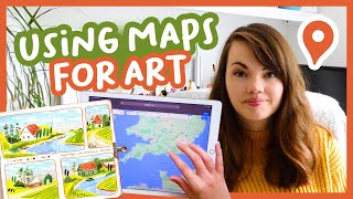
- Hi all! Today's video is quite a short one but I found it such a useful experiment. I talk about the importance of colour and tone and use some my least favourite colours to create a landscape. It doesn't create great results but the amount I've learnt from this is so helpful! Hope you enjoy it too 🤗
🧡 M A T E R I A L S
Tombow ABT Dual Brush Pens * - 126 light green, 451 light blue, 177 dark green, 553 Lilac/Blue, 055 Bright yellow, 725 Hot pink, 452 Blue
www.jacksonsart.com/tombow-du...
Uni Posca PC-8K 8mm chisel shaped tip * www.jacksonsart.com/uni-posca...
Liquitex Acrylic Marker 8-15mm tip * Bright Aqua Green
www.jacksonsart.com/liquitex-...
Caran d’Ache Luminance 6901 Pencils *: 719 Dark Phthalocyanine green, 015 Olive Yellow?, Dark Indigo 639, Burnt Ochre 077, Light Cobalt Blue 661
www.jacksonsart.com/caran-d-a...
Neocolors:
Neocolor II Pastels * - Lemon Yellow, Salmon Pink, Sky Blue, Yellow Green, Grass Green, Violet, Light Blue, Purple www.jacksonsart.com/caran-dac...
Ecoline Brush Pens * - 676 Grass Green, 507 Ultramarine Violet
www.jacksonsart.com/talens-ec...
The starred links above * are affiliate links so I get 5% commission from your order if you buy using the above links, but at no extra cost to you. If you’re a new Jackson’s customer, you’ll also be able to get 10% off if you use the links above! 😊
💚 R E F E R E N C E
Old English Villages
💜 T H I N G S M E N T I O N E D
My favourite art supplies video: • My Favourite Art Suppl...
💛 L I N K S
Patreon: / katiemoody
Instagram: / katie_moody
Facebook: / katiemoodyart
Etsy: www.etsy.com/uk/shop/KatieMoo...
Newsletter: www.katiemoody.co.uk/newsletter
Blog: www.katiemoody.co.uk/blog
💙 M U S I C
YT Audio Library - Zábava


A great way to explore color! I enjoyed this video. Thank you for sharing!
Thank you so much, so glad you enjoyed it! 🥰
Ooh I love this experiment. Love the 1st picture and the 3rd one. The middle one is a lot brighter! 😊
Thank you Emma! I still don't like to look at the middle one 🤣
Oooo the first book really sparked my interest! Love this style!
Thanks so much Hanna! 🥰
The second one with the bright colors could be one from a child! They love this vivid tones so much. Anyway, really great idea and video thank you Katie.
Thank you so much Anne! 💛 Definitely, children don’t care much about natural colours and go for the brightest 😆 it would certainly stand out on a wall though!
I really find watching other artists fascinating. I too use intuition for my colors, but I am more comfortable with bright, neon tones. My realistic, more natural tones are what I struggle with. I think the middle drawing was definitely struggling from values. Even if it’s not a nature color, it should still use color theory that you have going in the second picture.
Isn’t play and experiment so much fun? Fantastic video.
Oh that's so interesting that you are the opposite to me with the bright, neon tones! I found them so much harder to use and get the values right so I need more practise for sure 😊 thank you for watching and commenting! 💜
I would love to have those Carandache crayons! They look so yummy and creamy! ❤
They’re one of my favourite art supplies, I use them on everything! Definitely recommend trying them out if you can 😄💛
I like the first one. That fluorescent green literally hurts my eyes!😵💫
Hahaha me too 😆 he’s back in the drawer where he belongs 🤣
This was such an interesting challenge, especially the 3rd piece 👏
Thank you so much! ☺️
So much amazing work❣️
Thank you so much 😊
This was very informative and I enjoyed watching it as always. I find it very relaxing to watch and listen to you Katie. ❤
Thank you so much, Kathy 🥰
you could make a use, of the ecoline brush-pens that you don't use, by muting their colors down. the brushpens unscrew, so you can either add a bit from another brushpen, or straight from the ecoline ink bottles. (btw the bottled inks come in the same shades as the brush-pens as well. so you can even replace their ink.)
maybe you know that, but i thought it wouldn't hurt to leave a comment for someone who maybe didn't know ^^
That is such a fantastic idea, thank you! I knew they were refillable but I hadn't thought of adding in other colours to mix new ones - genius! I'll be giving that a go today! 😄
This was a really interesting experiment. Thanks for sharing. The water turned out really nice on the third one.
Thanks so much for watching and commenting ☺️ I liked the blending on that one too, it added a lot of depth to the river!
Good stuff
Thanks so much! ☺️
I really love how the first and the third one turned out!! I normally love fluorescent colors, but ouch did that second one hurt my eyes 😂
I think the balance of the super saturated colors and the more muted and desaturated greens and blues really worked well together in that third piece
Thank you so much! Oh for sure, not one to be looked at for long 😂 I think the balance of mixing the brights with the muted is the way to go for incorporating those colours for me!
#3 is my favorite. It's your normal style, but with a tiny pop of extra color. Toning that bright green down a bit might be nice, but I do like the addition of the bit of pink and purple.
Thank you so much! I agree, I think the green could definitely be toned done but I can see myself using the brighter colours for the details and finishing touches! ☺️
This was interesting! I am definitely guilty of buying the color because it looks cool (opera pink or fluorescent orange gouache) but it is not useful for mixing 😅
Thank you so much for watching! Oh yes those colours look beautiful! I also find the neon colours don’t translate well in photos or videos compared to how vibrant they are in real life so a tricky colour for sure!
Yes the strength of that middle one hurts my eyes a bit 😅. The purple trees are quite a nice look though. I think my least favourite colours would be all the brightest ones and all the pinks.
Hahaha it really does 😂 I agree, I'm not sure I've ever used pink in such a big block of colour before, only for highlights!
Hint? Buy refill eco line inks and tone down those ultra brights as an option do you utilize them more naturally
Oooh I love this idea!!! Thank you so much!