Intro to Data Visualization in Python with Matplotlib! (line graph, bar chart, title, labels, size)
Vložit
- čas přidán 22. 07. 2024
- Practice your Python Pandas data science skills with problems on StrataScratch! stratascratch.com/?via=keith
Join the Python Army to get access to perks!
CZcams - / @keithgalli
Patreon - / keithgalli
Yay finally posting again. Hopefully this video will help you get comfortable working through the matplotlib library. I'm going to post a follow up video with real-world examples (combining pandas with matplotlib) and different types of plots next week. I originally was going to include that in this one, but I thought the video was getting a bit too long.
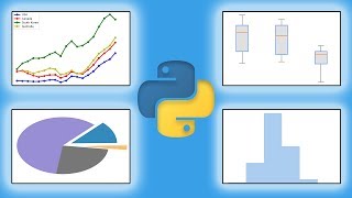
In this video we walk through some of the basics of matplotlib. We start by making a simple line graph. We learn how to give the graph a title and label the x & y axis. We learn how to scale the graph by specifying the x & y tickmarks. After this, we restyle our line by passing in keyword arguments then do basically the same thing with a shorthand notation. We resize our graph and save it. Then we end with a simple bar chart.
Source Code (includes code and data for next video as well):
github.com/KeithGalli/matplot...
Matplotlib Pyplot Documentation:
matplotlib.org/api/_as_gen/ma...
Font List:
jonathansoma.com/lede/data-stu...
Install libraries Needed for this video:
Option 1:
Open up a terminal window and type
pip install matplotlib
pip install numpy
pip install pandas
Option 2:
Download anaconda which will contain all the packages we need. A video on how to do this is here: • Python Tutorial: Anaco...
Thanks for watching! Make sure to like and subscribe to not miss any future videos! Let me know if you have any questions.
---------------------------------------------
Follow me on social media!
Instagram | / keithgalli
Twitter | / keithgalli
--------------------------------------------
Video Timeline:
0:00 - Video overview (note real-world examples moved to next video)
1:43 - Setup
2:23 - Our first line graph!
4:50 - Add title and labels for x & y axis
7:13 - Change font type, size, etc.
9:02 - Change tick marks (scale graph)
11:20 - Add a legend
12:25 - Restyle our line (color, line style, markers, width)
15:53 - Shorthand notation to restyle lines
17:27 - List of line customization options
17:55 - Plot more complex lines
22:20 - Resize Graph
24:48 - Save Graph
26:00 - Annotating/Cleaning Code
27:00 - Bar Chart
31:25 - Final Comments
---------------------
If you are curious to learn how I make my tutorials, check out this video: • How to Make a High Qua...
*I use affiliate links on the products that I recommend. I may earn a purchase commission or a referral bonus from the usage of these links.


A great way to teach. I like that you show how to look for information on the referenced source. Thank you for sharing and for making these very useful online classes. :)
I am really grateful for your tutorial videos, you cover all the must-know topics, your explanations are easy to understand and watching you make mistakes sometimes makes me comfortable as someone who's learning.
You could totally roll out your own courses or work as a CZcamsr (or become a teacher) if you want to!
Thank you Keith for the great video!
This is helping my a lot for my bachelor thesis.
Thank you so much! I am now trying to go through every single one of your videos in data science section and have learned a lot!
You are very helpful and enjoyable. In an easy way you provide a lot of stuff to get anyone start using the libraries from scratch to a stisfying degree.
Congrats on finishing your degree, Keith!!! :) As a student who studies Education but would like to go into data analytics, your videos are super helpful and inspiring! By any chance, you could do more videos on how to build regression models in Python? :) Again, thanks for making these amazing tutorials!! :)
thanks keith for such an amazing video on matplotlib your content is very much structured and well taught the concept in very layman terms so even a non-techie can learn concept great video keep posting more
I watched about 2/3 of your Pandas video, it's the visual stuff that I'm after, so I'll try this one.
Dude, I watch all your videos, you make videos very carefully, very instructive, thank you very much
I'm finding your explanations much easier to understand than other channels.
I like your videos, Keith! Simple, practical, to the point. Good job!
You are becoming my favorite instructor. Keep it up, man!
Happy to be back! Video Timeline:
0:24 - Video overview (note real-world examples moved to next video)
1:43 - Setup
2:23 - Our first line graph!
4:50 - Add title and labels for x & y axis
7:13 - Change font type, size, etc.
9:02 - Change tick marks (scale graph)
11:20 - Add a legend
12:25 - Restyle our line (color, line style, markers, width)
15:53 - Shorthand notation to restyle lines
17:27 - List of line customization options
17:55 - Plot more complex lines
22:20 - Resize Graph
24:48 - Save Graph
26:00 - Annotating/Cleaning Code
27:00 - Bar Chart
31:25 - Final Comments
If you enjoyed this video, make sure to like and subscribe! :)
Your videos are the best videos on python data science modules. I would like to thank you for helping people like me who wants to grow there career in python. Thanks again bro.
Extremely beneficial for me and other, I guess. Million thanks and it will be great if you make all the tutorials series focused on different topics and provide detailed explanation of each step in the future.
your video helped me a lot and it will also assist in my future career as a "Data Scientist" at Oracle!
thank you!
and what's that weird sound? here 26:43 ?
25:02, almost died
Hey Keith u are amazing at making virtual lessons with an understandable concept and ur way of teaching is quite good. Hope u will make more vedios on all the programming languages
Thank you for this great video!! This should be helpful for all beginners of matplotlib!!
This video was very helpful. I had issues understanding matplotlib but I followed along and I better understood it. I also learnt how to read documentations and find what I want. Thank you.
me too
this video is the perfect way to understand the library
Thank you so much for taking the time to teach us! That exit stage left was very dramatic....
Thank you, I am happy I found these videos on the right time.
it's very helpful & useful to me.
thanks for your recording 💖
Thank you so much for making this, Keith
For those curious, you can use plt.annotate() to add the coordinates of markers to the graph.
x = [your x coordinates list]
y = [your y coordinates list]
for i, j in zip(x, y):
plt.annotate(f'({i}, {j})', (i, j), textcoords='offset points', xytext=(0, 5), ha='center')
You can play around with the options, but this will add the coordinates centered slightly above the markers. If 5 seems too close, 10 is a better option.
Knowledgeable and talented instructor.
It was my fisrt vid so nice too meet you after your Academia stuff. Thanks!
that's great your to took time to do these video man, thank you so much.
man you are the best one so far i have seen. your tutorials are so helpful and easy to get your feet soaked into. thanks for existing
An idea for a tutorial might be making a 3D plot or surface with data collected through a Tkinter application. Great video, thank you)
Thanks a lot for your videos Keith, much appreciated!
YOU ARE THE GUY ENCOURAGE AND SHARING YOUR KNOWLEDGE TO TO THE WORLD
Good videos Keith. Not draggy by any means.
Great video!!! Better than my MIT professors explain it :D
Thank you for the video. It's very helpful!
Thanks Keith. Keep up the great work!
Nice introduction to plotting, very useful
very helpful
thanks keith
Thank you so much Keith for your videos. U make it easy to understand because u do not rush. Keep it up. U are doing a great good 🙏🙏👌👋👋
sorry i have a question
when i installing the package " plt" .
That is displayed
" ERROR: Could not find a version that satisfies the requirement plt (from versions: none)
ERROR: No matching distribution found for plt
"
I need help :/ pls
Nice work man!!
excellent tutorial Thumbs up to you Keith
really like this video and your other video, thank you so much
Nice brushup!
Thanks a lot...
Good vibes and greetings from Japan
Thank you Keith this video is really awesome!
Thanks Keith, you made my day 🌟
thanks a lot, your videos has been very helpful
Thanks dude this helped a lot! Greetings from Switzerland :))
Hi Keith! Thanks for this video! I'm working this tutorial on my Mac and I have come across some problems executing the codes here. On the first graph you made, I had trouble showing the graph size with the plt.figure, with a dpi of 300, line because the output didn't show an enlarged version of the graph. However, when I tried to run it, it the notebook showed this result .
Second issue is with the Bar chart's hatches. I got good results with the slash and circles on the design but on the third one with the stars, I can't get past it. It only showed the same blue bar without a single stars at all. It was worse when I tried the for loop you did because it didn't show no patterns. Weird.
Thanks fam!
Very valuable content, thanks
Good start
Thanks Keith. Great videos!
Very helpful video. I tried the same process on my exercise but stacked where they said x and y must have same first dimension, but have shapes (30, 30) and (1,). I checked my x and y find they have the same dimension but I am not sure about z because it has 3D data. How can I solve it?
Greetings from Nepal ! Ur vids r superb, great help . Thank u 🙏
This guy made it look so easy!
hey, thank you for your videos, i'm having probloms on pycharm using the label and color via legend() and i have followed your instruction but i'm getting an attribute error: 'Line 2D' object has no property 'label' any idea why?
Thanks Keith. Do more!
Welcome back Keith👍💪
Glad to be back! :)
Thanks Sir, any guidance on using matplotlib to plot trajectories?
Nice intro easy to follow but one must do what it says not only listen ... I learned that we must put legend() to be able to see label =('') .... thank you
Thank you for these, really helps!
Thanks for video to share your knowledge on python
On that line graph, how can we use logo at the end of this line. Suppose if we want to use Facebook and Twitter logo, small size or even how can make a circle and write"FB" or Twitter like this at the end of each multiple line.
You are the best period.
Hands Down
"if i did 'yel' which is not a color it's gonna yell at me"
hahhahaaha made my day
thanks for the tutorial
I have csv data of one city which is I have been read in python using panda library now I want to extract specific area of that city How would I do this ? Which Library would I use for this purpose ?
Csv City data contains (Lat & Long )
Finally My boy is here
Sorry to be gone for so long!!!
Sir your explanation so clear and I understand very easily please make more videos on python for freshers but I have a doubt how we are use some string,list ,set, dictionary methods in class , please make one video with above data types mothods please sir thank you for sharing this video
Hi Keith. Thanks a lot for this video. I got " invalid character in identifier" in Jupyther on the line "plt.title('Our First Graph',fontdict = {'fontname':'Comic Sans MS'})", any idea what's the problem?
That is supercool, thank you!
Hi. Can we create a project timeline using pandas? Thanks
Informative. Thank you so much.
Very Helpful
Hi Keith. Thanks for your Videos - they demystify the subject matter. I Had issues registering and importing Matplotlib in Visual Studio Code (free version). Only able to plot with Matplotlib when using Jupyter Notebook. Can you assist in getting Matplotlib running in Visual Studio Code?
thank you for this video. its very very helpful.
Thank you
But can you plot an ogive or cumulative frequency curve using matplotlib???
Thanks a lot, bro.
You are amazing. Thanks for your time, but could you make a tutorial about a real project, please, so that we can use all of the libraries that you taught us?
Wanted to put the values for each Bar. How to do that.. looks like plt.text can help. But it's getting more complicated. solved, thanks
Thanks. Do you know how to change the background color in dataframe.plot graphs ( the background on which there are: labels and graph name). In subplots you can use 'facecolor' param, but it doesn't work in plots generated from multiindex dataframes.
Informative & love it.
Thank you and very helpful Video!
I like the way you teach
sorry i have a question
when i installing the package " plt" .
That is displayed
" ERROR: Could not find a version that satisfies the requirement plt (from versions: none)
ERROR: No matching distribution found for plt
"
I need help :/ pls
Thank you so much for this!
Thanks man, great video!
Numpy-->Pandas, now I am watching Matplotlib, Thanks for you video.
Love it!!
hahaha,same order here...
hello i installed pyautogui but still is not displying graph please what could the problem
Great job!
the bar graph gives error : ---> 10 bars = plt.bar(labels, values) :tuple' object is not callable
tired the code from the github , same error
Thank you so much.
How can we plot Map through Lat & Long ?
hello kindly may I get the matplotlib link . the one here doesnt work
Nice and simple 👌👍💥
we have only one problem in python as whenever you draw line graph it becomes zig zag,is there a way to make zig zag lines graphs to be s,mooth????
Sehr gut! Vielen Dank und viele Grüße aus Deutschland!
hy, can anyone explain how to add Data labels in line charts or bar charts?
Can u make a vedio on how to implement tooltip in phython graphs..
Hello Keith! I have watched few of your videos and they are very interesting and helpfull.
Now I have a problem with the installation of matplotlib. I have tried both the "pip" and the Anaconda options. It seems to be installed, I can find the folder into the directory, but when I try to import it, I get the error "No module named 'matplotlib'".
There is a trick that I do not know to solve the problem?
Thank you!!
import matplotlib.pyplot
# it's 'matplotlib.pyplot', not 'matplotlib'
Thank you sir
Thank you!
Hi Keith using bar chart code I am getting two charts:
one with patterned bars and other without any bars at all. Can you help.
Can you share your code?
THANK YOU KEITH LOVE FROM INDIA
nice job