I found a way to never use Pixels again in Elementor

Vložit
- čas přidán 8. 12. 2022
- Is this the perfect way to work with Elementor's container when you want to make your designs pixel perfect? I think I got something interesting here. Let me know if you have any feedback for my new system so that I can implement any improvements in the course.
Btw, you can download the template here → living-with-pixels.ck.page/ea...
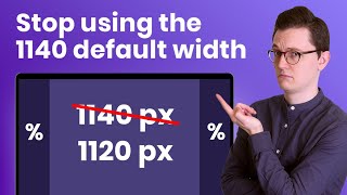
Video I mentioned about the 1140/1120 grid → • Elementor’s default 11...
→ Software I recommend
Hostinger for affordable webhosting: livingwithpixels.com/hostinger
Siteground for premium webhosting: livingwithpixels.com/siteground
Elementor for no-code web-development: livingwithpixels.com/elementor
Figma for Web Design: livingwithpixels.com/figma
All recommended software & discounts: livingwithpixels.com/software/
→ Full A-Z Courses
Elementor Pro Mastery Course: livingwithpixels.com/elemento...
Figma Design Mastery Course: livingwithpixels.com/design-c...
Business Course: livingwithpixels.com/business...
→ Starter Guides for Beginners
Elementor Starters Guide: livingwithpixels.com/elemento...
Figma Design Starters Guide: livingwithpixels.com/design-g...
→ My Social Media
Tiktok: / rinodeboer
Instagram: / rinodeboer
Twitter / X: / rinodeboer
Some of the links above are affiliate links, which means that I earn a commission when you make a purchase via my link. Thanks a lot if you decide to do that! I couldn't make all these videos without it. - Jak na to + styl


Is this the perfect way to work with Elementor's container when you want to make your designs pixel perfect? I think I got something interesting here. Let me know if you have any feedback for my new system so that I can implement any improvements in the Elementor Pro course. Btw, you can download the template here: living-with-pixels.ck.page/ea81ccad85
i downloaded the file, but it shows 2 jason file only
@@exterminatic So? You need to import either one or both into Elementor, in there you will find the containers with this layouts.
@@uncodedlife Apologies for confusion, I am new to elementor, where do i need to import the files.
@@exterminatic on every random page. There is a red plus or the folder icon next to it. That is where to import the template.
@@uncodedlife I downloaded the file and trying to import. I keep getting invalid file.
Well done Rino! Now you have to change you business name to Living with Percentages! --And now it's time to learn REM instead of pixels for font sizes. :)
Hey, is it really that good working with REM instead of pixels for font sizes? I have heard that its better but is it really that good in comparaison?
@@imlivid2746 yeah it is REALLY good working with REM because browsers respond well with REM. When you use REM, for example if someone has eyesight problem and they go to their browser settings and edit the default browser font size, your website will respond to that. If the fonts are in px it will not respond to that adjustment.
Then again if you have set the default font sizes of your desktop, tablet and mobile to be in different percentage sizes, then when building and use REMs, the responsiveness on text will be automatic across your website. This does not work with pixels because you have to set it everywhere to make it responsive.
Best comment of the day XD
Living with Fractional Units!
😄
Responsive design is one of the most important skills a web developer can have but also complecated! Please create more videos like this about responsiveness using elementor. Thank you for this video!
I am so stoked for this functionality! As always, you explain tings in a very clear way. Looking forward to more videos about this! Cheers.
I don't know what I would do without your videos!! Thank you!!
Very cool, Reno! Thank you for putting in all your time on this and making it easy for the rest of us.
We work so much with it and always discover something new! Thanks for sharing and your perspective, Reno! Keep on! ✌😊
Absolutely BRILLIANT! Great idea - thank you! Looking forward to your upcoming Elementor Container video tutorials.
Thank you for sharing this.
The part I like most is you showing the Figma design as well.
Well done 👍
Very nice. I appreciate your attention to details and clear explanations. Well done!
i just want to say -thank you Rino, for all your excellent content. You are a true master at your craft.
Love love love this! thank you for sharing! look forward to you tutorial when container are made official in Elementor!
This is just amazing, thank you so much for putting up quality content like this!
Watching it again, still the most useful and in-depth explanation!!! You saved my bacon!!!
I Love your videos! They are always helpful to me as a web designer who uses Figma, WordPress and ElementorPro!
i understand so many things all at once. it was a several lightbulb moment in my head. thank you very much
Hey Reno, when Elementor release it properly and you finaly do the full Container tutorial, it would be brilliant if you could base it on the Hello theme. Ferdy has done a great 4 hour tutorial but it's based on Blocksy (he's got to feed the family!) and we'd like to stick with Hello as we use it a lot. Keep up the great work!
agreed
Hi Rino, Very well explained. I thoroughly enjoy your video., Can't wait to see your full container video.
Thanks very much. Really shows how much effort you have Bern put to make this video.
You're a genius! I was so confused and I was also playing around with percentages and couldn't quite wrap my head around it but was getting around to this I think
Rino da GOAT. Thanks for the help friend. Your Elementor class is legit too.
This is great Rino
I've been experimenting with that a lot as well and this really also works well for me and my websites. Thanks a lot!
Great tutorial! Thanks for the sharing!
just spent a bunch of time on containers and this is awesome!
I just did something similar today. I found that if you remove the "Gap between elements" and you set the main container to "Wrap" you can use the right % (like 50%, 33.3333%, 20% etc) since all containers already have a 10px padding around them it leaves a nice spacing. That is how Elementor does it by default when you add a new container with multiple columns.
That is not really correct way how to take advantage of the container.
@@jcwebtech the correct way is to code custom themes and not use Elementor haha
@@integrateur You will be still using Flexbox when you custom code. I can code but I choose not to because clients want editable sites. I ditched Elementor for bricks though.
@@jcwebtech I know, I use Bootstrap 4 for the grid but there's less annoyings paddings/margins than Elementor to take into consideration :)
Great video! Well done Rino!
Great video! I’m hoping Elementor can somehow add CSS grid inside the designer grid and give the ability to use all unit sizes like REM, EM, CH on every element like Webflow does and give us more creative control over the container because I pride myself on being consistent while saving time and I dig Elementor 😭
I love this concept. When Elementor goes live with the flexbox I would love to see you do a more in-depth how to video of this for us advanced amateurs.. =)
such good fundamentals! Really hard core which we love!!! Thank u
Love your commitment… thanks for all your help in this website Dev journey I am on…
great watching you share your learning, great energy.
Absolutely brilliant. Thanks!
Thank god you figured this out so I can learn from you lol
I loved your 1120 system. Stoked to learn this model and use it now :D long live flexbox
This concept covers at least 90% of use cases and is still flexible enough to adapt. Thanks for taking a complex concept and making it simple enough for this old rock to understand!
Glad it was helpful!
Magician Rino! I was watching and trying to get knowledge about px,em,% videos in yt, now got in fav channel!
Fantastic! thank you Rino!
Dude, you are simply incredible. Thanks
Your work is phenomenal
Well I am a beginner but thoroughly enjoyed this episode and cannot wait for more. Thanks so much.
Thanks a lot, I have been trying to figure out why the 50% cause the flex items to wrap within the parent but you have explained it perfectly. Thanks a lot
This is awesome. Thanks for sharing!
Muchísimas gracias Rino... Te ganaste un nuevo suscriptor. El contenido de tu canal es buenísimo. Muchas Gracias.
Great work on this. Very helpful
❤🎉 thanks for sharing, very nice job, I thought that my elementor comprehension about container was a mess to fit 2x 48%. You make my day ,good job
thanks rino!! this is super cool
Great video. I hope make more complex tutorial like directory site.
Thanks for this tutorial 😊
great! thanks! you put in a lot of time to make this easy for us.
This content should cost money. This is gold.
Thank you for the explanation that revolutionizes my approach to elementor
And thank you very much for the models ✌
Thanks. The science of flex container. Very complex.
thanks for all your hard work man
Thank you so much!!! Awesome work… greets from Austria 🇦🇹
Amazing video! Ty Rino
I really needed this thanks
Thank you so much! You save my life! Love the way you say containersh, numbersh, dollarsh....
Happy to help! Haha and sorry for my accent
True, I find it funny 😂
Thanks Rino! Great tutorial!
Thank you 🙏🏻
You nailed it!
Genius Rino - thanks
Finally, someone is doing it like me, top! I go even further and set all my margin and paddings in %.
Great vid Rino.... Most of us love designing for desktop - but then want to cry when we have to deal with mobile optimization. Elementor or someone should make an AI based site optimization calculator tool plugin that allows you to auto-optimize your entire site (based upon your selected inputs) for the ultimate optimization experience. (how you want certain sections to be - PX/%/REM/EM/VH etc etc. Would be a massive time-saver to have a tool to put in all settings/inputs to test on 1 section at a time on elements like main container, sub-containers, width, height, margins, paddings, typography (REM/EM/PX), etc etc so you can see what the section looks like as it scales up/down. Once those settings are right for your "test" section - you could then apply to rest of site to yield a similar effect without having to manually adjust every, single element - which is a painstaking process for anyone who's ever tried to design a custom site.
the reason the layout breaks is because flexbox doesn't take gap into account it doesn't subtract it from 100% width... and by default the gap is set at 20px... so for example a 3 column layout with a 20px gap is: 33.33% plus 20px gap + 33.33% + 20px gap + 33.33% so its almost 100% width plus 40px gap... and because elementor doesn't allow you to use calc in the width field you can't subtract the gap... the best solution i have found is to use a plugin which allows you to use calc in the width field... then on each container within the parent container you can set each width to: calc(33.33% - 40px) and it will work perfectly... then on tablet if you want a 2 column layout you can use: calc(50% - 20px) and 1 column on mobile just set it to: calc(100%)... if you use different a different gap amount you can just adjust that in the calc.. hope that makes sense... i have not tested out your method but if you alter the gap to like 10px for example does it still work?
Yea, that’s what I explained right? Or am I missing something? Nevertheless with these numbers you can just change the gap and it will still work! I have tested this from 12px to 30px in the 1140 grid (most websites stay within this range) and it still works. So this is even less work I believe because you can change the same % from 12px to 30px of gap.
@@rinodeboer oh yes nothing wrong with your explanation and i have tested your template and it works all fine which is great but i was just suggesting another solution... i think what this really highlights though is how bad flexbox is for structural layout, css grid is so much better and easier and will allow for much more complex layouts... flex is great for content layout though... i don't imagine we are going to get css grid anytime soon in elementor 😂
Ahh yea, I see. Let's hope that the CSS grid will come soon.
You can now use custom units as of 3.10. I'm currently using calc to solve this problem.
Thank you Rino!
this channel is a blessing lol
Muito bom 👏👏 vou testar...
5:20 Holy crap, I'm trying to keep up with your explanation and am getting confused...I can't imagine saying all that, and that quickly, in a language that's not one's first language, like you do!! Well done!
Fantastic work. Just a few thoughts after spending time with your amazing template:
I have a layout that consists of 6 boxes in total: 2 boxes of 35% in the first row, and directly below them 4 boxes of 20% each on the second row. This causes an issue where the second 35% box shrinks to allow space for one 20% to its right, so I have 3x3 boxes instead of the 2x4 that I need. This doesn't occur when you put something of 100% width between the two rows though.
Also, the dividers in your template aren't set to 100%, so the layout breaks, creating uneven looking boxes. I might very well be missing something, but I thought you should know.
But great work, thank you for your generosity.
Great tutorial!!
Have just moved back to Elementor from another Block Builder for latest site to simplify layouts - hadn't thought of using the grow setting to simplify percentages👍
This is awesome!
I am so excited to start using bricks and will use this there and in my current project in elementor
Great vid! "Slightly" off topic: My nr.1 challenge now are: What are some of the best ways to display long texts (of course also mobile and tablet friendly!)... For example long-ish intro texts, even on the front page.
PS: Thrilled to buy courses from you, too. Please include at least three "hacks"/ tricks/ ideas for long text sections in your course! -thanks
Remarkable tutorial! Thanks for sharing your findings and your excitement!
One of the areas closely tied seems to be image sizes such as for headers. I didn't see any videos addressing this; have you done any? How do image sizes need to tie into containers?
Hey Rino, I'd love to see an approach on hero images, seems like I'm never happy with the proportions of it
Can't wait for your elementor course btw
uffffff >>>>> soooooo helpful
Hi Rino, this video is full of wonderful tips! Please make a video tutorial about it if you can, we would all appreciate it
this is so cool
thank you
The problem I personally found with using grids, is that my work ended up looking too corporate even when I was doing work for clients who wanted things to look'funky'. Learn this and then forget it and pull it out when you need it.
Thanks so much for the great advice and the templates, Rino!
Really appreciate the time and effort you invested in learning about the container behaviour 😉
I just started to get to know the container system and need some input:
I created 2 horizontal containers with the exact same settings. I added text widgets to both, also with the exact same settings. Breakpoints are set by Elementor but when I drag the desktop window (viewport) to reach the tablet breakpoint the text alignment/text on desktop changes all the way with every minor decrease in VW. In other words, the text block does not stay the same, it changes constantly until it reaches the next breakpoint and then snaps to those settings.
Are there any specific settings I have missed to keep the text block fixed until it reaches the next breakpoint?
Really good explanation of the Flexbox and Elementor's implementation of it, thanks Rino. Can you share the settings you have for the additional breakpoints please? I have 2 customers who always say that the layouts don't work so well in landscape on their mobiles
Awesome!
you can use css for the box size problem, box-sizing: border-box;
Soooo LivingWithPercentages from now on? :) Keep up the good work, cheers
Hi Rino and thanks for those suggestions and explanations. I'm just confused (my fault) on where I should set the 1120 instead of 1140. Probably this is a stupid question but should I change it on Site Layout Setup to apply to the whole site automatically? Or, can I leave the 1140 on Site Layout Setup and put 1120 on each Container I need to align?
Thanks for your video. I really appreciate your clear and smart explanation of this container concept and percentages etc. (I downloaded your template but I got an error in Elementor (Pro) saying "Invalid File" when trying to import it as a template.)
You are genius.
Love it ❤💯
As always your videos help to understand the enormity of website design for us novices. One question though. I noticed @ about the 11:35 mark you figure out the width of a container in Elementor. What did you do to display that measurement? Thanks for taking the time to produce these videos.
He's using the screen shot function. Press Shift+Command+4. Click and drag the crosshair and you'll see values around it. Once you let go of the click, your computer will take a screen shot of what's in the box you dragged out. To stop this just hit the esc button before letting go of your mouse and the crosshair will disappear. This is on Mac, I'm not sure how you do it on Windows.
Amazing Tutorial Rino! Does this scale well with Height as well? Especially with images or do we need a clamp() solution?
Hi Rhino I'm using grids for this kind of layouts (utility classes). But still I'm very curious how you prevent the last item in the list to become 100% width. I watched the total video a few time but can't figure out how you did that.
Use flex box and max-width media queries. Can also put in custom code if you are Davy with flex box.
i recall him saying that he wants to design without coding, no idea if he knows html/css at all, but yea flex box is kinda what he wants :D
Hi Rino, excellent content as usual. I just have a question about those rules: as I'm following your channel, are those rules "compatible" with one of your latest video, i.e. Easily Manage your Container Width from here in Elementor released about 1 month ago?
Hello Rino! I don't know if you've come across this dilemma at some point... because it's exclusively for Windows. How do you deal with the 125% zoom that Windows brings by default? It has happened to me that website designs end up looking much bigger on the screen than they really are because of that damn client-side zoom.
By the way, excellent as always the information you give us!
Hey Rino thanks for this video. Was curious how you have that bar at the top to toggle between the different devices view. Is that something elementor has or is this F12 (inspect screen)?
Hey Rino. Great video as always. I also played with these types of layouts and came to the same conclusions with Flexbox.
I ended up creating utility classes for CSS Grid instead. Grid is so much easier to predict and manage for layouts.
Elementor and Bricks don't yet have a UI for Grid, but it is easy enough to add utility classes for this and override as needed.
Let me know if you want me to do and share a quick video showing how to do this.
Yes please!
I would love to! Always interested in learning more easy ways. Could you email the video to rino@livingwithpixels.com? Thanks so much 🙏🏻
@@rinodeboer Hey Rino, I will email you as requested.
@@steala Hey Kalpesh, :) I have reached out to Rino. I won't post a link here, I think it is bad manners to post video links on other people's channels. I'll let Rino decide what to do with that.
You can post the link here! The reason I asked for email is because I wasn’t sure it was a CZcams vid.
Eres un crack!
New YT name.. Living With Growth
Thanks for the video, love the math behind it. Been using your 1260 grid on my last 2 projects since your previous video about grids. Any reason not to go up to 1340 since the smallest screen sizes nowadays are most likely 1366? Get the full width for smaller laptops and still have plenty more white space for desktop?
Good point. The reason is the width of the content. Like I said in the video, if the text box becomes too wide then people won't find reading text on your website comfortable. That's why most websites don't use % for their main container. And another reason for not using 1340 is because there are still quite some old computers. I thought it was around 5%. So if you really want to have a wide website then I suggest you just put each background container on 80% or 85% for example. Then it will look wide on wider screens and good on smaller screens as well. But still, the width of the main text box is the main reason why you don't want to do it. People who buy ultra wide screens do that for multitasking, not to have every application on full width. So that's how I see it.
This is fantastic Ryno! Thanks for sharing! 🥰 Would you mind me asking what extension you are using for measuring things in Chrome? Thanks again!
Thank you! I just use my Mac screenshot feature. Not something from Chrome.
Well done Rino, thanks for sharing! My question is for you is what's the best featured image size for posts in WP that will look great on all devices?
Thank you. This depends on your design on the single post template. But I would say don’t go wider than 800 px and you will be fine.
Thanks Rino! Could you please post the Breakpoints for all these Devices?
You are in good luck because the next video is exactly about this. I will show you how you can even add extra breakpoints.