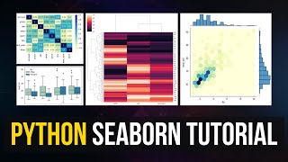
Python Seaborn Visualization for Numeric Variables | Histogram, KDE (Kernel Density Estimate) Plot
Vložit
- čas přidán 19. 02. 2023
- In this tutorial, we are going to learn how to use python to analyze numeric variables. We will create histogram and KDE plot for a certain numeric variable.
The dataset we use in this tutorial can be downloaded in here: drive.google.com/file/d/15li7...
Support me to make more videos: www.paypal.me/jessicasheng?lo...


Nice work, I found your video very helpful. You have presented it in a professional way and above all it was simple to understand. Thank you from Italy.
Glad it was helpful!
Love you! Thanks for your work
Thanks for your support!
Great content. Please continue. Thanks
Thanks, will do!
The way you solve the real task is really great and followable, big thanks 👍🏼
Glad it was helpful!
@@jessicas9186 heng hao ! :)
Thank you for this tutorial.
Welcome 😊
Good stuff! Thank you.
Glad you liked it!
wonderful! subscribed
Thank you!😄
Thank u mam for giving a valuable content.
Thank you!😀
Hi, great video, it has helped me a ton! I have a question. Is it possible to extract the KDE value it calculated or used to create the plot from one of those functions?
How many rows or maximum row of data or database when we use Seaborn or Matplotlib?
very well explained, thanks for your work. you got a new subscriber
That is awesome! Thank you! 😁