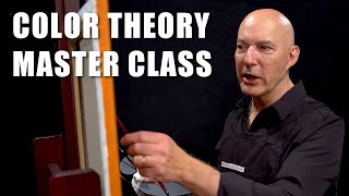
Learning This Could Instantly Improve the Colors in Your Paintings

Vložit
- čas přidán 26. 01. 2024
- Join this channel to get access to perks:
/ @florentfargesarts
Like, comment and subscribe !
***
LINKS
(ABOUT THE LINKS: CZcams might ask you to confirm that you want to leave the site, it's normal, don't worry! You can trust the links to my personal website www.florentfarges.com, as well as Instagram, Facebook, Spotify and Patreon, simply click "GO TO SITE")
➡ Thank you for supporting me on Patreon!
/ florentfarges
➡ LEARN OIL PAINTING - A 7 HOURS VIDEO COURSE :
www.florentfarges.com/the-pra...
➡ ADVANCED PAINTING COURSE ON COLOR AND PAINT - A 9HR COURSE :
www.florentfarges.com/the-art...
➡ Free Resources for artists :
www.florentfarges.com/education
✔ Social media :
Facebook :
/ florentfargesarts
Instagram :
/ florentfarges.arts
Support me on PATREON and access real-time tutorials with commentary (and more) :
/ florentfarges
If you want to connect with me, the best option is to use the contact form on my website.
Write me :
www.florentfarges.com/contact
***
About me (bio) :
Website :
www.florentfarges.com
I am an artist living and working in France. I learned the techniques of the Atelier of the Nineteenth century and now I try to share some of my knowledge with the rest of the world, because I think that beauty still has an important role to play in artistic creation. I do mostly drawing and oil painting, and my goal is always to provide techniques, thoughts and explanations that can be useful to anyone, from beginners to more advanced artists.
The material I use most of the time (not necessarily in this video) :
Drawing
✓ Kneaded eraser
✓ Plumb line (DIY)
✓ Small mirror
✓ An old synthetic brush
✓ Masking tape
✓ Cutter
✓ Sandpaper or sanding block
✓ Mahlstick or Hand rest (DIY)
✓ Level ruler
Graphite
✓ Pencils 2H, HB and 2B
Charcoal
✓ If available: Nitram charcoals (H, HB and B)
✓ Square charcoals
Black and white chalk
✓ Sketch pencil Conté white
✓ Square Conté noir : HB and 2B
✓ Chalk or pencil holder
✓ Pencil sketch Conté Pierre noire : H and HB
Sanguine
✓ Sketch pencil Conté : Blood and blood Medici
✓ Crayon Polychromos Faber-Castel : sanguine
✓ Sketch pencil Conté white
Oil painting
Palette
(Extra-fine paint, recommended brands depending on availability: Sennelier, Lefranc Bourgeois, Winsor and Newton, Royal Talens Rembrandt, Blockx, Michael Harding, Gamblin)
✓ Titanium White PW6
✓ Flake White (or substitute) PW1
✓ Cadmium Yellow light (or "lemon") PY35
✓ Yellow Ochre PY42
✓ Raw Umber PBr7
✓ Transparent Red Oxyde PR101
✓ Burnt Umber PBr7
✓ Venetian Red PR101
✓ Pyrrole Red PR255
✓ Quinacridone Rose PV19
✓ Quinacridone Magenta PV19
✓ Ultramarine Blue PB29
✓ Mars Black PBk11
✓ Cobalt Teal Blue (turquoise light) PG50
✓ Phthalo green warm PG36
Brushes
✓ Filbert hog bristle and Synthetic sizes n° 4, 6, 8, 10 and 12
✓ Flat Synthetic brushes (same size)
✓ Round sable brush or round Kolinsky sable n° 4, 8, 10, 12 (from the size of the nail (about one inch) or synthetic imitation
Medium
✓ Linseed stand oil
✓ Odorless mineral spirits
✓ Or Alkyd medium (Liquin, Galkyd, Flow'n'Dry etc.)
✓ Safflower oil
Surface
✓ Linen canvas, fine grain universal coating
✓ For studies : Canson oil-acrylic oil paper Figueras
Others
✓ Palette
✓ Sponge and spalter brushes
✓ Palette knife in the shape of a water drop, no souldering
✓ A few small pots, containers, jars...
✓ Paper towels
***
#art #painting #inspiration
***
Thanks for watching !


![[Vowel]물고기는 물에서 살아야 해🐟🤣Fish have to live in the water #funny](http://i.ytimg.com/vi/3G9MH063Cx4/mqdefault.jpg)


in fact, I’ve just simplified my life with red, yellow, blue, burnt Umber and white. I use blue and burnt Umber as my darkening color, white and yellow as my lightning color . life is so much simpler , as long as your values are dead on you’re OK if your colors off a little
good for you
Did someone say influenced by Mark Carder? Lol it's all good because Mark is a beast at painting... anyways.
Lets hope you dont have a deep turquoise, heavily saturated red/oranges or need truly transparent glazes. Limited pallettes are great for paintings that dont require the need for overly chromatic colors like still lifes and some portraits. Landscapes can have the appearance of being too dark, same goes for some still lifes and portraits..
I think limited pallettes with the addition of similarly necessary chromatic colors makes the perfect range of colors to mix from. Even temperature palletes expand the painters range.
Limited pallettes are still great nevertheless as it simplifies color mixing to its most base form..
Try swapping cyan for blue, and magenta for red. Just as an experiment.
I've learned more in 20 minutes about color concepts than 4 years in studio art.
😭
I have watched a read quite a few color theories and no one has explained it like this. Makes so much more sense.
Thanks 😉✨🎨🖌️
This is simply one of the most helpful explanations of color mixing for value I've ever seen. You've illustrated it perfectly. The combination of visuals and charts along with your descriptions just makes it all click. Thank you!!!
You're very welcome!
Agree!
Absolutely
This is a really good lesson. It’s rare to see complex issues like this discussed.
Glad it was helpful!
The rule of thumb is adding white almost always make the color pale and lighter (ie: chalky and dusty). The exception is with really dark staining colors like Phthalo blue, which a tiny bit of white can make it look more vibrant from its masstone, but a little too much, you will have the same problem of desaturating the color.
Now adding white does not intrinsically change the hue, ie, you cannot change a blue to a green by adding white.
In this video there is nothing wrong with mixing white, yellow with an orange. It can certainly make it both lighter, and slightly more vibrant, depending on the yellow that you use. Now, if you do that, you can no longer "get" the same orange, in fact, it should be an orange-yellow that you are getting. So the change in hue is the sacrifice you have to make in order to maintain chroma (vibrancy).
Likewise, you can generally get brighter "blues" when mixing a phthalo blue with a little bit of green, and a bit of white. But then again, you are not getting the same blue, you are getting a blue-green.
The easiest way to achieve the colors you want is to buy a single pigment color that best resembles it. Mixing colors generally makes it muddier (with exception, like phthalo green and yellow makes really bright leaf greens).
So my rule is, if you can't mix the color you want, don't. You'd be far better off getting a new color and then tune it to your liking, then to waste paint trying to make a perfect mix. Then again, where is the fun without experimenting with mixes?
So, if you want a truly bright orange, mix an orange with a fluorescent orange. That way you won't need to sacrifice big hue shifts that makes the color so yellow. If you want a truly bright blue... well, there isn't one without using some UV glow in the dark blue paint. It's just physically not possible with the pigments we have today. The best shot you have is to glaze a phthalo blue, or only add a tiny bit of white to it. Cobalt Turquoise Light (PG28 or PG50, not Cobalt Teal), is the closest you can get to a "bright" opaque blue, without getting too much of a green in it.
I love color theory! I remember figuring out that orange plus white doesn't just equal light orange. And specific pigments make such a big difference too, like how not every red plus blue make the same purple, or how some paints that include a white pigment or filler will dull the hue you're going for. I would say that understanding these things have pretty much revolutionized my experience of painting
Yes. Something I discovered trying to match colors when I was sign painting. I had to mix up a kind of ugly pea green. I finally matched the color when I realized it was a WARM pea green.
I believe some black pigments to be warm black, and there are cool blacks.
Purple is a cool color. Mixing alizarin crimson and ultramarine blue, both being cool colors, should make a better purple than cadmium red and cobalt blue.
Another thing, paints are chemicals, not light.
I've been an artist for a long time and have never heard such a clear and truly eye-opening explanation of color mixing! Fantastic!! Thank you❤
I like to think of the colour wheel as a big funnel. Like the kind you would spin a coin around to watch it circle and get sucked in. Every mix is a journey that is going to get sucked in by the colourless hole in the center. The further you have to travel for your mix the more your going to get sucked in. Gotta throw your mix a few life lines from the high chroma colours to keep it on course... least it end up in the colourless pit of suck. lol
Thanks for the great video. :)
How elegantly explained a fairly complex topic! Thank you so much, you are a great teacher!
Fantastic. Please do more along this line. AND, IF POSSIBLE... COULD YOU DO A VIDEO ON THE COLOR TEMPERATURES?. Again, TYTY
Just painted a Lego mini figure and struggled with getting my yellows dark and my blues light. Blew my mind when you jumped right into yellow and blue! This changes everything!!!! What a great video! Truly the best advanced color video I’ve seen out there
As a colorblind person who desperately wants to paint I love these type of videos. A more mathematical approach to color than "feel". I've been banging my head against the wall, getting frustrated with colors. These are much more helpful than anything out there.
That would be frustrating, I’d be painting monochromatic at that point 😂
You should take 2D and 3D Design classes, you actually have insight for accessibility in design already with colorblindness I imagine. Also, art is so much more than a pretty colorful painting if I'm being honest. You can definitely do it. Good luck pursuing art!
Not being much of an artist myself(aside from some modest photoshop/gimp experience), this was such a helpful video for me in better understanding color theory and how the professionals are able to find the perfect combinations. It was always so painstaking before for me to fumble through colors through trial and error, but this really demystified a lot quite quickly. Filled in a lot of the gaps. I feel like every other explanation I’d seen just fell so short in comparison. So thank you for sharing this.
😮 I almost for a split second sort of understood that!!
Well, hope it last longer if you watch again 😅🤣
I did...and I'll keep on watching. I understand.. retaining needs practice. Thank you
@@FlorentFargesarts I believe that different companies use different pigments to get their colours. Paint may have the same name but are def not the same when trying to mix a colour. Thanks you for this info, most appreciated.
This is one of the most illuminating color lessons I have ever had. Merci, Florent.
This is exactly what I needed!!! I have been struggling with color quite a lot and could not figure out what I was missing. It was this!! Thank you so much!! Fantastic video as always. Love your work and content. Thank you!
This was the best color lesson I have ever seen. I’m a beginner, mostly self-teaching/ CZcams taught painting “artist.” You explain very well and no “fluff or nonsense” to have to sit through. I am very appreciative. Subbed and look forward to viewing all your product.
Thanks so much!
Edited for “artist”.
Thank you! Your various videos on colour theory have completely changed how I approach painting and helped be level up!
You are so welcome!
I WILL WATCH AGAIN AND AGAIN. INFORMATION WORTHY; LOVE THIS. 🥰Kt
Something I discovered trying to match colors when I was sign painting. I had to mix up a kind of ugly pea green. I finally matched the color when I realized it was a WARM pea green.
I believe some black pigments to be warm black, and there are cool blacks.
Purple is a cool color. Mixing alizarin crimson and ultramarine blue, both being cool colors, should make a better purple than cadmium red and cobalt blue.
Another thing, paints are chemicals, not light.
Ooo… awesome!! Thank you!
I thought ultramarine was a warm blue? I love colour theory but it can be so confusing sometimes lol
This puts words to what my eye has been doing through trial and error! Thank you so much, the clarity of the color tree and the lines you drew is so helpful. Will be much faster to mix now!
A very good lesson on how to mix color properly! Thank you.
I learned something about color theory that I have been overlooking in my work. Thank you for giving me a refreshing perspective in mixing my colors. 😊
Colour is so fun and interesting! It took me until this last year to REALLY understand the logic of colour, even after an art education and degree in art history. Developing my palette, facing frustration and watching seasoned painters actually explain their choices on youtube has taught me so much.
I’m not really into strong colour. I don’t really like to mix a ton either. Seems I’ve always been drawn to muted, limited palettes.
My entire palette is:
- Titanium white for lightening and cooling.
- Phthalo blue for skies and some vibrant greens/blues.
- Ultramarine for darkening, distance and muted greens.
- Alizarin Crimson for reddish objects and muted purples.
- Burnt sienna, amazing warming earth colour for skin, natural objects, wash and mixes with ultramarine for black.
- Yellow ochre for warm, natural objects and skin, hit by light. Muted greens with ultramarine.
- Cadmium yellow medium for more vibrant greens, warm lightening and sky nead horizon.
Limited palette:
- Titanium white, Prussian blue, yellow ochre and red oxide/burnt sienna. I love the muted effect this makes. Kind of a modified zorn palette.
Best explanation for color theory I've ever heard. Thank you!
Practicing this in digital art for a long time but the explanation is so well executed felt like I re-learned the technique! subbed. Thanks for such a well paced and extremely well explained video.
Best explanation I've ever heard and watched!
Very well done! Thank you! I'm sure I'll revisit this many times
What a wonderful lesson and demonstration. Thanks!
Thank you for sharing your knowledge and experience 🥰
These are precious details that make the whole Difference! 🙏👌👌👌💕
Fantastic, amazing video, never seen an explanation this good!!
One of the best examples I've ever seen! Fabulous. Absolutely fabulous
Wow thank you for this insight. I‘ve never really thought about color that way
I'm gonna practice this ASAP thank you.
This is the most important color theory lesson I’ve seen since learning the basics. Amazing- thank you so much!
This is one of the most informative colour lessons I've ever seen! Thank you very much for this!
thanks so much I can't wait to work in this way to bring up the flat colors when I need to darken and lighten!
Wow, thank you so much for this explanation, Florent! It's fascinating and so very useful!
Wow! Super classe sur les couleurs, merci Florent!
Absolutely amazing again Florent! Gros merci pour tout ce que tu partage! Super helpful!
You dont know, how much you helped me with your videos about colors. Thank you, you answer my questions!
It's brilliant, amaizing etc. Your two videos showed me how understand color.
This feels like a magic trick! Thank you so much for sharing your knowledge and enriching my practice!!
Excelente presentation with detailed demo. Worth to watch it many times. Thanks so much. This is a great eye opener for sure! Blessings and take care
Excellent explanation - so helpful. Thank you!
Thank you for sharing your understanding and knowledge 👍🏻😀
Thank you so much for this well explained and comprehensive video!
Incredible explanation
Thank you so much for this highly insightful lesson.
Fantastic explanation!
You are my favorite go-to for oil painting tips. I'll be taking one of your courses this summer. I particularly love this video because of how the science of how colors effect one another and how they are or are not perceived by the human eye. Very enlightening. Thank you!
Fascinating. I really love your style of teaching, Florent. 🌟
Thank you so much 🎨🖌️
Wow! I learned quite a lot from this video. Thank you for such a clear and visually compelling explanation.
So helpful! Thank you so much for sharing!
I happened upon this and really enjoyed the ease with which you explained the 3 values and then actually drew in the color chart to show how the color is pulled towards the color you add to it! Then how to draw the color back again. ❤
Thank you for this clear explanation of what seemed to be so abstract a subject as to deter my efforts to work through murky explanations. This will be a much reviewed resource. I’m using watercolors and hope to have a space to commit to practicing oil blending to paint.
This is incredibly useful. Thank you ever so much
this was wonderful thank you so much.
I learned so much.Thank you.
F A C I N A T I N G. Just yesterday was playing with darkening a yellow thanks to your explanation it totally makes sense for my outcome. Cheers
I like the way you expressed ❤
I just love this video, so clear and so useful in a matter so difficult to explain in a simple way. Thank you
Glad it was helpful!
This was amazing. Thank you
Thank you so much for this very interesting and informative video. You explain things so well!
Amazing! I bought the color pdf....sooo helpful🙏
Thank you. Very generous.
Merci beaucoup Florent! ❤ un sujet complexe expliqué simplement. Une bonne piqûre de rappel !
This was a really good lesson! Thank you
Thank you thank you thank you. I’ve earned my living at art for sixty years and only now am beginning to grasp color theory? Winging it was getting old. Great video!
As a self taught artist, I so appreciate you sharing your color theory knowledge! Thank you!!
Enjoyed this, great explanation!
I'm working on my first oil painting (a portrait of Deadpool which is far from perfect) and I started out with just red, white and black... it took me a while to understand that I needed to work with other colors to recreate the different shades of red as realistically as possible. This is a great explanation and has added a lot to my knowledge and I'm going to start implementing some of the things straight away!
Woww! This was very interesting. THANK YOU SO MUCH!
Thank you so much for this I just never knew! Thank you!!
Loved this video, great description of how colour works in all its non intuitive ways!
Glad you enjoyed it!
Great video, thanks for the info. I mostly mix based on gut feeling but this makes it all a lot more logical
Glad it was helpful!
Very informative! Thank you so much!
Thanks man. Awesome video.
Thank you so much!
I’ve studied color theory for years now and this is the first time I see this kind of approach to it. It seems obvious, but in fact it isn’t (especially when the references you’re using to study are pretty much what is institutionally known, i.e., they tend to not update their sources)
I’m really happy for starting my day with your video, it made my thinking juices flow! Wonderful work! Especially on catching my attention between thousands of art videos on youtube with a perfect thumbnail 😂
that is really good. Thank you!
Amazing. Thank You.
thank you!!! really understandable and helpful!
another superb video from the professor of painting!! thank you Florent, merci beacoup!
Thank you very much 🖌️✨🎨😉
Very helpful video. Thanks!
outstanding info
This is amazing! The best explanation I ever heard and saw. Thank you 🙏
Glad it was helpful!
tellement important comme leçon. merci beaucoup
A eye-opener , thanks Florent x
👀 Thanks
Excellent content Thank you
Man i Paint miniatures and let me tell you this Is the fix that i was seeking for to my color mixing knowledge!!! Thnx aloot...of course i Ve purchased the PDF!!
A great video! Thankyou for sharing. I want to make a vibrant but light purple. So I am going to experiment.
Very informative. Thanks.
Wow! Thank you! That was eye opening. It's not something that I was unaware of but seeing it demonstrated with the color charts really made it come to life.
Glad it was helpful!😉✨🎨🖌️
THANK YOU!
So so helpful
Thank you!!! ❤
Thank you it was useful