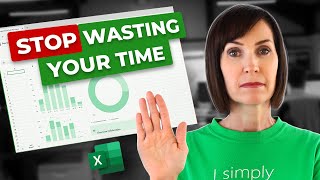
Interactive Excel Dashboard Tutorial in 3 Steps (+ FREE Template)

Vložit
- čas přidán 30. 07. 2024
- How to Make Interactive Excel Dashboards & ONE CLICK Update.
👩🏫 Master Excel now with 20% off all courses until Feb 15, 2024: bit.ly/excelcourses130224
➡️ DOWNLOAD the free example file here: bit.ly/3-step-dashboards
In this video, we're going to transform the sea of data into a sleek, interactive dashboard. We'll craft this dashboard in 3 steps, starting with cohesive design elements. Then, we will analyze and visualize key metrics; and lastly, add interactive elements for data exploration. All in under 20 minutes.
LEARN MORE
===========
📰 EXCEL NEWSLETTER - join 450K+ subscribers here: www.myonlinetraininghub.com/e...
🎯 FOLLOW me on LinkedIn: / myndatreacy
💬 EXCEL QUESTIONS: Get help on our Excel Forum: www.myonlinetraininghub.com/e...
⏲ TIMESTAMPS
==============
0:00 Before & after
0:29 Step 1: Designing the dashboard
3:47 Don't miss out on this opportunity!
4:03 Step 2: Analyzing & visualizing key metrics
16:37 Step 3: Adding interactive elements
17:59 Adding new data & refreshing the dashboard
18:40 If you struggle with gathering the data
#ExcelDashboard #Excel #ExcelTutorial - Věda a technologie


❓What's one unique dataset you're eager to visualize using the techniques from this tutorial?
Master Excel now with 20% off all courses until Feb 15, 2024: bit.ly/excelcourses130224
Nice ma'am
Amazing work Mynda, thanks for all the effort ❣
Glad you enjoyed it! 🙏😊
Amazing! I didn't realize that such good looking and insightful dashboards can be built using Excel data. Thanks for making this YT video. Truly appreciate your time and efforts!👍
Glad you like it! 🙏
Out of all the tutorials I have been watching, this one is straight to the point and easy to understand. Thank you!
So glad it was helpful!
You have an amazing ability to adapt data to appear in this beautiful, harmonious and useful form.
Wow, thank you!
Thanks, Mynda
You are too kind. I wish you all the best, now and always
I just love learning from you, a plethora of knowledge that you impart in an impeccable fashion, easy to comprehend
Thanks for your kind words!
So very awesome and thank you for sharing, this dashboard says a lot about your understanding of data and how to visualize them correctly.
Glad you enjoyed it! 🙏😊
Simply amazing! Thank you for sharing this with us
Glad you enjoyed it! 😁🙏
Last conditional formatting trick was new to me, very handy indeed! Thanks for sharing...
Glad you discovered something new 😁
@@MyOnlineTrainingHubWould an And Function make sense here? Like AND($D10=Analysis!$A$10;Analysis!$A$12="") With this function the purple frames will only be shown, if you select a name from the slicer.
@@MyOnlineTrainingHub for some reason, when i update the data, this formating trick get modified and will only work for the first column. no idea why is that. Also when i dont have any name selected - its still showcasing the selection - while there is none.
@@liumahir yes, that function works better i think. fix the issue when you do not have anything selected in the slicer.
Thank you very much for the in-detail explanation. Best explanation on dashboard so far.
So glad you liked it 🙏
I've been a huge fan! Thank you for making this video. :) God bless!
Glad you enjoyed it! 🙏
Very well-created Dashboard.
Brilliant Colour Scheme.
Excellent use of Data Bars and subtle use of Gradient to highlight figures.
The Conditional Formatting to highlight the Sales Agent is fantastic. Simple, yet very effective.
Thanks Mynda....,
Thanks so much 😊
Thanks so much for this tutorial. 🥰
You are so welcome! 🙏
Fantastic! Just what i was looking for!
Great to hear! 🙏😊
Thanks Mynda,
One tiny tiny remark : it would be better to drop the name in the filter section of the pivot table and use it for the conditionnal formatting instead of using another pivot table with names in the rows.
bcz, if the prson didn't select any name from the slicer, we will still have "Alex" being highlighted in the table,
but if we add a filter to the first Pivot table, we can use it as the base of our conditionnal formatting. The filter will either show "All"" or "the active name in the slicer"
Love that idea 👍 I sometimes build an error message into the dashboard if people select multiple names none of the charts display, but I was on a time constraint with this video 😉
Taking that idea a little further -- the conditional formatting after Refresh only shows it being applied the the name, not the other PT fields in the video. Sorry I haven't had time to play with the download yet but I've been bitten by that quirk before and so I was specifically looking for it. Would using the name as a filter instead address that also?
I have tried to solve this issue with the AND function in the Conditional Formatting. My second logical condition would be to see that A12 in the analysis sheet is empty, which happens only if you select one name. It works fine for me.
Great dashboard as always! I especially love the trick to conditionally format the selected name.
Glad you liked it! 🙏😊
This is awesome! thank you for this
So glad you liked it! 🙏😊
Nice, Mynda! Thank You!
Glad you liked it 🙏
You are simply amazing. Thank you!
Thank you too! 🙏
learned a lot, you're a star!
Awesome to hear 🙏😊
This is great, thanks Mynda.
Glad you liked it!
Awesome dashboard Mynda!
Thanks so much, Chris 😊🙏
Precious. Thanks.
Thanks so much 🙏😊
Hi Mynda. I love your video editing.
Thank you so much! I must admit that I’ve outsourced it nowadays 🤫
@@MyOnlineTrainingHub Well, you picked a good editor. But look, the essence of the video is you, that's what's important.
Top quality content as usual! Excellent dashboard.
Glad you like it! 🙏
Hi Mynda, sorry to be so bold but I have content suggestion for 1 video which I think many people would find very useful.
I would like to create a quick comparison spreadsheet for buying a car, where you compare costs of HP, PCP and PCH (leasing). I am not sure where to start.
1. I think just creating 3 separate tables perhaps. And then using charts
2. Another approach, maybe having 1 table and then use pivot charts. But for this task I don't think this approach is the most suited, probably 3 separate tables still best.
3. I am thinking if the What if analysis tools are suitable for this?
I am a bit confused where to start with this. I think a video on this would be fantastic, as many people are faced with tough budgetary questions when buying a car.
awesome stuff again! greetings from the netherlands.
Welcome! Thanks for watching 😊
Struggling to really understand the dashboard . Thank for this video. I will try and practise and watch it over and over again
Glad it helped 😊
This was amazing! I’ve been really wanting to do something like this for my board reports, but didn’t realize it could be done so nicely in Excel. I was thinking we’d need another subscription to a different tool.
Wonderful to hear you'll be able to make use of it and save a load of money 😁
You are the one and only leader. You excel. Love it.
Thanks for your kind words, Scott!
This is Awesome! thank you.
Glad you like it! 🙏😊
SO good and very useful.🌹🌹🌹
Glad you think so! 🙏
awsome job... simply superb
Thank you so much 😀
I tried this in my excel and enjoyed the results. Thank you mam
Awesome to hear 😁
Awesome video as usual.
Glad you enjoyed it 🙏😊
My boss is just doing a great job here, refreshing my head
Superb video.
Kindly share one for sales vs purchases and usage.
Thank you.
Thanks so much! Will keep your suggestion in mind.
Excellent!!!👍❤
Thank you! 😃
Thanks so much
My pleasure 😊
Good to see you fixed the account issue 👍
Yeah me too 😅
Thank you so much ❤
You're welcome 😊
That dashboard is................
........EPIC 😎
😅 wondered where you were going for a moment! Thanks so much 🙏😁
Thanks very much
You're welcome 😊
Wow thanks!
Welcome! 😊
Amazing 😊
Thanks so much 😊🙏
Excelsia is a Wizard 💚👌🏻
😁🙏
Could you please create a simple project gantt chart. Thanks
Like this: czcams.com/video/ANzRp-y-iW8/video.html or a project management dashboard with Gantt chart like this: czcams.com/video/5qtSioTE2wY/video.html
Your mode of instruction is so easy to understand . Thanks, Mynda. Can we, please, get the sample Excel file to practice like the other videos.
Thank you. As usual, the file link is in the video description. 😉
Thanks, Mynda, for such a prompt response. Much appreciated. you are "THEEEE BEST" tutor for these courses. I do not see any other videos from anyone if I am serious about REALLY learning a concept.
Mynda, I cannot see the sample file , after checking again. What am I doing wrong?
I think the link was missing. It's here: bit.ly/3-step-dashboards
I like that name highlight trick using the conditional formatting and the slicer! I don't quite understand why picking that top cell makes it check the entire column for the name though. I'll have to look at that more closely.
Great to hear. This video explains conditional formatting in more detail and will answer your question: czcams.com/video/Rzz9PyfwiVQ/video.html
@@MyOnlineTrainingHubNice! Thanks for sharing that Mynda!
@@MyOnlineTrainingHubFollow up. Just watched the video you shared. You explained it perfectly, as usual. Thanks again Mynda!
Hi dear can you do a video for simple book keeping
Thanks for the suggestion.
How you wre able to do like dis !! This is incredible 💕
Thank you so much 😀
Do you have any videos on exporting expiries from multiple sheets onto a dashboard. I’m looking for a traffic light system that summarises upcoming expiries, expired and current stock holdings
You can use Power Query to first append the data from the sheets together into one table, then you can extract the data you want with either Power Query or a PivotTable, and use Conditional Formatting for the traffic lights. I don't have one video covering all these steps, but I do have individual videos on these topics. Here's the Power Query video: czcams.com/video/YOC-pEIuHpA/video.html
Here's the PivotTable video: czcams.com/video/vQlFiLUaw4k/video.html
Here's the Conditional Formatting video: czcams.com/video/Rzz9PyfwiVQ/video.html
How can I show month on month changes in staff absence for each department in my organisation in a nice chart? What would you recommend?
Depends how many departments you have. If there's only a few, you could use a simple line or clustered column chart. If there's a lot, then maybe sparklines.
Hi Mynda, I'm wondering if you have dashboards, pivot tables, etc. that are used with screen readers and would be accessible for people with disability?
great question. I don't have anything specifically for this, sorry. I'm not sure how good Excel is at reading charts. You could always download one of my files and test it out.
Thanks for your reply, I sincerely appreciate it.
We've recently had some internal training regarding accessibility and well it's complicated.
Nothing we do on a day-to-day basis will currently work. More chances to learn tho 👍
Thanks you for sharing. I tried and faced a problem, It doesn't work when I cut the slicer and paste to another sheet. The slicer cannot paste on the dashboard sheet. Could you advise how to solve the issue?
That sounds very odd. I wonder if the dashboard sheet is protected? You're welcome to post your question and sample Excel file on our forum where someone can help you further: www.myonlinetraininghub.com/excel-forum
Can I have the data sheet to practice? Thanks a lot!
The link is in the video description.
Does this work if you are looking at median data for the month, not average?
You can apply these techniques to any data. As for summarising median values, you could find the min, max, average or median of the medians 😊
We need to know how to calculate a field. This is a great video but you skipped an important step = Values in the columns sections of pivot field. If you don't show that then no one is getting passed minute 7:50.
The PivotTable calculates/sums the field/column when you check the box to include the field in the PivotTable. This data is already in the source table you see at 8:00 (see the column headers of the table are the same that you see in the PivotTable field list at 8:08).
As I check the boxes to include the 'Total Calls', 'Calls Reached' etc. the PivotTable knows these columns/fields contain numbers to it automatically adds them to the Value fields area and sums them for me. All this is shown in the video. There are no hidden steps I do outside of the video.
What if the new data is in coulmn instead of row, means if new data will go to next columns? I am asking it as I deal with attendance and test performance of a college students having different subjects.
I would use Power Query to unpivot those columns because your data needs to be in a tabular layout. See this video on unpivoting: czcams.com/video/-IMqkg35adA/video.html
@@MyOnlineTrainingHub excellent video. But 1 thing is missing you didn't discuss multiple headers (more than two headers)
I cover that here: czcams.com/video/-IMqkg35adA/video.html
How can I put a map of the US in the dashboard and be interactive with a slicer?
I cover that scenario in this video: czcams.com/video/McLQ3gEGbHQ/video.html
Hello Mynda, I have come across a query and hope you can suggest some solution to it. I have a list of Stock names in a table (which obviously has Exchange & Stock Code in bracket at the end). I can't seem to get the text in a new cell (outside table) in anyway, tried, TEXT, SEARCH, LEN.. nothing seem to be working. Do you have any workaround? Thank You
Should be straight forward. Please post your question and sample Excel file on our forum where someone can help you further: www.myonlinetraininghub.com/excel-forum
the interactive slicers does not seem to work when opened in the Mac version of Excel is there a fix for that
There’s no reason why the slicers wouldn’t work on a Mac 🤔 they won’t work on an iPad, but a Mac should be fine.
📝 Summary of Key Points:
📌 The presenter demonstrates how to create an interactive dashboard in Excel using fictional outbound sales call data. They follow three steps: cohesive design elements, analysis and visualization of metrics, and adding interactive elements for data exploration.
🧐 The presenter sets up the dashboard canvas, changes the color theme, and adds headings. They insert shapes for key performance indicators (KPIs), icons for metrics, and a slicer to filter data based on salesperson names.
🚀 The presenter formats the data as an Excel table, creates a pivot table for analysis, and adds number formatting and slicers for filtering. They also insert text boxes to display KPI values and labels, and format them accordingly.
🚀 The presenter creates pivot tables and column charts to visualize the data. They format the charts, add titles, and adjust the axis settings. They also add conditional formatting to highlight selected salesperson names in the KPI table.
🚀 The presenter demonstrates how to update the dashboard with new data by copying and pasting it into the data table and refreshing the dashboard.
💡 Additional Insights and Observations:
💬 "The dashboard is designed to analyze and visualize key metrics from fictional outbound sales call data."
📊 The presenter emphasizes the importance of cohesive design elements and visually appealing charts to create an informative dashboard.
🌐 The video provides a step-by-step guide and practical tips for creating an interactive dashboard in Excel.
📣 Concluding Remarks:
The video offers a comprehensive tutorial on creating an interactive dashboard in Excel. By following the presenter's three-step process, viewers can learn how to design, analyze, and visualize key metrics effectively. The use of fictional sales call data makes it easier to understand and apply the concepts demonstrated in the video. Overall, this tutorial is a valuable resource for anyone looking to create informative and visually appealing dashboards in Excel.
Generated using TalkBud
AI is amazing, isn’t it!
👍😎✊
🙏😁
Can we do it by using jeda ai 😢
Possibly, but AI is really only good for one off analysis. If you want to use the report again next month, it's more efficient and robust to build it in Excel or Power BI.
@@MyOnlineTrainingHub Thank you so much 💓
3 steps?
1. Prepare your canvas
2. Analyse/visualise
3. Add interactive elements
Broken link alert, i dont download
Sorry ok
Thought so 😉 hope you find it useful.
😝 Promo'SM
Awesome video lecture as always. Thank you. Also, will you marry me?
Glad you liked it 🙏 I’m already married 😉
This is awesome! thank you for this
Glad you liked it!