Creating Waffle Charts With Matplotlib and PyWaffle

Vložit
- čas přidán 29. 11. 2023
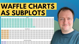
- Waffle charts are a great way to visualise categorical data, are aesthetically pleasing and easy for readers to understand - which is one of the key goals of effective data visualisations. They also provide a nicer looking alternative to pie charts.
Waffle charts are square or rectangular displays made up of smaller squares in a grid pattern. Most commonly, it is a 10 x 10 grid, but they can be any dimension you want them to be, and this will depend on the data you are looking to display. Each square within the grid is coloured based on a category and represents a portion of the whole. From these plots, we can see contributions of individual categories or display progress towards a goal.
Advantages and Disadvantages of Waffle Charts
As with any data visualisation tool, there are advantages and disadvantages to displaying data in specific formats.
Waffle charts have several advantages for displaying data, including:
A great alternative to the pie chart
Interesting and aesthetically pleasing to look at
Easy to read and interpret
Data is not distorted
Great way to visualise a small number of categories
Easy to visualise progress towards a goal
Even with these advantages, there are a few disadvantages to using waffle charts:
It can be hard to read if you have a large number of categories to display
It can be hard to compare non-adjacent categories
Can’t include text or numbers within the squares due to their size
Accuracy can be impacted if the values are smaller than the square’s representative value. eg. if a square equals one unit, and you have a half unit
Within this video, we will use geological lithology data to see how we can use Python to display Waffle charts.
⭐️ If you haven't already, make sure you subscribe to the channel: / @andymcdonald42
▼ --- SUPPORT THE CHANNEL --- ▼
☕️ BUY ME A COFFEE: www.buymeacoffee.com/andymcdo...
▼ --- GET THE CODE -- ▼
▼ --- SOCIAL CHANNELS --- ▼
Thanks for watching, if you want to connect you can find me at the links below:
/ andymcdonaldgeo
/ andymcdonaldgeo
www.andymcdonald.scot/
#datascience #petrophysics #python #datavisualization #eda - Věda a technologie


The waffle chart looks great, minimal and clean, great video Andy!
Hi Andy appreciate this another great tutorial! Still waiting your courses!
❤