
- 135
- 957 097
Power BI Helpline
India
Registrace 6. 07. 2022
Get Help into Questions Related to #PowerBI , #DAX , M Code, Power BI Data Modeling, Analysis Service Model and Power BI Service .
Our videos are mostly specific to real time challenges faced into Power BI projects and its solutions. We use smart and most efficient techniques to solve such challenging situations in Power BI and DAX.
Checkout our playlist and SUBSCRIBE to our channel, for all such interesting topics in Power BI.
Our website's blog posts.
www.powerbihelpline.com/resources
Dynamic Hierarchy in Column Header | Customize your Matrix Visual in Power BI
Many times we get the requirement to show different levels in matrix column header only for few fields, or only for selected fields in the slicer.
In this video, we will show a solution, where the Matrix column header will show further drilldown only for the selected fields in the slicer, and for remaining fields it will show the aggregate values.
Get Help into Questions Related to #powerbi, #dax, #powerquery Power BI #datamodeling, #analysisservices and #powerbiservice and #microsoftfabric
Check out our website www.powerbihelpline.com and blog-post. for end-to-end power BI solutions, Power BI templates, or any kind of Power BI questions like Power query errors, Authoring and optimizing DAX codes for complex business logic.
Follow us on LinkedIn
www.linkedin.com/in/power-bi-helpline-22a2a2244
Email- info@pbihelpline.com
@PowerBIHelpline
zhlédnutí: 1 243
Video


Dynamic Column Header with Multiple Measures in Power BI | Table and Matrix Visual Power BI
zhlédnutí 3,8KPřed 2 měsíci
As we know that measure names are static, but many times we need to show dynamic column header names in table or matrix visuals, which changes based on slicer selection. Field parameter is not the solution for this particular requirement. In this video, we are going to create a solution to show time intelligence measures with selected month names as the column header of our matrix visual. Get H...

Data Driven Email Subscription in Power BI | Conditional Email Alert for Power BI Report
zhlédnutí 2,7KPřed 3 měsíci
In this video, We are going to create a solution, where data driven email alert with screenshot of the report page will be sent only to those store managers where total sales amount is less than the total forecast value. We will use some Dax technique with new dynamic subscription, and will convert this email subscription into fully dynamic and conditional email alert system Get Help into Quest...

Variance between 2 from SAME SLICER in Power BI | Compare 2 values from Same Slicer
zhlédnutí 2,7KPřed 4 měsíci
In this video, we will create a solution to compare 2 selected values from the same slicer. All our visuals will only show when we select any 2 values from the slicer, else it throws a popup message, saying that you have selected these many number of values, please select only 2 to compare. Get Help into Questions Related to #powerbi, #dax, #powerquery Power BI #datamodeling, #analysisservices ...

Table Visual with Small Multiple and Variance Arrows | Native Power BI Visual | New Power BI feature
zhlédnutí 3KPřed 4 měsíci
We have got many amazing new features in Power BI native visuals, which we can utilize to create such visuals. In this demo, I am going to utilize new features like, Overlap option, Custom data label and error bars, to create a table like visual, which will also show small multiples. Get Help into Questions Related to #powerbi, #dax, #powerquery Power BI #datamodeling, #analysisservices and #po...
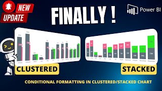
Conditional Formatting for Stacked/Clustered Column Chart in Power BI | New Power BI feature
zhlédnutí 10KPřed 5 měsíci
With Power BI Native Clustered/Stacked Column chart or Bar chart, we know that we don’t get Conditional Formatting features. But with This new Feature and a simple DAX trick we can actually achieve dynamic color formatting for one of the columns in a stacked column chart. Or we can dynamically apply different colors to a series in the Stacked column chart or Bar chart. This video will answer be...

Issue with Last Refresh Date/Time in Power BI
zhlédnutí 6KPřed 5 měsíci
If we create a query inside Power query editor with DateTime.LocalNow() function to get Last refresh date/time, then there is a very big problem. This almost gives the refresh Start time, because this individual query is very smalls. And if your dataset takes much time to complete it’s refresh, then result of above query is not much useful. Til now we were looking at the TimeZone conversion, bu...

New Dynamic Email Subscription/Alert for Power BI Reports | Power BI Update Jan 2024
zhlédnutí 2,7KPřed 5 měsíci
We now have new feature in Power BI service in the section of Email Subscription for report pages. Where we can dynamically filter the reports using defined filters in a separate table. And send email alerts to different set of users. In this video I will walk you through, how to enable this functionality. This video will answer below query- - Dynamic Email Subscription/Alert For Power BI Repor...

Column Chart Makeover with New Power BI features | Dec 2023 Power BI Updates for Column/Bar Charts
zhlédnutí 4,3KPřed 7 měsíci
In this video we will use December 2023 Updates of Power BI desktop, which brought many new features for column or bar charts formatting. It has Borders for columns, Title and Details for data labels. Let’s use these features with some tricks to make our column chart even more impressive. Get Help into Questions Related to #powerbi, #dax, #powerquery Power BI #datamodeling, #analysisservices an...
New way of Add/remove Dynamic fields | Create Colorful Checkbox and toggle with New Power BI Slicer
zhlédnutí 3,6KPřed 7 měsíci
In this video, we will use new Power BI slicer to create the amazing slicer experience with colourful checkboxes and toggle. We can Dynamically add or remove fields from the visuals using such slicers. By adding Field parameter and some DAX tricks. To create the required measures, we will also utilize the newly added Copilot in Power BI desktop. Please note that, we are using here Dummy data to...
Dynamic Column Names with Multiple Measures in Power BI Matrix or Table Visuals
zhlédnutí 7KPřed 7 měsíci
We use Field parameter to dynamically change the fields, but in case of multiple measures in the Table/Matrix visual, how can we dynamically change all the column names. Let’s find out 2 easy solutions for this particular problem. Get Help into Questions Related to #powerbi, #dax, #powerquery Power BI #datamodeling, #analysisservices and #powerbiservice and #microsoftfabric Check out our websit...
Solve Data Export and Drill Through Problem for YTD QTD & MTD in Power BI
zhlédnutí 1,7KPřed 8 měsíci
Many Times, we create a drill through page to get detailed information of underline data, but with a value which show YTD or QTD, Month Drill Through may not show all the relevant information, because drill through page will be filtered only for the selected month. In this video We will Provide a solution for this particular problem. Which could be very useful in Data Export or drill through of...
Previous Year, Current Year YTD & Future Months Forecast in Power BI | Dynamic Axis in Column Chart
zhlédnutí 3,8KPřed 8 měsíci
Yes, Power BI Native Column charts can be modified to show amazing visualizations. In this example, we will create a visual which will show a single bar for Previous year value, then A single bar for the current YTD values, and then it will show you the future months forecast values along with cumulative sales amount below it. This visual can be very useful in many of your financial reporting P...
Slicer Controlled Color Properties in Power BI | HSLA Slicer in Power BI | Dynamically change Color
zhlédnutí 1,8KPřed 9 měsíci
Default Conditional formatting is not enough to have such flexibility to control the color Properties in Power BI like Hue, Saturation, Lightness or Opacity. In This video, I will present you the way to control these color properties based on slicers. So that users will have the flexibility to setup the color's properties based on their requirements. Get Help into Questions Related to #powerbi,...
Status Indicator Slicer in Power BI | Can We Filter and Count with Status Icons?
zhlédnutí 5KPřed 9 měsíci
We usually apply Conditional formatting feature for such requirements, but we cannot have an Indicator slicer with that approach. This Video will show You, how can you create a slicer of Green Red and Yellow Status Indicators. And then filter the Table visuals with that. This will also count all the line items for each status icon for single or multi selection. Get Help into Questions Related t...
Show Cumulative FORECAST and Actual on the Same Line | Power BI Line Chart Formatting
zhlédnutí 9KPřed 10 měsíci
Show Cumulative FORECAST and Actual on the Same Line | Power BI Line Chart Formatting
New Way of Creating Power BI Reports | DataFlow Gen 2 inside Microsoft Fabric
zhlédnutí 2,4KPřed 10 měsíci
New Way of Creating Power BI Reports | DataFlow Gen 2 inside Microsoft Fabric
DAX + ALGEBRA Fusion in Power BI | Create Tachometer Without Custom Visual or SVG in Power BI
zhlédnutí 2,1KPřed 10 měsíci
DAX ALGEBRA Fusion in Power BI | Create Tachometer Without Custom Visual or SVG in Power BI
Power BI Native Progress Bar | Create Progress Bars Without Custom Visual or SVG in Power BI
zhlédnutí 15KPřed 11 měsíci
Power BI Native Progress Bar | Create Progress Bars Without Custom Visual or SVG in Power BI
NO CUSTOM VISUAL | Create this Variance Chart in Power BI
zhlédnutí 7KPřed 11 měsíci
NO CUSTOM VISUAL | Create this Variance Chart in Power BI
Magic of Dynamic Data Label and Error Bars in Power BI | Create Next Level Line Charts in Power BI
zhlédnutí 3,2KPřed 11 měsíci
Magic of Dynamic Data Label and Error Bars in Power BI | Create Next Level Line Charts in Power BI
HIDE Power Query Transformation Steps from Power BI | Reusable M Codes with Expression. Evaluate
zhlédnutí 2,5KPřed 11 měsíci
HIDE Power Query Transformation Steps from Power BI | Reusable M Codes with Expression. Evaluate
Dataset Refresh Report with Power BI Rest API and Power Automate | Track all your refresh Status
zhlédnutí 17KPřed rokem
Dataset Refresh Report with Power BI Rest API and Power Automate | Track all your refresh Status
DAX Powered URL Parameter will Blow your Mind | Filter a Report from another Report in Power BI
zhlédnutí 3,4KPřed rokem
DAX Powered URL Parameter will Blow your Mind | Filter a Report from another Report in Power BI
Create ALL IN ONE Power BI Visual ✨| Show Previous Years, Forecast and YTD in a Single Visual
zhlédnutí 3,1KPřed rokem
Create ALL IN ONE Power BI Visual ✨| Show Previous Years, Forecast and YTD in a Single Visual
Default Current Month Name in Power BI Slicer | How to Show Latest Month Name Dynamically in Slicer
zhlédnutí 12KPřed rokem
Default Current Month Name in Power BI Slicer | How to Show Latest Month Name Dynamically in Slicer
Previous -N- Months or Future - N- Months with SELECTED Measures in Power BI |
zhlédnutí 9KPřed rokem
Previous -N- Months or Future - N- Months with SELECTED Measures in Power BI |
NEW Power BI Card Visual Will Blow Your Mind ✨ | Power BI June 2023 Update 👏
zhlédnutí 4,9KPřed rokem
NEW Power BI Card Visual Will Blow Your Mind ✨ | Power BI June 2023 Update 👏
Dynamically Remove Incomplete Week Dates from The Visual in Power BI✨
zhlédnutí 1,4KPřed rokem
Dynamically Remove Incomplete Week Dates from The Visual in Power BI✨
Power of Microsoft FABRIC + COPILOT | Is This The-End of Power BI Reports Development?
zhlédnutí 2,5KPřed rokem
Power of Microsoft FABRIC COPILOT | Is This The-End of Power BI Reports Development?
Hi Can you please share this dataset. I have mailed you yesterday
RANK By Year and Sales = VAR vRelation = ADDCOLUMNS( SUMMARIZE( ALLSELECTED(Sales), 'Date'[Year],'Product'[Category] ), "_Sales",[Sales Amount] ) VAR Result = RANK ( DENSE, vRelation, ORDERBY ( 'Date'[Year], ASC, [_Sales], DESC ) , PARTITIONBY( 'Date'[Year]) ) RETURN Result gives same Result 1 in a matrix with 'Date'[Year],'Product'[Category]. Sales Amount = SUMX ( Sales, Sales[Quantity] * Sales[Net Price] ). Could you share file please
My problem is that in my version of Power BI, the 'Data Colors' command is not available, so I don't know what alternative to use. Which version of Power BI has this command?
Use Latest version of PBI desktop. I think these features can be used from Feb 2024 version onward.
Awesome. Could you please make a video on how to use Rank to sort based on a list of values? Eg rankx -- The third argument of RANKX is useful when the outer -- evaluation requires a different expression than the -- inner one. For example, when ranking an expression over -- a pre-built lookup table DEFINE VAR SalesLevels = SELECTCOLUMNS ( { 6000000, 3000000, 1500000, 750000, 0 }, "@Limit", [Value] ) EVALUATE ADDCOLUMNS ( VALUES ( Product[Brand] ), "Sales Amount", [Sales Amount], "Level", RANKX ( SalesLevels, [@Limit], [Sales Amount] ) ) ORDER BY [Level] ASC 2. How to do approximate match lookup in powerbi
Very creative, but DAX and audio explanations are too fast to grab and understand. I have to rewind several times to get the concept. Anyway, great video.
Great suggestion! Thanks for providing your valuable input.
can you share the dax code here?
DAX Code- VAR _baselink = "app.powerbi.com/groups/EnterGroupID/reports/ReportID" VAR _filter = "?filter=Dim_Date/Year-Month in ('" VAR _Filteryearmonth = CONCATENATEX( FILTERS(Dim_Date[Year-Month]), Dim_Date[Year-Month], "','" ) & "')" VAR _brandfilter = " and Product/Brand in ('" & CONCATENATEX( FILTERS('Product'[Brand]), 'Product'[Brand], "','") & "')" RETURN _baselink & _filter & _Filteryearmonth & _brandfilter
Thank You for the solution video , I have also mailed for this query, But in my scenario only one year is showing, Please tell what to do ?plz reply
We have posted few more videos about dynamic column headers, please check it out. Meanwhile we will look into your query.
Very useful information
Glad you liked it
Thanks for your video! But I have 1 question: If I have a lot of report in my workspace and I want to monitor all historical status of them, how can I do it? Because I see we input the group_id and dataset_id, with 1 report just has 1 dataset_id
There are REST APIs already available for such usecases. you may need to use more than 1 API step by step. Please checkout Microsoft official documentation about Power BI Rest APIs
Amazing! really helpful!
You’re welcome 😊
I tried this approach but it didn’t work .please help me
Make sure you are not missing any point. you can send an email to get the PBIX file used in the demo to compare if anything is missing.
@@PowerBIHelpline sure mail id please
@@PowerBIHelpline sure email id please
😮 Thank you 🙏
You’re welcome 😊
Hi .i am getting error...it says the sort can't be done as there are multiple values associated.can u pls help
sort order need to be created for unique values. you may need to concatenate with some other column to make it unique. e.g. Year*100 + month this may result like 202405. and this year_month is unique even if you have many years.
does this also work on a stacked bar chart?
Thanks for watching. There are some new features for bar/column charts, which could be used for such requirements. we have posted a video demonstrating those features. Please check it out.
So stupid that something as simple as this and show N periods in a visual isn’t just an option.
Thanks for the video. Similar to how there is the “forecast” extension to the actuals, it would also be nice to see trend (sounds similar to forecast but in my world, the trend is different. Forecast is human input and can always be much higher). Also an extension or a whole different line for budget. And a way to evaluate the forecast vs budget by + or - 1,2,4 percent
Great suggestion! Thanks for providing your valuable input.
So I have a power bi report user. If this report user clicks refresh, would it be possible to trigger the API to put updated data down to the report?
For that you can add a Power automate Button on your report which is configured to refresh the published report once clicked
It isn't streaming dataset it is simple dataflow.
In this example, Streaming dataset is created in power bi service which sources the refresh history of a simple dataflow.
@@PowerBIHelpline Can you solve my problem? Every 5 minutes I want to stream data to a streaming dataset containing 3 pieces of 15-minute data. Unfortunately, I don't have any new data in 5 minutes, only the existing ones are updated. The real time dashboard is updated only when there is new time data. And it doesn't update retroactively if you don't. How do I manage data refresh every 5 minutes to a streaming dataset if I don't have any new data? The company's workspace update data limit is 15 minutes. I generate the data in Python and only 1 normal SQL Available.
Thank you for your help! I have 1 question: when I got to the very end to check, my month is sorted alphabetically instead of Jan Feb Mar etc. do you know how to fix this?
there are many ways to sort the month names, The easiest way is- sort the month name by month number
I was trying to create a similar logic but it did not work, compared to you I did it a filter for the past one year, like if I select this year from a slicer, it was supposed to show previous year : New OPEN requisition = VAR _fromdate= IF ( Selectedvalue('Past/Future'[Past or Future])="Past", MAX(NEWDATET[Year]), Min(NEWDATET[Year]) ) VAR _pastfuturemonthshift= SELECTEDVALUE('Past/Future'[Multiplier])*MAX('No. of year'[No. of year]) VAR _periodshift= DATESINPERIOD(NEWDATET[Year], _fromdate,_pastfuturemonthshift, YEAR) Return Calculate( [Open Requisition], REMOVEFILTERS(LU_Calendar), KEEPFILTERS(_periodshift), USERELATIONSHIP(LU_Calendar[DateValue_DATE], NEWDATET[DateValue_DATE]) )
Super! Thanks!
Welcome!
Sir I have tried Measure formula as I have seen but it doesn't show the sum of the selected column in visualization in Graphical way. It says that Couldn't load data for this visual because MDX model script (3, 36) calculation error in measure. What can I do? Please reply
Please check the datatype of fields used in your DAX expression. it seems you may have incorrect datatype for any particular field used.
@@PowerBIHelpline I am talking about measure sum formula. It is not showing in graph.
Great video but you are very fast 😅 or I am getting old and slow.. Thanks a lot for sharing.
Thanks for watching. Fast but not furious😅
Long time not update videos😀
Thanks, save my day!
Glad to help
Great ❤
Glad you like it
Always on the lookout for your videos, awesome, thanks.🎉
Thank you so much
My forecast value is empty(Can't figure what's wrong.
It shouldn't be. Make sure you have correct forecast measure , and/or not missing any step.
Sir How can we find Duplicates in Poer BI.
if you are validating something in data view. then you can add a calculated column using DAX expression- CALCCULATE( COUNT( Table[Column1), ALLEXCEPT(Table, Table[Column1]) )
Good work 👍
Thank you so much 😀
Cool One after a break 🙂 ...
Welcome back! Cheers.
Please share the file use.. email sent thank you
Rank value is not coming when we add into matrix
It should work in any visual, however we need to understand the how column headers and row headers are creating the evaluation context for any particular DAX
without tabular editor can we do this
Yes
Why do you make the connection between two tables "one to many"? i guess it is wrong as we have only distinct values in both columns!
Yes, That doesn't matter in this case.
Awesome thankyou. I was doing it in the query instead of the transform data table
Glad it helped!
this video just earned a new sub. thank you!
Awesome, thank you!
Getting this error - Current vs Previous[Previous_totalsales]: dax comparison operations do not support comparing values of type text with Values of type number
As per the error, it seems you have missed the parenthesis at the right place. please check
but how will it take input from front end if I give to the user?
Input from the front is possible by using a Power App visual in your report.
how to make it automatically detect the Item code and system time and datae and user email. I just want them to add comemnts and they cant edit the date time, email or item code? I have tables having relationship based on Item code?
In this video as well, they can only add the comments for the particular selection. So it all depend upon how you create the Power App, and how much flexibility you want to give to the users.
This is really helpful, thanks a lot.
Glad it was helpful!
Waoooo
Glad it was helpful!
This video is awesome. Thank you so much for sharing. Could you please let us know can we use AD group to capture login user. Our CEO does not want to see few fields but other employee need to see all the fields. Please suggest with this example.
Yes you can use AD groups to assign the roles under dataset security setting in Power BI service
Hi Thanks for the video I did exactly as the video the power bi and the txt file are in shared network I managed to refresh the power bi file but when i change a step in the txt file and try to refresh it from another computer which has the same level of permissions as mine it shows me an error message Invalid identifier Is there any solution for it
It depends upon the changes made in the file. may be the M code need to be modified in advance if such changes are expected.
Can you please tell me that how you used the emojis in the titles
you can press windows and ; to get such emojis
Column header is not changed in your video?
Recently posted video on dynamic column header changes, Please check it out.
Your Content is Uniqueness!! Please make more video on dynamic DAX because most of interviewer will ask this type of question
Thank you so much the recognition. We will definitely post more and more unique videos on dynamic DAX
super video ..!! Thanks for sharing.
Thank you! Cheers!
what is [Total Amount] in the dax measure?
Total Amount is a measure which is just the sum of the total sales amount.
ProgBar visual gives automatically gives this, we don't have to create it
As mentioned this is not a custom visual, and it is a way to show , how can we create such visuals with the help of DAX and SVG