How I fixed these data-heavy slides from McKinsey, BCG, and Bain

Vložit
- čas přidán 15. 11. 2022
- In this video Paul takes a critical look at data heavy PowerPoint slides from McKinsey, BCG, and Bain to see what he can do to make them even better.
Designing data heavy slides can be a difficult task because the audience can easily get overloaded with information. That's why it's important to choose the right chart for your message, remove any distractions, and put a focus on the insights.
If you're interested in learning to create your own high-quality charts and presentations, make sure you check out our advanced courses!
Data Visualization ☞ bit.ly/3TKt11s
Presentation Design ☞ bit.ly/3UJJi88
PowerPoint Speed ☞ bit.ly/3hOxjaM
SLIDES IN THIS VIDEO
"Future of Work Employers Edition: Pulse Check", BCG, October 2022. www.bcg.com/publications/2022...
"Reimagining Mexico's Chemical Industry", McKinsey, October 2022. www.mckinsey.com/industries/c...
"The Private Equity Market in 2021: The Allure of Growth", Bain 2022.
www.bain.com/insights/private...
=============================================
🚀 FOLLOW US
We regularly post high-quality content (that's actually helpful)
☞ Instagram: / theanalystacademy
☞ Linkedin: / the-analyst-academy-llc
☞ CZcams: / @analystacademy
🏆 COURSES
Join thousands of people all around the world who have enrolled in our courses
☞ FREE 5-Day Course: www.theanalystacademy.com/fre...
☞ Data Visualization Course:
www.theanalystacademy.com/dat...
☞ Advanced Presentations Course: www.theanalystacademy.com/adv...
☞ Advanced PowerPoint Course: www.theanalystacademy.com/adv...
☞ Courses for Teams: www.theanalystacademy.com/teams/
📣 DOWNLOADS
Use our most popular downloads to improve your slide-making skills
☞ 100+ Real Consulting Presentations: www.theanalystacademy.com/con...
☞ Top 50 PowerPoint Shortcuts (PDF): www.theanalystacademy.com/top...
🎬 MORE POPULAR VIDEOS
Check out some of our latest and greatest here on CZcams
☞ PowerPoint Storytelling: • How McKinsey creates m...
☞ Top 50 PowerPoint Shortcuts for Consultants: • Top 50 PowerPoint Shor...
☞ Top 8 PowerPoint Hacks for Consultants: • Top 8 PowerPoint Hacks...
☞ Consultant Explains the Pyramid Principle: • Consultant Explains th...
☞ 10 REAL Consulting Presentations: • Video
☞ How to Design Effective Presentations: • How to Design Effectiv...
ABOUT US
At Analyst Academy, we teach high-value consulting skills found at the world's top consulting firms. Our clients include small businesses, Fortune 500 companies, universities, and individual students in 100+ countries around the world. Each of our courses combine years of knowledge from high-performing consultants into highly engaging lessons packed full of best practices, time-saving tricks, and some of the industry's best kept secrets. Our downloads, courses, and articles are all inspired by best practices from the consulting industry. Learn more at www.theanalystacademy.com
All views expressed on this channel are that of The Analyst Academy LLC and its employees. Any materials mentioned or shown have been obtained through publicly available sources (e.g. firm or client website).
#powerpoint #presentations #consulting #mckinsey


Our new data visualization course is live! Head to our website for a free preview.
this guy is the michael jordan of data visualization
Of course 😊
wow! i scroll down for comments first and then watch videos. this is so exciting to know and i can dive in!
*Kobe Bryant.
That first BCG slide tho. AWESOME WORK 👍
Thank you!!
Great work there with the Bain slide! Well done and looking forward to new videos from you. Well done!
Great video! Especially the first chart that you've changed from BCG looks phenomenal.
Hi! This is super useful and I think your videos help both on-the-job consultants and aspiring ones. I would suggest one thing: use more recent presentations as some of the companies you refer to changed their templates and presentation styles quite drastically - I think this would upscale the relevance of your content! Thanks a lot
From someone who hates doing decks and struggling to tell stories in PPT, this is very helpful to level up. Challenging though, not going to lie. Thank you, you make this so interesting.
I love this format, it makes the explanation of what makes a great slide great much clearer
Fantastic work. I really like the transitions and the logic you use for your modifications.
Wow, this simplified and delivered main messages very clearly. Thank a tons for these tips.
Excellent! A much needed, no nonsense insight into making presentations better! Please keep it up!!! I hit 'like' and 'subscribe' after only a minute of watching!
The channel is GOLD.
The Bain graph is a classic example of how to "lie" with statistics or an obfuscated representation thereof. Comparing 2021 with 2019 value shows that the percentage increase in EU/Asia is at least as big as in the U.S. In fact, at least for Asia one might assert convergence with the U.S. Your graph shows clearly that which is obfuscated in their original graph. Good work. It is also a reminder to be explicit about whether one talks about relative numbers/growth or about absolute numbers.
This is exactly the content I’ve been looking for.
I always feel I am learning a lot with these videos. Very useful to convey the message through slides.
Super useful comparisons. Thanks a lot for your content
I love this videos, I’m starting at Strategy and I find them incredibly useful!
Found your channel today, Love the Case Studies. Keep up the good work!
This is very insightful! Thank you!!
Magic! Great work!
Really helpful guidance. Thank you!
great ideas! looking forward to more!
Thank you for sharing. Great video!
Great video!!! Thanks for sharing
Loving these videos!
Oooof the one from Bain is definitely a hard one. Tough to say which is better, I do like your aesthetic a lot more. Excellent video.
Particularly loved that last example
Thank you for this very useful video!
Great! Thanks for sharing!
i am hypnotized by this man
awesome, greate storytelling techniques!
I liked the transformation of the Bain chart very much, great visualisation of the main points of the headline. Deal count data kind of lost even though it provides additional insight, would deserve visualisation too.
Awesome lessons.
great explanation!!
very nice- you're 3 for 3. Couldn't agree more with your comments and suggested changes.
Great video!
Your video changed my life sir. I have subscribed
Thumbs up for this video!
Brilliant!!
The second case solution is very good indeed!
The first case solution is not as good as we can expect because grouping title can be confusing, you can think is only for the first case. Better to add the two colors with a +. This way no possible confusion.
Hi Paul, really like how you put glows upon these charts, I totally agree to say that the changes you made makes the slide proves the point better. I have some question if you don't mind, how to decide what type of data visualizations needed to help prove our points. do you have any recommendations on this topic?
Thank you. 👍
Rellay good explained, thanks for sharing :)
Great job
This guy is really good and an expert in data vis.
Thank you
At the final chart there would be an opportunity to put a rectangle in the background with soft color to emphasise that the last couple quarters are important. Or a small rectangle above with a percentage about overall growth in total deal value. Which would it make easier for the reader to deal with the scale on the left hand side since the jumps are in 50B. Thanks for the video!
Very helpful :)
Hey Paul thanks for the content, may I ask which platforms or tools do you use to edit the charts, thanks in advance.
Very insightful - even for a veteran consultant of 20 yrs!
For the first example, I wonder if consultants might still argue for the classic bias toward "trending up" chart visuals. While the scatter plot is indeed more technically correct, the emotional bias for at least Western readers like the US might assume a "downward trend" and mistakenly associate it as "negative" or "bad".
The third chart is fantastic, but I wonder here if pro consultants might be dealing with a bias to value complexity that "needs explaining" (by a high value consultant). While I prefer an honest and clear approach as was outlined in your recommendations, I do wonder if some folks out there would still pick the earlier, more complex, version because it might force readers to seek out an explanation from the presenter (the "expert"). Great leaders will see right through this given two options, but might miss it with only the one slide to look at as part of a larger presentation.
Kudos to those of you who can reduce your 10s or even 100s of slides down to crystal clear and, ideally, actionable information! And, kudos to Paul and this channel for advocating for that.
Just change the bottom axis to share of desked workers and then you make laggards bottom left and leaders top right
It was really good to get introduced to this vision of cleanliness and communication with data!
How were you able to customize the charts so much? Which tool did you use?
think-cell quite likely
I love this
Nice one! What program do you use though? I feel like some of these are limited in Excel
BTW, cannot agree more on putting legends around line chart ends. So much easier to view
Such an easy win!
I love you you bald smart man. Subbed
What tools do you use to make such awesome looking charts?
The video was really good, really insightful, i've been reading story telling with data by cole nussbaumer, and this video really puts the theory into a practice
Nice slide.
This is great! I worked at McK and I thought as good as their ppts are, they are kinda boring if I were the clients! 😂 ...on the Mexico plastic-waste slide, do you think it would help more if Mexico only part is emphasized more perhaps by adding dotted line around it or something else, so as to draw more attention to Mexico? Of course, that may not conform to McK standard, but from the viewer's POV?
0:10 coming up
1:35 one very function of iPad is to write the master mouse and revise the slide just on it.
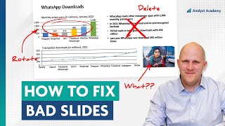
2:05 put y axis will lead to distraction.
2:15 when you draw a chart, you want to simplify the most and draw to the most importance.
2:50 a combination chart can be great but usually the scatter plot can do much better in these.
3:25 a problem: when we see trendline, we want to see the pattern of growth. But this is just data from low to high.
5:35 these 4 legends in different countries.
6:00 why i'm confused is because of the color scheme.
6:15 this dark blue is their emphasis color and accented by this blue color.
6:40 it's not a background or foreground color. as it is in between.
7:15 this has a downside that, this might not fit with their color scheme, but in personal opinions, this emphasizes the messages better.
7:50 i'm adding the percentage sign here, even if that's against Mckinsey's formatting guideline, it makes more clear.
8:25 no confusion for dumb people like me.
8:45 that's more of a personal preference.
9:30 a very good-looking slide with 3 different charts showing 2 dimensions.
10:00 the tile should give you an indication for what you should focus in your chart or slide.
11:05 it's very difficult to compare with N america with the rest.
11:50 notice how i put here right next to line themselves than legends. it's more visible.
12:05 the obvious missing piece is deal count. it provides contents for info but doesn't need to be emphasized.
12:20 but one way around that is to include the table.
12:35 something to add up the clarity: the connection between the two subtitles, and the color scheme.
Thanks Paul. I love what you teach so freely and openly on YouTUbe - it's very helpful. One question: on the mckinsey slide, the heading highlights 'volume' but the graph is about 'percentage'. In other words, Mexico percentages are the highest, but without knowing quantity, there is no way to know volume. To my mind, there is nothing in the slide to confirm that Mexico has the highest volume... it is assumed through percentage and the size of country/population. Thoughts?
This is a good catch, but I think the title still works because it says “large volume” (which is technically true), and not “largest volume”.
I think the better option for the Bain slide would be a stacked column chart
Hi Good morning, will you pls do different types of corporate charts videos in your channel
How about making the deal count in the last chart into a bar chart?
In the original version of the Bain (3rd) slide, the title under "Asia-Pacific" differs from the other two. The additional words "...and growth..." threw me off from the start.
So I have these two workflows from two different divisions but basically they do kind of similar things. One division is doing it holisticly but manual and laborious. And the other is doing the same stuffs in parts but automatically. So I want the former division to sort of eliminate the redundancies and take advantage of the later division efficiency. Do you have an example for that? Apologize if I confuse you.
How do you add colors to those sections
Could I suggest reducing the frequency of swapping out the graph while giving comments? It would be better to stay at the visuals so that we can look into it while listening to your explanation. Thank you!
Thank you for the feedback!
Instead of using the raw data on deal count, what about using some sort of heat map?
Color scheme (CI) doesn't mix well with graphs anyhow. Excel for example automatically uses the primary, secondary etc colors. And this what you described with the McKinsey slide.
It doesn't make sense that one option about waste (or any other topic, not related to the company (for example: performance of us vs competitors) is simply the primary color.
I only use the primary color of my company in completion charts (where are we vs the others) and in timeline charts (primary color is this week's revenue and secondary color is the past, for example)
Imagine how they feel, the poor interns who designed these slides on Friday night at 11 p.m., while they were hitting their 80th weekly hour
Hi. What software did you use to recreate these charts? Or did you use R or Python or other programming language?
I use Ampler! It's a PowerPoint add-in kind of like Think-Cell. Here's a free 1-month subscription: my.ampler.io/alumni/theanalystacademy (affiliate)
4:26 translation of deskless workers is wrong
I like the functional logic that goes into designing nice and effective visualization. Sad to say, in government, where I work, there's a certain limit to how slick your presentation can look. It's almost frowned upon when your presentations are "too pretty". Just the general vibe and aesthetic. The tone and messaging has to be toned down to the point of obscurity.
cool
When i learn excel charts, my teachers always use charts from the Economist magazine as examples. I do like their style. Is it also considered top level abroad?
Definitely. Used lots of them in our data visualization course. Excellent charts.
Actually decided to make a video dedicated to this topic! Watch it here --> czcams.com/video/cGGkAGBre3A/video.html
🔥🙏
장표계의 메시 그 자체
question: on the Mck slide, wouldn't it be better to include the "capturable plastic waste" tag underneath the Landfilled and Recycling legend instead of on the first bar?
@ 6:30 "It's navy blue, not black." Right?
👍👍👍
Great video but also why am I entertained by this🧐
Sometimes I ask myself the same question. 🤷♂️
𝖕𝖗𝖔𝖒𝖔𝖘𝖒
As a physicist and statistician in tech this video is really painful to watch. You really improved the first and the third one but still much space used by diagrams with almost no information in it. Consulting industry is not worth the money most of the time.