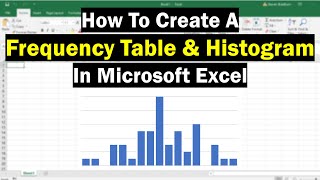
How to Make a Histogram in Excel

Vložit
- čas přidán 20. 07. 2024
- In this video tutorial we’re going to have a look at how to make a histogram in Excel, which is one of the ways to create a clear visual representation of data. So, let’s see how to do that!
Don’t miss out a great opportunity to learn:
How to Make a Graph In Excel
► • How to Make a Pie Char...
How to Add Chart Elements in Excel
► • How to Add a Title to ...
===============
❤️ Become a Patron:
Do you find our tutorials useful? Join this channel and become a patron
CZcams ► www.youtube.com/@ExcelTutoria...
===============
⏱️Timestamps⏱️
0:00 Intro
0:43 How to Make a Histogram in Excel
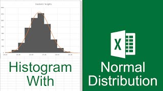
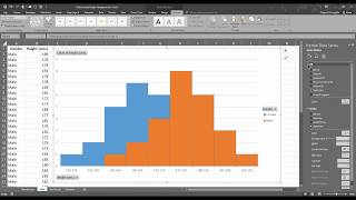
1:07 How to Adjust the Histogram
1:45 How to Amend the Histogram Itself
3:26 How to Change the Style and Design of the Histogram
================
Is this your first time on EasyClick? We’ll be more than happy to welcome you in our online community. Hit that Subscribe button and join the EasyClickers! :)
► czcams.com/users/ExcelTutori...
Transcription How to Make a Histogram in Excel
► www.easyclickacademy.com/how-...
Got Microsoft Office 365? Get it here
► www.easyclickacademy.com/buy-...
Connect:
LinkedIn ► / easyclickacademy
Facebook ► / easyclickacademy
Screen Recorder & Video Editor:
Camtasia ► techsmith.pxf.io/c/1266206/34...
#MicrosoftExcelTutorial #ExcelQuickAndEasy #EasyClickAcademy - Jak na to + styl


Very well explained. Thank you!
Very helpful. Thank you
Very helpful video. Thank you so much.
Thank you, so easy to follow!
Very insightful
This is a very good example! However, I don't know how to add the greater than equal to and the less than equal to symbol onto Excel.
very useful tysm
Thank you a lot!!! You guys, saved my life😂❤❤❤
Thank you !!
Thank you so much!!!!!!!
i tried the add the data labels but it's not appearing :(
I can't see "Insert Statistic Chart" option at all!
Thanks
what if you want to create a histogram with the different variables on the same histogram
Nice🌻
You’re Welcome :)
This video was histogreat! 👍
Does not explain how to change the bins range and number??!!?
Hi, who is the author of the intro and business cards. I really like them.
You, thank you :)
i m working on MS EXCEL 2013. NOT ABLE TO FIND IT. PLZ HELP
my excel is the newest version, there is no bin width selection, how can I change the x axis, it alway start 0
Did u ever find a way ?
Hey! If you right click the one of the bars on the chart, it will open bin formatting, and you can adjust that way. I just learned this by the grace of God because I was stuck too at first! Hopefully this helps you out!
@@lathandennisomg thanks
@@lathandennisThanks for sharing that tip!
@@lathandennis Legend!!!
shoutout to my boy john
bro lost 55 years of his life for a histogram tutorial
god bless amen
i keeep putting the god damn x axis in and it just disappears.
Why does mine sum it all up when i turn it into histogram in excel 2019
doesnt work for me
Jesus loves youuu💌read John 3:15-21💌
How about you do tutorial in access
My graph won’t even show up
But in my cases it's not working!!
This doesn’t work…
Trash