The Secret to be Mobile Friendly in 10 Minutes | Truly Responsive Web Design

Vložit
- čas přidán 30. 07. 2024
- This is how to make your WordPress website responsive - no code, it’s easy. TIMESTAMPS 👇
Watch the next video in my mobile friendly web design here: • Mobile Friendly Made E...
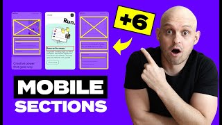
In this WordPress Tutorial, I'll show you how to make your website mobile-friendly in 10 minutes automatically, no more messing around with fonts, margins, padding or the rest. Ever wondered about px em rem vw vh in Elementor, Gutenberg or other page builders? Or just simply want to know how to design something that is automatically responsive and looks great on desktop, laptop, tablet and mobile. This is how to do it - and don’t worry, you don’t need to know css or html code, this is for beginners and can be done with Gutenberg or the major page builders like Elementor.
🔔 SUBSCRIBE & HIT THE 🔔 to turn on notifications & never miss a new upload!
TIMESTAMPS
Responsive Web Design (00:00)
Absolute Units or Relative Units (00:40)
Font Size (01:05)
Changing Default Font Size (02:10)
PX EM REM VW (02:40)
VH and VW viewport height and width (03:28)
Percent % columns, margins and padding (04:45)
How to use these relative units for mobile-friendly web design (05:19)
Thanks for watching, make sure to comment! And who do you know that would benefit from this tutorial? Spread the love, share this with them.
Get Elementor (free or pro) - jackinthenet.com/ep
Jack in the Net
jackinthenet.com
#wordpress #jackinthenet #jackduel #elementor #gutenberg
Affiliate Disclaimer: This video & description contains affiliate links. If you buy a product through this you won't pay any extra, but I get a small commission. Thank you for that support it really helps to keep making free video tutorials.


Hope this video has helped you, to understand more about how to use rems to make your site mobile friendly check this out: czcams.com/video/EPyyo7EPkyA/video.html
Hello. Appreciate your video. What site would you recommend for building both mobile and desktop site? Thank you.
Thank you SO MUCH! I've been struggling with a new website that was supposed to be 'responsive' since I've never worked with mobile or tablet layouts before. I was taking quite a bit of time to make each section three times, one to be visible on tablet, desktop, and mobile, and then resizing everything for hours.
After two days, I found your video. You've saved me countless hours.
I have been tearing my hair out over how unresponsive to mobile mode my site is... and now I think I have the solution, thanks to your video! I'm still tearing my hair out over the fact that I'm going to have to go through my _WHOLE SITE_ and change everything away from pixels... but at least I have a solution. Sigh.
I am really thankful for your video, I was struggling with responsive modes and sizes. I'm building my graphic designer site for my own, trying to build in elementor, and from time to time I have some issues which I wasn't getting how to figure out... I used to use pixels to re-size all, so when I first start to use my site on my cellphone I take a shock, realize that all the measures blow off... This video save me, I wasn't able to figure out what in the god damn I was supposed to do to size all in a responsively way. Huge thanks from Brazil!
Jack, I feel like an explorer who has found something very valuable. Your collection is a treasure!!!
Wow thank you. Been searching for this video. I have very simply adjusted my website to mobile friendly. I litterally used the % and it worked!
Jack,
I just found this video and it has been the easiest to follow and understand. I just subscribed and I will start watching all your videos!! Defaults in Elementor is next. Thanks for making it so clear and understanding!!
This is the first yt coding tutorial from which I’ve actually learnt something❤️ thank you 😊
It is that time after having made an update where you think a plug in must have ruined your site.😮 nobody tells you in so many courses I have done! this so valuable information. Thank you❤
Thanks for a great video. I've been struggling to get the display correct across devices and this has finally helped me do it without just trying to guess.
Best video I've found on this topic. Love how you went straight to the point -- Thanks for this!
That made my day. So super explained and everything to the point. I am absolutely thrilled. Thank you for your valuable content. 😊👏
Jack, this video is incredible. So clear and informative. TBH, I have never seen anyone tackle this before. Great job! Makes sense, I'm going to stop working in pixels. Sound quality 👌 Haircut 👍
Thanks Matt. People often shy away from it because it involves html and css but you can control it easily with themes, Gutenberg or page builders now. And it's so much easier to keep things responsive across devices. BTW you weren't wrong, the Rode WG2 is great.
Love clear precise videos as such. Subbed
Oh Gosh! After many months of struggles. BOOM Jack shows it. Thanks, man. Thumbs up!
thanks. really liked the way you broke it down and explained quickly. gonna try and implement this tommorow to my project 🙂
Thank you so much! Finally a really valuable channel! +1 subscriber! Great job👌
Jack, this video is an eyes opener. Amazing. Thanks
Very insightful. Does this apply to landscape mode as well. I made corrections to the spacing in the mobile portrait mode of the website that are not applying to the landscape mode.
I'm using blocksy theme and gutenberg, the problem when I make changes in blocksy customization the page be mobile friendly and when I come back to gutenberg the page doesn't be mobile friendly. Specially, the blocks that I made with gutenberg doesn't have all the measurement options. What can I do ?
Thank you Jack for another awesome video!
Wonderful explanations- very clear!
Mystery solved. Thank you for clear explanation.
Absolutely incredible. I wish I would have known this sooner!!! THANK YOU!
super super helpful, thank you for sharing this!
wow, how come I never knew this all these years. Thank you so much
thank you for this informative video. it was very helpful. hope to get more hopeful video from you. bless you jack.
Now I know! Thanks, Jack
This is awesome!
I was wondering why all of my mobiles were so jacked.
I was using EM for all of my sizes.
Trying to edit my site now!
Thanks again!
Very useful, thank you!
Thank you for informative content, appreciate it
Thank you so much Jack, this was really very helpful.. :)
Thank you, this is very helpful!
Quick question, are you say that everything on the site should be set to 5 vw? Sections, containers, texts, images and videos? I'm using Elementor Pro and i'm not seeing vh anywhere.
This was very helpful. Thank you.
Oh wow. At last. Tuts should start with this info. Thank you.
This did not work from me. I used VH and VW to size everything. Still, the page would only look good on some mobile devices but not on all. I ended up having to use the preset sizes and positions (eg Center Center and Cover). Does anyone have an idea of what might have went wrong? Would appreciate an explanation.
Hi Jack this is good but my site was not built using an elementor. And a picture I put on the site will be the same picture across mobile devices and it is not working. My images are being cropped out on the mobile. Please help.
just excellent, so clean & user freindly
Really helpful. Thank you so much
wow, that was immensely helpful thank you
Great video, thank you.
Very clear bro. First time watching and i loved it. 😊😊
How do I do this using Gutenberg? Every time I make a different layout for mobile, I get the same layout on desktop. I know it can be done easily with Kadence, but I prefer using blocks.
bro you helped me alot... thank you soooo much
Thank you sooo much that really help me a lot 🙏🙏
You're the best tortorial teacher.
Thank you so much jack
To the point information! Great
Glad it was helpful!
Well explained! Very clear and concise explanation
How do you only have 7k subs? Your content is so valuable! Thank you Sir.
Well needed input
Love the video! Truly helped with my understanding of how all of this works. I'm using the Pendant theme, and changed from px and em to VH and %, but parts of my mobile site are still giving me issues. The font size and a few other elements are still funky. 😣 I have no clue what to do now to make it mobile-friendly. Ugh.
Thanks for watching. Try this as a build on from it: czcams.com/video/EPyyo7EPkyA/video.html might help with the issues you’re having
Thank you.
You're a hero.
The best video on elementor😊
Thank you, Luka Dončić!
What html & css editor are you using in this video? Thank you.
You're the best 😊
Thank you!!!
Howcome you tell us to use EM or REM for fonts and then you use VW yourself? 👀 really curious about this though, since It takes way too much time when using pixels
thank you so much
which software you used for demo in this video
hi jack .. when i am making any header adjustment on mobile its also changing on desktop .. really annoying please help
Thank you for the video. it really helped understand. I do have a big question though. I switched to that and for some reason mobile and tablet still looks bad and buttons are on top of each other. Do you do any zoom training or can you tell me how to fix that. I tried everything
Hi, thanks for the comment. I do zoom coaching, yes, but have you watched this video yet? It expands upon this and might help solve your problem: czcams.com/video/EPyyo7EPkyA/video.html
Thank you)
This is useful
Thanks Jack
You baffled me with mathematics, but I got it, thank you.
Have you the link for global setting video?
You didn't put the link to the global settings in the description.
дякую, субтитри дуже гарно переклали
thanks
REM, great band!
Very well
Where is the you spoke about at 2:41?
wordpress is trying to charge me a yearly fee to use free plugins (like elementor). Is there any way around this? How would I go about using a free version of elementor if I dont have a wordpress subscription? Thanks.
The only cost of your site is the hosting!! And what ever plug in YOU want to buy!
I am looking forward to watching more tutorials on Gutenberg. Do you have a framework created allowing users to follow a structured journey for learning. Certainly many will watch segments and other explore other content in their quest to become competent. Still, having a basic trusted structure to refer to is beneficial. Why not copy the architectural modeling Gutenberg follows? Enable users to assemble learning blocks in a path for learning, adding or deleting video content as they wish. Create a space where other trainers can add approved content. All of these could easily be monetized. Chuck
Hi thanks for your comment. I do have learning courses including gutenberg these will be live shortly on my website.
Hey, how do you do this on namecheap? No one uses whatever stupid garage thing you have
The new look suits you Jack!! It would be great if you make a little more detailed tutorial.
Thanks :) I'll do some further videos on it, this is as a good starter for people
great
Being struggling with responsive sites cause of the sizes this makes me feel stupid cause it's so easy🤣
Amazing tutorial. Best one yet.
Thought It's still a mess over here. Doesn't come out well proportoned like yours. Text is scattered everywhere. Same with buttons.
I was learning wp thru udemy and mf didn't tell me to use vh,vw and % instead just kept going with px
This looks promising. Thanks for this great tutorial. I'm noticing my elementor pages are not passing the google mobile friendly test, and two errors always appear: 'text too small to read', and 'clickable elements too close together'. Note: I just managed to get one site to pass the test by making body text larger, I believe 20px, and creating more space in the footer links by using the WP footer (not elementors template). These solutions appear obvious, but they were not working very well before. I'm not really sure what changed, tbh. I did not make any of changes mentioned in this vid, but I will give it a go on other sites. My other sites are way more complex... we'll see.
Does gutenberg has these options?
Yes I’m using both elementor and Gutenberg in the video. Gutenberg works well with it
Fucking awesome!
Please create for blogspot version, sir. 😊
2:25 sooooo, where is the link?
Thanks ...
But You Said below ... Where is the global setting video ?
I pray this works
🙏💖☀️
Elementor is horrible for full responsive and this video did not help me at all
But wait...... there is no iPhone 10......
Absolutely incredible
long story short we are supposed to use VH for sizing all the site, right?
best trick thanks