Master Responsive Design (8 point grid system) | UI and Websites | Figma file included

Vložit
- čas přidán 29. 06. 2024
- Simple guide to master designing responsive websites. Learn about breakpoints and how to set up responsive grids in Figma using the 8 point grid system. See how autolayout can help you design faster.
Sign up to my mailing list for link to Figma file: mailchi.mp/d2437fc71638/sign-up
Time stamps:
00:00 Intro
00:30 Responsive design explained
01:27 Breakpoints
05:11 Mobile or Desktop first
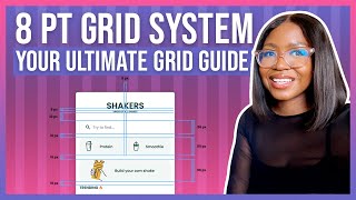
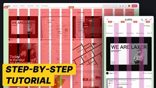
06:13 Grids in Figma
10:18 Design for mobile
📺 Watch next:
- 8 Point Grid system: • 8 Point Grid system - ...
- Improve UI Designs: • Better UI design skill...
- Choosing & Applying colours: • 8 Point Grid system - ...
📘 UX Books:
- Dont make me think: amzn.to/3VBi4Bj
- The design of everyday things: amzn.to/3BdWMS
The giveaway competition is now closed, but sign up to receive updated on the next one:
Mailing list: mailchi.mp/ca51b817ab2a/ol6ec...
Instagram: / uxtshili
Twitter: / uxtshili
Tiktok: / uxtshili
💬 HAVE QUESTIONS about UX/UI, tech or Figma? Add it in the comments and I will be happy to answer. You can also let me know what topics you would like me to create videos on
Some of the above are affiliate links, at no extra cost to you. - Jak na to + styl


I hope you have found this useful, let me know if you would like me to clarify anything 😃
Great video Tshili! Quick question
Can you include this Figma file in your description so we can practice with it?
@@kayodedesign Yes, here is a link, I hope its helpful www.figma.com/file/mwzS0c31qsO6gpQzZ8tM9F/Responsive-grids?node-id=0%3A1&t=Gp6DH8LOIdoeMe2t-1
@@uxtshili Thank you
I've been going through so many grid tutorials, even from big UX CZcamsrs, but yours are the ones that finally helped me understand! Thank you Tshili!
Thank you for watching. I'm glad it was helpful 😊
Love it Tshili, I learned a few new tricks from this ❤
Glad you found it useful 😊
Thank you for explaining everything so clearly and concise, I was looking for great content and I found it :)
Thats so kind! thank you for watching
I went through the file layers and I understand what i have been lacking, thanks so much😁
😊 I’m glad it was helpful
Hi there, thank you so much for the video. I was nervous since I just started a new job, but finally understand responsive layout from watching your video. I hope you're recovered from your illness since then, and am doing well.
Im glad it was helpful. Thank you, Im feeling much better 😊
I am doing a design challenge for a job application for Product Designer. It is my first job after graduation and internships. I am sweating bullets to start to timer for UI design since I am more focused on the UX and research part than UI. And let me tell you, THANK YOU for these videos, for keeping them short and clear, like these videos were the only thing that was able to ease my anxiety. Bless your soul!
Thank you so much for your kind words, really appreciate it 😊
Super awesome tutorial, I have gone through many tutorials. But your way of teaching is really really nice ❤
Thank you so much 😊
Awesome Vid Ms. Shili.....
Glad you liked it 😊
i love you, you save my time ! from Congo Hello
Great! Thanks for watching 😊
Thank you for another great video! Thought it was so interesting when you mentioned that although a lot of traffic came through the mobile phone, conversions took place on the website, and so it was best to optimise both screens.
I just wanted to ask, how do you decide when creating responsive designs what should be stacked on top of each other, rather than just made smaller? Is it just eyeing it or is it using auto layout on a frame etc?
Hi Apologies for my late response. There's not set rules, but its usually based keeping things a good size. At some point your text/ images will be too small to read comfortably. So design multiple versions and then compare which one will looks best 😊
Great
Thanks for watching
Love it. You sound like AI (Alexa)
😄😄 thanks
👍🏾
Great job, it really helpful but how did you compress the whole thing on the desktop to hamburger menu.
The menu in the hamburger appears when you click it.
thank uuu but isnt the whole idea is about making the design of all devices in one screen ?
Not really, its about the one design fitting different screens
Why is desktop 1440 width when most desktop's re 1920?
Laptop is 1440, 1920 is usually a monitor size. I mentioned that screens come in different sizes, 8px grid system is to help the designs fit on different screens
in the intro she looked like she was held at gunpoint
Yes I was recovering from an illness when I recorded this
oh! I hope you're better now. (great tutorial btw)@@uxtshili