John Singer Sargent Portrait Painting Copy Using The Zorn Palette

Vložit
- čas přidán 19. 03. 2021
- In this portrait painting tutorial, realist artist Alex Tzavaras completes a master copy of a John Singer Sargent Portrait Painting using the Zorn Palette.
For Alex's Alla Prima Portrait painting course visit:
/ simplifydrawingandpain...
Or connect with Alex:
/ alex_tzavaras
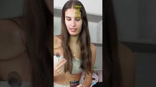
Alex is copying a portrait painting John Singer Sargent did of his teacher Carolus Duran. Completed in 1879, at Carolus Duran's Atelier in Paris, where he taught direct Alla Prima oil painting techniques.
To do this exercise yourselves, download a free version of Sargent's original painting here:
www.clarkart.edu/artpiece/det...
To paint this copy Alex uses the Zorn Palette. A limited palette usually made up of four colours, Ivory Black, Vermillion or Cadmium Red Light, Yellow Ochre and White. However, intead of Cadmium Red Light, Alex has substuted it with Winsor Red by Winsor and Newton. A much cheaper colour that uses a pigent called PYROLLE Red PY255.
This video is an add on to Alex's previous video on oil paints, in which he suggests some cheaper alternatives to expensive colours like Cadmium Red and Yellow.
To see Alex's previous video on oil paint, visit:
• Oil Paints - What Colo...
To see Alex's master copy of Juan De Pareja by Diego Velázquez, filmed entirely in real time, visit:
• Portrait Painting Tuto...
Alex Tzavaras is a contemporary realist artist offering portrait painting and alla prima oil painting tutorials. Alex teaches the traditional painting techniques artists used to draw and paint from life up until the start of the 20th century.


Yes, finally... a painter with the gift to do John Sargent justice.
Too kind.
@@SIMPLIFYDrawingandPainting You have the skills, Bravo. I'm very impressed
@@sduncanfoto Thanks!
@@SIMPLIFYDrawingandPainting 🤣
@Josiah Juan that movie of the polish lady with Lithuanian two men plebs behind her saying thank you for the traffic was interesting.
Not only do we get to watch and learn the technical aspects from your amazing work, we also get to learn a bit about art history. Thank you for the video, your efforts don't go unnoticed.
Thank you Sabelo! Glad you enjoyed it.
This guy is by far the most talented artist on CZcams!!
Really fascinated. Cannot thank you enough!
Amazing!
Thank you Alex for sharing your gifts!
Awesome, such good content, love your bold approach. Thanks for sharing your tips, Alex!
Another great lesson on materials and technique. Thank you!
I love paint :) and I love singer Sargent's work.
Thank you so much for your latest tutorial! I really appreciate the effort, energy and time you put into your videos. Thank you!
Thank you Crissy! Glad you like them.
This is great Alex. Thank you very much
This is amazing how the painting seems so exact
Seemed to have an expression even before the eyes were in
So talented
Thank you
Patricia
Thank you for your wonderful videos. The very best I have found. You’re so generous with all your information and demos. You’re an incredible artist.
Thank you very much Ann. Glad you find my videos helpful.
Thank you, Alex, for another wonderful demonstration 👏! I so enjoy watching your videos and truly appreciate the thought and work you put into producing them.
Thank you very much! I'm glad you enjoyed it.
its always interesting to see what you think about diffrent brands
Thank you very much for posting this video - it's invaluable!
Thank you, Sir, for all your hard work. You're a great painter and great teacher.
Thank you very much Kris! Glad this was helpful.
I love the magical moment where any given piece of artwork begins to come to life. Your style reminds me so much of my own, yet you have it completely perfected; such a beautiful display of talent, and years of experience. Absolutely priceless.
I learned a lot from your videos, the fact that you use few colors awakened the perception in me to combine them! Thank you so much!
Thank you! Glad you've found them helpful.
Amazing!
This is a marvelous study. I truly love your work. It is truly striking.
👏👏👏👏👏👏👏👏👏 Many thanks for this wonderful Master class!
Thanks Pablo
Amazing work sir 👏🏻👏🏻👏🏻
Love your highly skilled simplicity!
Thank you!
thanks for the video alex, always enjoyable and informative
Thanks Zak!
You're a brilliant teacher, and a fantastic artist! Thanks for sharing.
Thank you Dominique!
Awesome. Thank you very much for sharing the demo.
it was exciting to see your video alex you give much to think about when it comes to panting portrait im glad you want to share your knowledge
Thank you very much
Fantastic demonstration and really appreciate your objective assessments of the materials. Thank you.
Thank you Alex! Glad you enjoyed it.
Incredible ❤
Greate painting Alex, and greate video as well. You made a spot on shading, and a beautifull brushwork too! Remarkable!!
Thank very much Davi!
This really is masterly stuff. I’m almost annoyed that I hadn’t found your channel and work earlier. Simply stunning 👍🏻
Thank you very much. Glad you find my videos helpful.
i have anders zorn as my favorite painter you are a big inspiration for me
It is stunning: a good way of mastering mixed colours from a beginners point of view. A great inspiration even for a more advanced student.
Thank you Frank!
Thank you! Such great instructions!
Thank you for watching Cathy!
Fantastic tutorial as always
Thank you!
Wonderful study! Very enjoyable and informative
Thanks Jeff!
Well these are some really incredible skills you have! ✨
Thank you very much!
thank you so much for this!!
Brilliant video, thank you!
Fantastich,fijn dat u dat deelt zodatwij het proses kunnen zien.Dank u wel.
Great tutorial ❤thanks a lot!
Thank you!
Awesomeness!!🤩 Maestro you truly rock!! One of the amazing moments I take away from this session is how you modulate the edges on the side contours of Duran’s face. This creates this fresh airy soft look not to mention depth. I’m painting in acrylics, and I’ve been spending lots of time working on edges: hard soft or simply lost. It’s challenging but exciting. I’m finally learning to paint with my media instead of drawing with it. I’m working on your bowl of eggs 🥚🥚😜. Thanks sooo much for your expertise and generosity!!
Thank you Joann! Did you ever see my video on painting edges:
czcams.com/video/Sm9hCGY6k6k/video.html
It's a simple monochrome still life exercise, but when you're working on something where the drawing isn't too challenging and you don't have to thin about colour, you can really focus on paint application and technique. The eggs are another quite good exercise for that.
Awesome 💯
That looked like fun to paint
It was. Master copies are a great exercise.
Wow 🥺
As others have commented I really admire how you maintained the expression and distinctive personality of the subject, from start to finish. I think it takes empathetic skills for a portrait artist to be able to master this.
Thank you! Glad you liked it.
My most favourite brush stroke: the _transparent moustache_ ! Sometimes I forget that I _can_ use transparency (soft edges) and avoid too rough and jerky paintings. This image of yours has the perfect balance in my mind. Still the best channel on oil painting.
(Also the periodicity is excellent, just the right amount of time between videos.)
Thank you very much Risto! I often worry my videos are a little too far apart. I would like to release them a little more often, but I also have to make videos for my patreon channel too.
Pyrrols are more stable to humity than cadmium, and they lightfast as cadmiums. They gained a place in my palette. Thanks for this video
amazing, I love the Winsor Red and even Winsor Bright Red, thanks for sharing
Yes. I think I'm becoming a convert. I've used old Holland vermillion before, which is also made of pyrrole and that definitely doesn't perform as well as cadmium red and it series 4 so it isn't even that much cheaper. But Winsor red works really well and it's less than half the price of Cadmium! Well not Winsor and Newton Cadmium but certainly more expensive brands.
@@SIMPLIFYDrawingandPainting What I read is that Robert Liberace uses Winsor Red also, and he loves W&N colors
stunning
Thank you!
Thank you for a great video. Another benefit of Pyrrole as an alternative to cadmium red is that Pyrrole is non-toxic. I've also used W&N Scarlet Lake as a cad red light replacement.
Well done, looks excellent!
Thanks David!
Great instructive video, clearly explained
Thanks Dan!
I think Sargent would approve. Thanks for the demo. I've been experimenting with the Zorn pallet. Even tried it for a landscape.
Thank you very much! What landscape have you been painting with the zorn palette? It would work for some subjects, but it would be challenging to paint the British summer time with all its' bright greens and yellows. Tho speaking of Sargent and limited palettes for plein air, have you seen his water colours of Venice? They were done with just burnt Sienna, ultramarine and white.
@@SIMPLIFYDrawingandPainting Your welcome. I tried the zorn pallete to paint a walkway, trees and field of a local park. You are right, it was challenging....especially without blue.
I haven't seen Sargents watercolor work but I will in a minute. Thanks
Well done.
Thanks for this wow!
Duran's work makes me think of bouguerau's work as well . Velasquez is also one of my favorite painters. This was a great video and something i was glad to see. Thx. 👍
Thank you very much Duan!
You have some incredible techniques and skill sir 👌
Thank you very much Keyvan!
wow!!
Thank you Alex for this great demo and painting tips! Your info on the alternative colors is much appreciated for us painters! I’ll definitely have a go with a Zorn’s palette on a master copy. Maybe not this one though, a little bit intimidating lol.
Thank you! Good luck with it.
❤thank you ! This is so helpful!!! ❤❤
Thank you Angel! Glad you think so.
Awesome!
Thanks!
Thank you! Very useful
Thank you Maria!
Very informative and interesting. Thank you
Thank you Carol. Glad you enjoyed it.
Very good copy.
Thanks Daniel
thank you sharing this video.
Glad you like it Jackie!
greattt
Very good Alex ! :)
Thank you Svan!
There is Old Holland Scheveningen light red which is also a good/cheaper replacement to cadmium red. It s still a bit expensive but Old Holland product are top quality.
Great video btw, ty Alex.
Thanks. I seem to remember Old Holland's Vermillion is made with Pyrrole, same as Winsor Red I'm using here. But Old Holland Vermillion is series 4 and Winsor Red is series 2, so cheaper. But Winsor and Newton put more fillers in their paint than Old Holland.
Just seen this video, glad to see that you've noted the difference between the replacement flake and the real thing, which cannot be replicated yet using Titanium, none of them do actually work. The best so far is possibly the Michael Harding Titanium white No3 which is simply a faster drying paint.
Ur great
Thank you!
Thanks Alex. Another great informative video! I had a good look at the original. Do you know how Sargent gets that grainy effect on the skin? I've tried very loosely mixing colours with cremnitz and flake white but can't seem to get anything close.
Thank you Rick! Glad you liked it. Did you see the original at the Clark Art Institute? Well Done! Unfortunately, I'm also unable to match the exquisite quality of Sargent's brushstrokes. The only thing I can suggest beyond use the same lead white, which you are, is that you're still probably not using enough paint. Sargent ploughed through paint, particularly in the lights. Whenever I've copied a Sargent, I've always tried to pile on the paint like he did, but it still ends up looking like he used more paint than me.
thanks :)
Saint Petersburg oil paints; they seem to have some bad reviews, but I’m really liking them. The violet grey lory and glauconite work well for portrait shadows and some lovely soft shades like Petersburg lilac and malachite green which didn’t seem widely available in different brands; thanks for the tip 👍🏻
Thanks for letting me know, I'll check them out. I only tried their cadmium and cobalt to see how they compared to other brands. They're certainly pretty good value.
Thank Alex, I really appreciate you sharing these videos.
I really like your delivery and painting style.
How does Sargent get his portraits so realistic with barely any visible brush marks/ shapes. Is it a special blending technique?
Thanks Daniel. I believe Sargent would have worked in a very similar way to the way I did. Starting with large value masses and then refining them with smaller intervening value shapes. I reckon there are fewer visible brushmarks, mainly because he probably spent and little longer on his painting than I did and modelled it more carefully. Also his paint handling was far superior to mine. He may well have blended some edges together with his brush, like the ends of his moustache, but I think most of them he painted with intervening values. If you read what has been written about Duran's Atelier, students were apparently advised not to blend?
@@SIMPLIFYDrawingandPainting fascinating, and thanks for the reply. I'm following your video and trying to replicate. The Zorn palette is an interesting challenge.
I definitely need to practice sculpting facial features with the paint, like nose and eyes.
Hi, great tutorial. I am grinding my own colors from powdered pigments. I can control the way color feels like, by adding more or less oil to the pigment and grinding more or less. What should I look for when I grind titanium white so it feels more like flake white?
Thank you. I have absolutely no idea. I have never tried grinding my own paints. When you look at the ingredients of the Gamblin Flake white replacement all it says is: Titanium Dioxide (PW6) and Alkali refined linseed oil. I don't know what they've done to it to supposedly make it more like lead white. Which I don't think it really is. It's a lot more like normal titanium than it is lead.
It's funny, here in the UK Art stores are only allowed to sell lead white to Art restorers and they make you sign a declaration that you're using it for restoration before selling it to you. Also, it can't be sold in tubes, only in tins. But if you go to a store where they sell raw pigments, they will sell lead powder quite freely.
Thank you for the excellent demo. How can I reach the writings about Carolus-Duran’s lessons? Would really appreciate if you could name a few titles. Thank you.
If you google "Carolus-Duran technique"or "Atelie" you'll find quite a few blog posts about it. Here are a few:
lacrank.blogspot.com/2017/04/in-atelier-of-carolus-duran-will-low.html
gurneyjourney.blogspot.com/2009/03/carolus-durans-method.html
They appear to be based on the account of an artist who studied there called Robert C. Hinkley.
@@SIMPLIFYDrawingandPainting Great links, I read Gurney before but the pdf in the first link is extremely valuable. Thank you again and wish you a successful painting journey.
❤
Awesome vídeo. I I am exploring these painting videos since I always used charcoal and black and white but I have seen some painting videos in which they start first with the lightest values and built their way up to the darkest and some of them the opposite way. What would you reckon would be the best strategy to paint these realistic portraits?
Thank you. I don't think there is a best way, either way will work, lights first or darks first. For me, the most important think is to simplify your subject in to just a few main values i.e. the shadows, the lights, the background, the hair mass etc, and place this correctly before you start refining with intervening values or adding any details. In this painting I started with the darks because with the dark hair and eyes, they are the most obvious. But with another more high key portrait where the shadows aren't so dark. I might start with a flesh colour in the main areas of light. Then I'd think about how dark and how warm or cool the shadows where in relation to my initial flesh colour. Or if I was painting a still life or something that had a really strong colour in it, like a lemon, I'd start with the yellow of the lemon as its the most obvious colour, then I'd think about how everything else relates to it. If that makes sense? Here is another of my demos where I start with the lighter flesh colour first:
czcams.com/video/JkI1yTF6DFY/video.html
@@SIMPLIFYDrawingandPainting Thank you very very much for the care and response. I am a big fan of your work and your videos- and now even more!!. Will try both techniques since it depends on what we are painting as well as you mentioned before. Thank you once again :)
Really love your approach to it! Did you try to copy the works of Fechin? It would be exciting to see it!
I have never copied a Fechin, but that is a good idea!
@@SIMPLIFYDrawingandPainting looking forward!
Great video. Perhaps you've addressed this in another video, I'm watching your palette in this video, could I please ask, do you use medium? I do know you like to use a lot of brushes for layering over wet paint, it's hard to tell if maybe you've got medium off-camera, or maybe mixed into your paint beforehand. Thank you!
The only medium I used for this painting was for the dark accents in the hair. Other than that it was just paint straight out of the tube. The medium I used was stand oil mixed with turpentine mixed in equal parts. My next video is going to be on mediums.
Thank you very much, I do believe this is the best method for what I am trying to achieve. I wish I had seen your videos before I committed to another, very different, complicated and (to me) ineffective approach to painting "like Sargent"
Awesome videos and so helpful!!! Just curious... didn't Sargent recommend starting with half tones and then going to darks and lights? Does it matter?
Yes he said that. I've actually made a video about the book where he said that. where I break down his method:
czcams.com/video/O6XOcyiqN-I/video.html
Amazing Master study Alex! Do you think painting portraits from photograph is okay? I am not in an art school and no models too.. Kindly Suggest a way to practice portraits. Thank you for this amazing master study
Thanks Ayush! Master copies are a great exercise if you can't get anyone to sit for you. You will learn a lot and get great insights into the though processes of other artists. Painting from photos is fine, you can certainly use them to practice. But remember, photos do not capture the world as it the eye truly sees it. Also, they don't move, so they are no substitute for working from life. Another good exercise if you can't find anyone to sit for you is to do self portraits in the mirror. Like this one:
czcams.com/video/hDNinFaPA30/video.html
@@SIMPLIFYDrawingandPainting Thanks a lot for valuable tip Alex :)
Awesome demo Alex!! I'm on the market for a Yellow Ochre, but i'm debating with myself between the more opaque and brighter Yellow Ochre Pale or the semi-transparent and darker Yellow Ocher. Which one do you prefer and why? I think Yellow Ochre Pale is PY42 and the regular Yellow Ochre is PY43. Both W&N. Thank you
I use Michael Harding PY43. I Prefer it to Michael harding's regular yellow ochre which PY42 because I find it a little too green. I haven't use Winsor and Newton in ages, but last time I did it was probably their regular yellow ochre, which was fine. I don't think I've ever used their yellow ochre pale. But Tbh you can mix decent flesh colours with both, so it's just a matter of personal preference. Why don't you buy a small tube of both colours and see which you like more?
@@SIMPLIFYDrawingandPainting I'll do that, thanks a lot for your input
Amazing mastery , look so effortless and so efficiently done 💕- for beginners who want to replicate this painting, would you suggest to draw the portrait first before painting it ?
I'm pretty sure there's a preliminary sketch online for this painting that Sargent did .
@@timowthie ok thanks, I will sought it out. Will replicate this painting, l love the simplicity of the colour scheme
@@susanwong6471 I almost love Sargent's drawings more than his paintings. He doesn't need to do much to convey a lot.
@@timowthie agreed! That’s why he is one of the best! I love his loose style of “ paint dirty”
Thank you very much Susan! That's a very good question. The thing I find with doing an accurate underdrawing, is that afterwards people get hesitant about putting down paint because I don't want to lose my drawing. So their work ends up looking tight. I think all students go through this process of needing to resolve the drawing before putting down paint and then eventually figuring out how to simplify their subject into bigger shapes, them in with with colour then resolve the more accurate drawing after. However, there are plenty of accomplished artists who do resolve much of the drawing before putting down paint, or they may start with a more accurate underdrawing depending on their subject. And they still manage to keep their work looking painterly, so it is possible.
In your case, I would do as much underdrawing as you feel is necessary until you feel confident about blocking in colour, just be aware that you may need to paint over some of the underdrawing and will have to find the drawing again. It's all part of the process.
Is the relative warmth of the reference just in my head or lighting or something? Anyone have any insight on that? I've seen it multiple times.
My colours may not have been an exact match but yes, the difference in colour has a lot to do with the lighting and the settings on the camera.
Alex have you tried hansa yellow as an alternative to cad yellow?
Yes. I spoke about it in my previous video on oil paints. I used Winsor yellow and Michael Harding Yellow, both are made with Hansa:
czcams.com/video/J09PLnBtUMo/video.html
Hello Dear friend, how long have you studied painting to paint so beautifully 🙄😊
I did my first oil painting in 2004, when I was still working full time and just going to art classes in the evenings. I started training 3 full days a week in 2006. I made a video on how long it took me to learn to paint here:
czcams.com/video/nHI_LmFBVTg/video.html
Is the entire tutorial for this painting (non-time lapsed version) available on your patreon page?
Unfortunately no. There are no master copies on my Patreon channel. There is one portrait demo on there and two whole courses for beginners on drawing values and colour using still lives and casts. However, I do have a non-time lapsed master copy I did of a Velázquez, which I posted on CZcams. Here is part 1:
czcams.com/video/JoCSaNKDyNg/video.html
I love how the face with hair is basically a heart.
I think the copy is pretty much on target except for the color which to me seems warmer in the original painting. Yours looks rather cold and gray by comparison.
Do you wait for the layers to dry before adding more color?
No, all of these demos are completed in a single session, while the paint is still wet.
How should i stop my colours from becoming muddy?
Unfortunately there isn't really a short answer to that question. It has to do with understanding colour intensity and learning to see the relationship between neutral grey colours and more intense saturated colours. What happens when are colours go "chalky" or "muddy" is where getting grey or white mixed into colours that should be more saturated. A big part of this is learning to recognise which colours need to be more intense and which need to be more neutral, but also on a more practical level it's remembering to keep your colours clean as you mix them on your palette. Try to avoid getting all your colours mixed into each other on your palette. The way you do this, is once your palette is covered in paint you need to scrape it back, clean it and start mixing fresh colours again. I usually end up doing this several times during a painting session.
Why not french vermillion for your red? or Cad Red light?
I normally use Cadmium Red Light. But my previous video was on oil paints and in it I suggested some cheaper alternatives to some of the more expensive pigments (something I often get asked about). Following on from that video, I thought I'd try out the Winsor red for mixing flesh colours. It works really well and it's a lot cheaper. If you're interested, here's my previous video:
czcams.com/video/J09PLnBtUMo/video.html
hello sir so the Pyrolle Red is grate alternative to Cadnium Red?
Yes, I reckon Pyrolle is reasonably similar and it's a lot cheaper.
thank you i was reluctant to paint due to fear on cadniums
do you have a favorite painter artist
I have many, but Sargent is definitely one of them.
i mean did you like gambling colour ist it any good
Gamblin are a perfectly good brand. I'm just a bit sceptical about their flak white replacement. It isn't the same as real flake white.
Did you use any medium ???
I can't remember. I usually don't use medium, I just try to use the paint as it comes out of the tube. But here, I may have used some for the darks in the hair and beard. When I do use a medium, I use a mixture of stand oil and turpentine. You may be interested in another video I made on mediums:
czcams.com/video/22zHMjpdK2Y/video.html
Thanks! but acrylic Paint Is there tutorial?
I'm afraid I never use acrylics, but as far the visual aspects are concerned i.e. interpreting what we see, shapes, total values, colours the principles are all the same.
@@SIMPLIFYDrawingandPainting Thank you very much for the answer, yes this is clear, the problem with acrylics is that they dry immediately and therefore there is the difficulty of blending, I wanted to understand if there is a method to be able to create the same effect as oil painting. (sorry english I use automatic translator)
@@SIMPLIFYDrawingandPainting ok thanks. The problem is the different technique. Acrilic dries very quickly unlike oil and therefore it is very difficult to make shades
Impressive, with just a...few...colors.
Thank you Kevin!