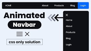
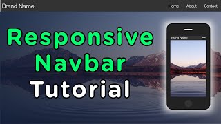
Responsive Navigation Menu Bar + Hamburger Menu Toggle - Only with CSS

Vložit
- čas přidán 26. 04. 2020
- Please subscribe: / @purecode7237
In this video we create a responsive navigation manu bar with logo, only with CSS and HTML, NO javascript! Using media querys we toggle the hamburger menu (made pure with CSS) to open the menu on mobile and tables
MORE SMOOTH TUTS:
Pure CSS Parallax Effect on Scroll (no JS) - Smooth Parallax Scrolling with Fruits:
• Pure CSS Parallax Effe...
Pure CSS Scroll Snap Effect:
• Pure CSS Scroll Snap E...
Pure CSS Animated Text & Border Box Gradient Effect:
• Pure CSS Animated Text...
--------
Music: Name of the Child - Motions - Jak na to + styl


Bestes Tutorial und das erste, das so richtig klappt :) vielen Dank!
This was most helpful! Saved my project. THANKS!
make more please, you're a legend
Thanks a lot bro!!! You safe my life 😄
Blessings from Venezuela
Thank you so much bro, you safe me from stress.
Worked perfectly! Thanks.
Thanks a lot ... Bro...This video is very helpful to solve my problem of hamburger menu ...
You helped for my project !!! Thanks !!!
big thanks who borned you bro...😊
Thanks a lot bro your video solved my problem
can u please give source code, i dont know what the problem, not working for me
Thanks Bro🤩
awesome !!
Thnx buddy
Thank you
perfect
Perfeito!!!!!
nice video
been through this so many times and cant get it to work the source code would of been handy :(
display : none in toggle-menu how does it go dark
ummm thanks...link in description would be awesmome!
The responsiveness works for me but not when I click the hamburger 🤔
What am I doing wrong?
can i get source code of this project
Nice, very nice tutorial, but i have a problem when i pass to -768 the transition animation appears. Im doing mobile firts, the solution was delete the transition property of the menu, but now appears insta from right to left
I couldn't get "@media screen and (min-width: 992px)" to work.
However, "@media only screen and (min-width: 992px)" did the trick.
Add "only".
👏👏👏
sorry sir i need only code line that make navigation responsive
not working
Can you share That smooth logo???
For those who are not working type this when writing responsive code:
@media (max-width: 992px)
instead of:
@media screen and (max-width:992px)
any can give source of the code or link plz...
What is the logic for checkbox even hamburger is placed ?
Why all youtube tutorial has same method ?
👌👌👌👌👌👌👌💯💥
Thanks but can you give source code in the description??👍🙏🙏
Behn jab chize samjh aa gyi toh code ki kya zaroorat khud code likho
bhai hamara wala work nhi karta, kahi na kahi koye koye na koyi masla ajata hai
@@sanketsingh5555
Upload source code please
where is the code
source code