5 Design Mistakes to Avoid in Power BI

Vložit
- čas přidán 4. 07. 2024
- Join my Power BI Design training here: my.datatraining.io/pages/powe...
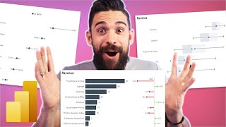
In this video I show you 5 common design mistakes that I often see in Power BI reports. Learn how to recognize what doesn't work in terms of report design and how to fix it.
Enjoy this video and subscribe to always stay updated on my favorite Power BI tricks :)
Download PNG file: datatraining.io/powerbi-design2
--------------------------------
📊 TRAININGS 📊
---------------------------------
Power BI Design 4 Weeks Transformation Program my.datatraining.io/pages/powe...
Power BI Essentials datatraining.io/powerbilearni...
Business User Training datatraining.io/powerbi-busin...
For Custom Trainings and Consulting email directly support@datatraining.io
---------------------------------
⏱️ TIMESTAMPS ⏱️
---------------------------------
00:00 Intro
00:55 Design Mistake 1
02:17 Design Mistake 2
03:51 Design Mistake 3
06:45 Design Mistake 4
08:17 Design Mistake 5
10:59 End
---------------------------------
💻 VIDEO LINKS 💻
---------------------------------
Report Theme JSON Schema: bit.ly/3u4IUJk
---------------------------------
😍 JOIN 😍
----------------------------------
Join bit.ly/4b453bi
Subscribe bit.ly/31MnQGO
Insta / howtopowerbi
LinkedIn / basdohmen
TikTok / how.to.power.bi
X / howtopowerbi
fb / howtopowerbi
Threads www.threads.net/@howtopowerbi
Newsletter datatraining.io/newsletter
---------------------------------
👇 CHECK THIS OUT! 👇
---------------------------------
💻 My gear amzn.to/47F21Yc
📚 Power BI books MUST READ! amzn.to/3tUfFcj
💡 General books I recommend amzn.to/48YNo33
🎶 Music for my videos www.epidemicsound.com/referra...
🚀 For growing on CZcams: www.tubebuddy.com/bas
🏄 Stuff I use daily amzn.to/3HqfMQ2
* Above are affiliate links, which means at no additional cost to you, if you make a purchase using these links we will receive a small commission. It supports us and helps us to continue making more How to Power BI videos!
Thanks for being a part of this channel and all your support! 💪 🙏
#HowToPowerBI #PowerBI #DataTraining
#powerbidesktop #powerbitraining #powerbideveloper #DAX - Věda a technologie


Download PNG background for free : datatraining.io/powerbi-design2
Great example of design pitfalls! My design policy is usually FSBC(Font, Size, Balance, Color) × STD(Snapshot, Trend, Detail) where the first part is similar to what you mentioned on the video and the second part is more like an EDA kind of thinking. The second part should contain at least 2 out of these 3 types of the charts such as Scatter chart or Card visual as “Snapshot”, Line or Ribbon chart as “Trend”, and Metrix/Table as “Detail”. By using the combination of these, one can easily get tons of insights by slicing and dicing.
When we started our migration from Tableau to Power BI I created a document outlining EVERYTHING. A specific color palette, pixel specific locations and sizes of objects, defined spacing between objects. People thought I was crazy but all of our reports have a similar look and feel so anybody can use any report and know exactly where to find what they want.
Is there a real benefit of moving from Tableau to PowerBI? I´m following this channel and I find it quite useful, but everything seems just less straight forward
Bas always on point!! My manager and I were just talking about having something like this into a PBI best practice guide for our larger team. Top notch content.
Excellent piece!! Thank you.
Maintain consistent fonts and consistent gap between visuals are my favs.
I totally agree, it seems little stuff but they are so important to bring balance on the reports. Very useful Bas.
Thanks for this, it's great to pay attention to detail while being a UX Power BI Developer
Great job. Would stand out even more, if you showed comparison at the end :) Just to amaze everyone even more :)
As usually very educational! Easy to understand and to remember what to watch out in a report.
thank you Kate 😊
Good tips! Thank you for sharing Bas!
You are a great tutor of POWER BI reports, always delivering something important and unique. Many thanks.
Glad you like them! thanks!! 😁
Thanks Bas! You're always informative.
Thx for watching!!!! 😃
Loved your videos! Help me a lot ❤
Extremely useful tutorial. Well explained 👏
hey you video are so good and help me a lot.
can you make help about my problem
i have two slicer one about state and another one about district. so when i select the state value is not display but when i select the district the value are present (interaction between them are right) so how can i solve the problem?
Thanks Bas. One additional issue I see, and always check from now, is if all visuals interact with the slicers. If a visual is "stand alone" for examle using an ALL measure, this can be confusing, so in that case this visual should be clearly separated from the others. One other tip: create an "i" (information) button,, if you hoover over this button the user can see a short explanation in form of a tooltip.
This was great. Thank you
Thanks. Love your videos. Greetings from South Africa.
😁 greetings from Germany
Great video! How did you make the lollipop chart (sales team vs target%)? Thanks!
Thanks for this video!
I'm from LinkedIn by the way.
Another common mistake I see is the wrong use of shadows which causes inconsistency in depth perception.
Ah thats a good one ! Nice to see you here 😃
What sort of visual did you use to create the "Sales Teams vs Target %" visual? (which reminds of volume sliders/equalizer bars)
I'm interested too. Could you please share the video link once you find out?
Thanks a lot for another supportive video. Keep it up.
😎😊 🙏 thx!
Hello, I have been watching your Videos and they have been really helpful to me in my learning. Can you also make a video on what tools and software you use to create your videos and edit them? Thanks in Advance! Have a Great Day...
What if we need to make more than 5 sheets in power bi, should we go with the same color usage or background color or how to select the colors accordingly ?
Please let me know your valuable opinion.
great stuff, thank you for sharing BAS
😎🤟
very informative thanks for this
Hey Bas, I know you made a video showing how to slice a graph by periods when you adjust the date so that months show for more than a month, quarter shows for more than 3 months etc. It'd be cool if there was a way to add a tile slicer that allowed you to click 1D, 1W, 1M, 3M, 1Y, and then the data was broken up by those sizes kind of like a stock graph. I would love a video visualizing this as this is a highly demanded item at my work
Agree on all 5 mistakes identified. Here are some more:
Design mistake 1: I see this in 9/10 reports incl. this one. There is no clear indication of whether performance was good or bad. Take profit for example, is 13,7% profit margin good, bad or average? We have absolutely no idea.
Design mistake 2: how good or bad exactly? Swimmer asks coach , "how was my swimming"? coach replies "too slow"... "How many miliseconds exactly too slow?" that is the answer you want. PRECISION.
Design mistake 3: Irrelevant and repetitive visuals. If the chart don't answer any relevant question then don't include it. Every chart should answer at least one relevant question and you don't want charts that answer the same question (then remove one of them).
Design mistake 4: Lack of metric break-down, to diagnose performance you need break-down to understand WHY the performance of metric X happened. In this example, what contributed positively/negatively to the overall sales and why.
This is great stuff but I'd say it's more taking a report from intermediate level design to advanced. A lot of the teams I work with are much more basic unfortunately, e.g., 20+ categories on a pie chart, multiple tabs with identical charts/information but each tab is filtered by a different office/org (when a slicer could suffice) - I could go on haha. Would you ever consider making a video for basic learners too? Would be great to have a resource to share with them!
side note, I really love all of the content from this channel - super informative and I've been able to apply a lot of the advanced tips in my own reports!
Can definitely relate to this!
Such a great video Bas! You touched on it here, but do you have a tutorial on making reports accessible? I had a blind instructor at a company seminar tell us to always use text to explain what screen readers can't read. I've never forgot it, but sometimes find it hard to implement with design in mind.
I used to work at an organization for the visually impaired and spent quite a bit of time trying to make our reports accessible to all. It was quite a few years back and at the time the accessibility options for Power BI weren't fantastic - especially in the way that you would navigate the various standard visuals with a screen reader (was very inconsistent). Hopefully it's now improved. The main take away we had was that we would populate the alt text on each visual so that the screen reader would describe the visual as the focus was placed on it. We found having a standard page and a second accessible version which removed non essential objects was the best way to go.
@@PeterKontogeorgisi love this suggestion. Thank you!
At 08:10 you compare the same image of the after results.
The rest, thank you for the video, great advices.
Awesome.. I got 3 of them when I saw
Great video! But these examples are usually simple reports. I am a heavy data user. What's the most detailed (with many pages, bookmarks, tooltips, page navigations, multiple slicers, drill through pages, etc) power bi report you've worked on and how did you manage and design of the pages, filters, slicers, visuals, etc) for the most efficiency?
😊 thx! yes, :p wouldn't be able to fit that in 1 youtube vid. I go into detail on those topics in my course
Can you help me this one
Display my data values on a graph without calculated functions like sum, count etc
Thanks Bas,
Do you have any video on how to create background images for report?
thx! 😊 yes, i cover some parts of background design here -> czcams.com/video/mxkacatPYog/video.html and here czcams.com/video/cYwioeHu_OU/video.html
Great video but the order of the field parameter slicer on the line chart was bugging me! Monthly, Weekly then Quarterly? Should be weekly, monthly, quarterly.
Yea definitely 👍 lots more to improve here
Nice spot!
#2 right on spot. Seeing that all that time as well and it's killing my eyes.
😅 yea once you see it , you cant unsee it anymore
Indeed 😆
Hey bas,
As a powerbi Pro i often find that reports grow bigger and bigger over time. These pretty reports are great in principle, but its missing the tables basically every single one of my pages has. Do you have tips to expand your reports over time?
Who says reports with tables cant be pretty .. sure they can be! 😀
what's your preference for the row header wrapping? It's kind of useful to see exact text, but it's weird to have rows of different height
As always bas is best😘
Great as usual, can you mention lollipop visual name please (Sales team VS Target)
that's done with a line chart (set width of line to 0, use error bar markers and line)
please answer, when we use buttom, should we always press CTR?
in desktop yes ( is the tool for creating reports, not the tool for "consuming" the reports ) .. once you publish it to service or report server then you can just click without holding ctrl
Hi bro!
After this video I have a suggestion for your content. Why can't you start a dashboard review series where u can get the dashboard from your subscribers and review it like once a week. From the we can learn a lot from our mistakes as well.
Thats a nice idea 💡 actually thought about it. The thing is that you cant really say if a report is bad or good if you dont have an understanding of how the end users use it. So i could only comment on some design aspects like in this video.
@@HowtoPowerBI This would be great to see. Agree that it would be more feedback on the design and visual appeal/impact of the report but that would be great imo.
How manage the space between visuals? Just using the red lines ?
when i wanna be quick yes, and alignment tools .. if i got a bit more time then I would choose the exact position of every object
How do have bar chart and scatter chart on same tile.
background or shape behind the 2 charts that creates the single tile for both
@howtopowerbi is that a BYLT shirt you're wearing?
Cuts
I would have made the bars in the "Region" graphic in the lower left-hand location all the same color. Having different colored bars for the categories "West", "East", "Central", and "South" is not informative because and actually confuses the person looking at this report.
Also in the visual titled "Sales Teams vs. Target %", I would have created horizontal lollipop chart (If I were to use this kind of visual) instead of a vertical one since the data is categorical. If the data were time values like years or quarters I would create the vertical lollipop chart.
What I don't get is why do you visualize profit margin % as a donut chart? Or avg. discount %? I mean, If these KPI would describe a process or goal that approches 100% and once it's there the goal is met, then it could make sense to me. But that's not how any business works: 100% profit margin or 100% discount. And this way of visualization also lacks any other way of displaying a reasonable target.
The aim of the video is to show 5 quick wins in terms of design mistakes. The focus is not on choosing the best chart types. Thats why I say in the video that there r still many other things to improve besides the 5 points mentioned. I agree, there r better alternatives for those visuals but thats a whole new topic for a different video.
Too much visual is a problem..its should be clean and straight to the point(goal of analysis).can be achieved by less visual
You bring data to life, thanks bas
Things I see as mistakes in Power BI reports. Too much while space. Too busy background. Too many different kinds of visuals. Not enough pages. Not enough visual space given to visuals that need it. Not showing enough data to support the story you are trying to tell. In general too 'fancy' of a report. If you are making it 'fancy' you are trying to distract from what you are reporting.
Good points . Yes fancy shouldnt be the aim of report design :)
Number 4 padding before and after, hmmm fortunately the OCD gene skipped my generation and for the life of me after many minutes of staring I could not decern any difference. I did think I maybe saw 31 faces and a vase.
No background, its is unnecessary clutter
You would go for a white / gray background for your reports? What would you recommend
@@HowtoPowerBI yes white or light gray background, definetly