A New Web Design Trend Going Into 2024?

Vložit
- čas přidán 28. 07. 2024
- bit.ly/3sPJrxR 👈 Design & code like me. Use "UI2023" for 23% Off!
designcourse.com/af 👈 My upcoming "Advanced Frontends" Course
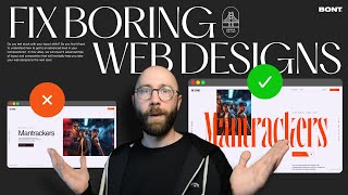
-- Today, I'm going to show you a new emerging UI design trend heading into 2024 that utilizes grid design much more than in the past. I'll feature 8 examples, and then my own custom design styled in the 2012 era, the present era, and finally with this new emerging trend.
Designs from the video, in order:
dribbble.com/shots/22694551-V...
dribbble.com/shots/22693255-M...
dribbble.com/shots/22694023-P...
dribbble.com/shots/22692764-G...
dribbble.com/shots/22691206-N...
dribbble.com/shots/22693802-E...
dribbble.com/shots/22687900-M...
dribbble.com/shots/22628998-C...
0:00 - Intro
0:49 - Design Examples
3:36 - 2012 Era Design
4:34 - Present Era Design
5:23 - New Trend
Let's get started!
#trend #webdesign #uidesign
- - - - - - - - - - - - - - - - - - - - - -
Subscribe for NEW VIDEOS!
Learn UI/UX: designcourse.com
My personal FB account: logodesigner
Coursetro FB: coursetro
Coursetro's Twitter: / designcoursecom
Join my Discord! / discord
^-Chat with me and others
- - - - - - - - - - - - - - - - - - - - - -
Who is Gary Simon? Well, I'm a full stack developer with 2+ decades experience and I teach people how to design and code. I've created around 100+ courses for big brands like LinkedIn, Lynda.com, Pluralsight and Envato Network.
Now, I focus all of my time and energy on this channel and my website Designcourse.com.
Come to my discord server or add me on social media and say Hi! - Jak na to + styl


Thoughts?
good work
This is such a new, interesting and unique way to design the hero section of a website. I would love to play around with this type of design. The layout generator is super helpful. Thank you so much for sharing 😊
Please add the links to the description.
@@tablomaxos2965 Done, thanks for the reminder!
I welcome any deviations from the safe and boring trends of web design.
As a Frontend Engineer, web performance fundamentals should become a mandatory segment for designers.
😂😂😂 let us dream
Frontend Engineers don't hire designers most of the time. And designers tend to rely on flashy portfolios, because they usually catch the ice. Are they usable? Maybe not. But for a junior designer it can work.
It's just Dribble and most of these Design will never be "executed".
I am both. Engineers should push back if it's unrealistic. Designers should respect the push back and focus on representing the brand, which includes pushing boundaries where need be.
@@videos6505 this fact is quite unique since these designs are actually awesome, it seems majority client are not brave enough to use these kind of style
I wish some designers knew that users usually visit a website for specific information or to do perform a few actions. All this noise in the design is just....... nope.. they look good, but that is about it. I wouldn't even know where to click to get started with anything.
Great video btw ❤. Thanks for sharing
A lot of these achieve what print used to do. It can ABSOLUTELY be done in a user friendly way. These are concepts. The whole point is to get the information people are looking for up front. Its up to you to know how to use grids, contrast, color and typography to make sure the eye knows where to look 1st, 2nd, 3rd. Its really not that hard.
These new trends are overwhelming, but my issue would be making some of these dynamic layouts mobile responsive(I'll appreciate a future video on that if possible).
I was just thinking this --- how does that look on mobile?! Surely it just ends up stacking again, and considering most people will view it on mobile, is it all that different?
i think from a response you might consider how the layout will adjust or even minimize features based on screen size and what you want the user to do
I agree. Too busy. Trying to fix a problem that isn’t there, just to start a new trend. They look like magazine layouts.
I had the same thought and I hope that @designcourse will make a video from covering this concern
@@stevetitch Well how else would you want the content to appear on a device with a screen size constraint, i.e viewing a site on a smartphone and in portrait mode? You will now need to present the most important information to the user and watering down and/or eliminating the excess eye-candy so that you give the user a more streamlined mobile experience. You will need to make the website more 'appy' if you want people to engage with it. Home page should be boxes with clear CTAs imo 🙂
All of these examples are exciting for designers, but for the average site visitor, they are confusing, busy, and cluttered.
Only if they're done incorrectly. If the pillars of design are respected, it'll work just fine. Grids, contrast, color, typography. Balance them effectively and you can do a lot more than put text next to a photo.
@@alanstowe2245 What do you think about the layouts in the video?
I've noticed the trend of "everything above the fold" coming back recently. This feels like the reaction to that. It's too busy in my opinion, and just like other trends it will probably fade out to something a bit more tame after a year or so
Exactly, looks very busy to me, and my question is, do these sites convert better than the ordinary sites?
UX leave the chat...
Might as well call themselves "Overwhelming and unnecessary as f*ck UI designers"
Not necessarily. Humans are complex intelligent creatures and the whole paradigm of UD and UX has I feel been very dumbed down over the years. There are no rules.
@@rickyanthony Your comment proves the fact that you do not know and do not understand what UX is.
First, read Hicks' law and understand the fact that a clutter of elements does not simplify, but complicates the user's scanning of the site.
And lastly, remember! All these methods of posting content are useless when today more than 70% of traffic comes from smartphones where everything is limited to 1-2 columns!
UX cries when see that design. Why?, they ask. For who is that? @Atractiondj thanks for understanding 💪
@@zadzadny Well, yes, you are absolutely right. When can you convince the biology of the eye that a frame of 100 pixels does not look larger than a circle of 100 pixels! And in order for the optical circle to look the same size, you need to make it 120 pixels and then to the eye they will appear the same in size. Then ask who I am and why the laws of the UX were written for a reason and why they must not only be read, but also understood how they work!
А до тех пор закрой свой рот хохол!
I love how videos like this conserve our culture with contex for people in the future.
I like the very narrow gutter widths, especially on the first example at 1:00. It's really futuristic how the hero section almost touches the navbar but it still looks right
Thanks for the new video! I’m looking forward to seeing what other content you post! Always good to learn as much as you can!
The difficulty with these layouts is you really have to decide in the wireframe stage that it's the design style you're going to use, because you need more content than on a standard hero.
I agree with this one. Everything has to be deliberate for it to work.
All design should be deliberate. That's kind of the whole point.
@@alanstowe2245 but that doesn’t work on a client site that uses a CMS. They can add what content they want.
It's always nice to see more creative approaches to the hero section. However, I'm not sure how this can be adapted in a mobile screen without losing legibility. Or rather I'd say, it hasn't yet been figured out maybe.
.
It could also be a cool topic for a future video, where you attempt to convert similar hero sections to mobile screen sizes. I'd definitely love to see that video.
2:16 reminds me of the Macromedia Flash animation days, but overall I do like the use of bold colour and typography scale
I hope we get some changes like this that work. Most of the time, I just skip over everything on a website and go straight to what I need. We might as well just put the menu as the hero image.
If we can get with the coders on this and do testing to make sure the experience is good, we can make some great new designs 🎉
Great stuff ... great to see David Spade on the cusp of Design Trends ...
Luv those first two in particular! Great colors also in the first, will try and recreate a demo similar to
As much as these designs are slick, explorative, and eye-catching, I can see some of them being a bit tricky to build whilst remaining responsive on mobile. Figma is one thing, and development is another.
Great designs, especially layout elements positionings. As a developer, it would be arduous to implement and make it responsive but this can be solved for high cost and significant time.
Glad to see a web designer open to the new!
Love to see designs on dribble. This guys think outside the box. Even though this is not perfect, it will be nice to tap into there creativity and create designs thats aesthetically and also works in terms of ux ❤❤
I extremely like the video, man. Very helpful and informative. Thank you very much. It is presented so well too. Great, positive work.
This is a fantastic video. It's clear and easy to understand your explanations. Thank you for providing this information.
It looks more like a magazine than a website
Also, I think it would be a nightmare to make the new design mobile friendly
I agree. A responsive design with breakpoints I don’t see it working unless it’s in columns and rows but with hierarchy. Some of the designs have the biggest element lower on the screen. Would make zero sense in responsiveness
@@dcarter_uxin modern development you can just make two different components to show for different breakpoint - so design for mobile might be completely different
@@indexzet yes i understand you. but imagine seeing that transition on desktop. on phone you would never know. meh. still...no me gusta
@@indexzet Its easy enough to make the design responsive by simply add or remove content, but that is if the desired approach it begs the question: why design it in such a way in the first place? Content is king. It reminds me a bit of architects who go well and beyond to create the most impressive buildings, however, completely seem to forget the fact that said building actually is intended to have a purpose beyond looking pretty.
There is a quote by Steve Krug that has stuck with me: "If your audience is going to act like you're designing billboards, then design great billboards." His quote is in relation to user's tendency to scan content for what they're searching for. These designs are the opposite of that with a lot of secondary and tertiary information sprinkled all over to create a visually interesting design. Admittedly a lot of these look great great, but from an UX point of view I am almost 100 % sure they would score significantly lower.
@@denhaak8792 These designs have a LOT in common with billboards. I was thinking of billboards and magazines while watching the video.
For me this trend is a big NO. Not only it lacks one important concept of design, which is hierarchy, but it also distracts the user. Definitely too busy and confused for my tastes.
I didn't see a trend but a regression.
It's not for the user, it's for Dribbble
What a brilliant video. Great advice, simple and practical.
interesting approach. it first comes to my mind to see mobile - everyone still focusing on these flashy desktop designs but how do they look (and especially feel on mobile?). lately i love to focus on going back to super simple designs and making the site as accessible as possible in comparison to flashy. I've seen a lot of results lately where a "better looking" site performed way worse than the previous version.
Something not being discussed enough is this: how do these designs translate to mobile? Especially when optimizing for conversions. Great final design btw
Hi, great stuff but I am worried about the fact that such layouts might make users work to find content while on the other hand the typical "template-y" layouts do the work themselves and users don't have trouble finding information. Proceed caution when creating such layouts that are on dribbble and make sure users are able to find information that is important
I guess this new trend it's more like a magazine type of layout. It requires more attention but it delivers a more compact message. If the text is written well, it can really work.
It’s actually considered the bento box design concept.. designers are trying to mimic Japanese styles for grid layouts. It is not really new, I saw other designers trying to figure ways to use this 6 years ago. It’s only becoming more useful with flex box and mimicking some native app layouts to the desktop. Also very print like approach.
Ah great, I just searched "bento box web design" and I see what you mean, thanks a lot!!
I'm getting tired of bento box design. It's everywhere right now.
Designers have been doing stuff like this in magazines for decades. Its not mimicking Japanese grid layouts. Its just using grids, first year design class stuff. Highly recommend reading Making and Breaking the Grid to prepare for the future.
Interesting concept but probably a waste of time for the vast majority of websites unless you can prove it makes a noticable impact on conversion rates. Across the sites I run, desktop traffic generally acounts for 25-35% of total traffic, and sometimes as little as 10%. There are exceptions, but this is very much the norm. If you have plenty of resources and a much higher percentage desktop traffic than usual go for it, but otherwise it's silly to spend the extra designer and developer time on something most of your users won't see.
5:20 - I think I would prefer to have a green stamp kinda design (not sure what it is called) saying eat fresh or healthy which would be spinning in the place of "Eat fresh..." and change the truck image to someone happy eating food. As seeing someone happy basically makes the brand look trustable.
I am just starting the design of a new website for a plumbing company, I am going to give this a shot, thanks
Omg! I was not subscribed to your channel all this time... thank you for all the information, I am not a big fan of this new trend but maybe I need to experiment a little bit more to get used to it
That Cereen Magazine layout was beautiful.😍
🎯 Key Takeaways for quick navigation:
00:00 🎯 Web Design Trends Introduction
00:52 🌟 Example 1: Dynamic Hero Section
01:45 🌈 Example 2: Typographic Emphasis
02:41 🌀 Example 3: Busy yet Dynamic
03:35 🕰️ Evolution of Hero Sections
05:13 🌐 Future Trends in Hero Sections
Made with HARPA AI
Great content ! Thanks
Interesting layouts when viewing on a desktop but how do these look in mobile screen view?
Great video, also your explanation. Now I have to adapt all that information into an phone app
Some of the designs really look very clean
I like some of these from a design perspective, but most of them are a bit too busy and cluttered. And it is challenging to implement these as a template system with a set of rules i believe while maintaining recognizability
what about structure of the website. do you think the format is still the same? Hero > Services > about > benefits > testimony etc etc ?
Hi garry do you have the link to the other video? please... Thanks😊
Thanks for the cool video!
Should we call it a Complex Asymmetric Hero/Header layout trend?
Thanks for sharing!
New to UI here. What program is being used during the ecoeats review? 4:52
How do those respond to the mobile aspect ratio? They look really cool and innovative on desktop and please do a video on the mobile half
I think we should think more about the end user and how it converts rather than a dynamic design or how bad an old design might look.
As a direct marketer who builds websites for conversions my first thoughts are ahhh overwhelming.
I really like this design style
2:28 ‘Welcome’ is back! I’ve missed you my old friend.
I'd like to see some of these layouts in a mobile form. I'm generally mobile first at the moment (even though I prefer how desktop web design looks!)
How can I make the empty space in a div like that website example num 4. I tried everything and the only thing worked is clip-path which is complicated to place and set sizes
At this moment, I don't know if css frameworks starters still gonna work. I don't yet using prototyping ux designer like figma, just straight up in coding. And this design gonna take longer to built. The way the current treands are like this is because partially thanks to css frameworks and templating engines or front end frameworks. But with this, we might gonna back on traditional web built instead of cms and api assisted websites.
These more dynamic hero sections have a higher “delight”factor ✨ it’s our (designers) job to find a good balance with usability. I’d love to see a video on how this trend is applied on mobile as all the examples I find are desktop size
Yeah which is important in todays age. Attention is everything
But Usability is important too
bento design with this is so good
I like them but some are a tad busy. I think that comes from most likely many being design exercises for portfolios as opposed to live sites?
I love new things, innovations and ideas that are coming up every once in a while, but to me this is not really it. I love keeping my hero sections extra simple, no extra clutter etc. 🤷♂
It seems to be mostly inspired by that Apple trend where they throw in all their specs onto 1 blocky grid. It works for those presentation/video purposes but those examples are way too cluttered and a hell to make responsive..
What you said at about the 5:15ish mark - the second example might perform better than the third even though the third is more current. So many people wanting websites/apps would look at the two examples and immediately want the new trend even if you explain that the second option would perform better. It's frustrating as a consultant to implement this way.
I would be interested in how these beautiful websites are handled in terms of architecture and content structure. Mostly, I have the impression that everything the page contains is included right away in the hero sections. What comes next? Isn't it a mistake if the content that is already published in hero sections is repeated?
Does anyone know a channel that focuses on the implementation part of these kind of outstanding designs?
i love this photography 😁
What is the software you are demonstrating can you gice me the name please?
I love it!
Really like the Cereen style
Respectfully, what a mess these things are. If you want to persuade your visitor to take action, then keep the steps obvious and simple.
The skill is in managing the content to make the message obvious. Keep simplifying until everyone can understand your message and you will start converting.
KISS … always
What do you mean by that VR design is Dynamic?
But how do these transform for mobile view? They end up being stacked anyway isn't it?
And as much as I love desktop designs, most of the web traffic for most clients is through mobile. So is it worth going through all the trouble of developing such a complex design?
I think dribble designers and these concepts look good as concepts and design but might work well for everyone's time and effort.
This is really interesting, but im not seeing large businesses do this? I feel like the cutting edge design community and enterprise organizations are in seperate head scapces in terms of web design. Maybe they are a couple years behind?
Could you kindly show the third design in a mobile view 🙏
I wonder how all of that might look on mobile devices and how manageable it might be in CMS
Прекрасная супер связка. Спасибо, что поделились.
It’s quite dynamic, one might say
These have a lot of similarity to print design and such. They look great, might be usable but as said, will be nightmare to make responsive / work with mobile etc.
Can you paste a link to some of the best websites that has these kind of ui design template
Really interesting designs, but are these "mobile first" designs? As part of your review it would be nice to see the mobile version of the design as well, especially considering that there was a ton of info and design elements at the top of the page. It would be interesting to see how that translates on mobile.
Ye. It's specially important for SEO purposes too
I too wish reviews like this talk about mobile.
That said, I've seen a few modern websites omit certain paragraphs on the mobile version. Like a 3 column Header and Paragraph layout will keep the Header and hide the Paragraph elements on mobile so they can reserve some of that horizontal flow.
These designs are overwhelming
How do all these designs work on mobile?
I am missing the "where this would make sense" as part of the video. To be more precise understanding the need that led to this design to appear.
I actually liked the first Eco Eats version with the dark overlay. It’s simple and my eyes don’t need to go all over the place.
Interesting looking trends and these look cool, but not really my cup of tea for websites 😅 I'm having a hard time knowing where to focus first and where the design wants me to look next, it's just too overwhelming and busy in my opinion. BUT, when done right, I think this new look could still work, if it's not super busy and it's kept simple. 😄
Same.
I tried to look for same design but I couldn't find it is Possible data can borrow the design file
These layouts looks nice on Desktop but what about Mobile User experience?
Its dynamic!
Falls in the II category. Interesting Interfaces!
its looks to me so complex, and I belive its also hard for the user to adjust this tyoe website
I love how designers use old therm negative space as white space, even if its not actually white :P
Nice designs, but for a header area some are way too busy for my personal taste.
Have a huge problem with these layouts. They make finding content you are interested in hard. Imagine doing the first design for a startup - visitors need to process a ton of info before getting to the product that the startup builds and evaluate if its useful for them.
I like the look of most of these things. But I really feel like most people doing this stuff don't take into account the amount of WORK it would take to make not only these layouts look accurate to the design, but also make them work on multiple devices. I think most of these designs should provide a respective mobile version
Can we see a mobile version of this trends most of this trends i dont see their mobile version
Those examples look nice at a glance but once you break them down they all seem to be loading so much information above the fold - probably not the best for a user first jumping on. That last one was more realistic though :)
It's like the 'poster designers' have finally come to web. Exciting times!
great designs for a few percentage of people viewing it on large 16:10 desktop screens. Otherwise it is responsivity nightmare and not usable for laptop screens at all. Plus, hero should not beat you with information scattered all over the place, no matter the perfection of the grid etc.
Readability first. Designers should have that in mind. You cannot convert just with a fancy-looking site. Don't get me wrong, all those designs are looking great, so as long as you can make it easy to digest for a user it is okay. Some of them are too much cluttered.
I'd like to see how a lot of these responsively scale to smaller screens. I've hand-coded a few header sections that drastically moved text around imagery and it was truly an absurd and unnecessary waste of time. To me, it looked very cool and seemed worth it, but honestly nobody cares at all and that means it's truly not worth it. If you're working with dynamic content that's going to change, it's even sillier.
Looks like Bento grid are giing to be in Hero sections.
why don't you like using frames in your design gary?
I like the Bento trend on desktop, but I don't know if it'll translate well to mobile, given that's >70% of the user base. I've seen quite a few that looks great on big screen but turn in to a bore fest on mobile.
But how do u even make those corners without using a pentool (1:35) I mean, the shapes are on the image or as a background on the text? I just haven’t found the way to make them consistent in design, let’s not talk about code 😂