Unfamiliar CSS patterns that improve on the classics

Vložit
- čas přidán 1. 06. 2024
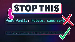
- Common patterns that get the job done are handy because if we come across it in a codebase, we know exactly what’s going on… but sometimes, familiarity holds us back. I get pushback when I use new methods to solve things we already have solutions to, but I don’t do it just for the sake of it, I do it because I feel like the new ways are better.
Plus, some old patterns, like declaring `flex: 1` on all the flex items to have even columns isn’t exactly common sense, it’s just something we’ve grown familiar with because it works, so there’s no reason other somewhat strange (at first glance, anyway) solutions can’t become common patterns over time.
üîó Links
‚úÖ My video explaining the * 999 flex switch:
‚úÖ Every Layout: every-layout.dev/
‚åö Timestamps
00:00 - Introduction
00:50 - using width: min() for a wrapper
04:30 - did you never start using arrow functions in JS?
05:10 - Using custom properties to make things more readable
07:48 - main with sidebar
11:00 - main with sidebar where the breakpoint is based on one of the children’s size
14:45 - The flow class ( * + * )
21:00 - why is flex: 1 for equal columns not considered bad practice?
#css
--
Come hang out with other dev's in my Discord Community
üí¨ / discord
Keep up to date with everything I'm up to
‚úâ www.kevinpowell.co/newsletter
Come hang out with me live every Monday on Twitch!
üì∫ / kevinpowellcss
---
Help support my channel
ü뮂Äçüéì Get a course: www.kevinpowell.co/courses
üëï Buy a shirt: teespring.com/stores/making-t...
üíñ Support me on Patreon: / kevinpowell
---
My editor: VS Code - code.visualstudio.com/
---
I'm on some other places on the internet too!
If you'd like a behind the scenes and previews of what's coming up on my CZcams channel, make sure to follow me on Instagram and Twitter.
Twitter: / kevinjpowell
Codepen: codepen.io/kevinpowell/
Github: github.com/kevin-powell
---
And whatever you do, don't forget to keep on making your corner of the internet just a little bit more awesome!


20:00 I'm a data engineer that likes to build simple frontends for backend services, and for someone that knows programming but not much css, your version with the custom properties is much more clear than the flex: 1 version.
Your channel has been my first and principal source of advanced frontend content since I started my professional coding journey (I started in cloud engineering). I’ve always found your solutions straightforward and reasonable. Maybe it’s because I wasn’t taught the old ways.
The updated wrapper just solved a problem I've been fighting with. By changing it to 100vw - 4rem it allows you to nest wrappers (of different max widths) within each other without having to reset padding on the inner ones.
plus one - I just used it and it's a charm!
15:17 omg, people say everything is unreadable, if that is unreadable, then you are probably illiterate.
that's totally readable the moment when you look at it. if someone cant read that, then they shouldn't be writing CSS anyway, they will make a mess.
18:48 amazing, never thought of that, really cool, amazing
this channel is fire absolutely loving it
the lobotomised owl is a classic
Don't sweat the immovable objects, Kevin! I started my CSS journey after reading Zeldman's book in 2003. I was set in my ways for sure, but have learned so much from your videos. Now I love learning new techniques! üôè
this video is the main reason why I subscribe to you, you give out alternate ways, new ways to do accomplish requirements.
Chapter 5 (07:48 - main with sidebar) took 2 hours from me. I had to learn other things to understan this part. Now I am better than yesterday :) Thank you Kevin Powell
I’m on your side, Kevin. I had come across the flow setup before, but only last week dug into it, reading Heydon Pickering’s original A List Apart article about it and then Andy Bell’s description of the reasoning behind it. I’ll admit…it’s odd looking, but once you study things like this, they actually become familiar. Nothing becomes familiar until we’re curious to learn more about it. And then, the great part happens where we can make use of what feel like these new great powers…all because we want to get better at laying out our sites. Thanks for this one. It was timely for me.
7:44 is the reason why I follow your concept. thank you.
Yeah, I always go my own way too. I want code that works really well. And I think the readability of your new code is just fine.
Omg people can get mad about the dumbest things lmao. For me the more ways I know of how to achieve something the better
Hey man, don't sweat the criticism too much. The value you add is great. I'm always either learning or getting inspired with your vids.
Yeaaaah! I needed a fallback for container queries! It looks like this might do it!
The use of 'padding-inline' in your first example can also be used to to approximate cqi by subtracting custom props from 100vw.
Don‚Äôt worry about the negative comments. All of us can learn from various approaches to CSS solutions. Your videos are always informative and help to explain what‚Äôs going on. If someone doesn‚Äôt want to use an idea, they don‚Äôt have to. It‚Äôs really that simple. Keep the videos coming üòä.
Kevin: I started web dev in 95, I have always hated CSS because of how it was impossible to control scope and make CSS maintainable.
I stopped doing web dev about 5 years ago and been doing backend dev since. Recently though I started working on a personal project using web tech. And you know what? It is amazing how much better CSS today than in my past.
The reason I commented was to say your approach to focus on maintainability is SO MUCH BETTER than those old ways of doing CSS. Ignore the haters; what you are doing rocks!
I have something similar set up as a custom property -max-width: min(100%-2em, 1120px);
Then I use that on my width: var(-max-width);
I agree that ppl are only mad because they aren’t familiar with it. And who is “mad” about it anyway? That’s silly
This is good. I'm glad you did an extra video on it because I missed it the first time. I'm going to start using this solution myself.
I am here for Brother Kevin's sermon. An attribute of a midlin artisan (ie programmer, designer, song writer, etc) is to fall deeply into a comfort zone. The patterns presented here are great, but the thought processes and reasoning is even better.
2:29 meanwhile what i do is:
display: grid;
place-content: center;
grid-template-columns: 2rem [content-start] minmax(0, 1160px) [content-end] 2rem;
& > * { grid-column: content; }
i find it easier to deal with, easier to modify later or add new stuff.
tbh, these days i keep finding myself adding `grid` to everything, maybe i make it the default * { display: grid } üòÜ
I actually do something very similar a lot of the time, but I've already looked at that in a video recently and I didn't want to revisit it, though maybe I should have mentioned it :)
I like to do grid-template-columns: [full-width-start] 1fr [content-start] minmax(0, 1160px) [content-end] 1fr [full-width-end];
That way I can do grid-column: full-width; on the elements I want to to touch the edge of the browser window.
column-gap: 2rem; or whatever handles the gutters
‚Äã@@iseudom same, i just kept it simple and matched it the example in the video.
normally i use something like this:
[full-start] .5em
[wide-start] 1fr
[content-start] minmax(0, 40em) [content-end]
1fr [wide-end]
.5em [full-end]
i find it easier to write space on the sides by hand so i can do stuff like these:
grid-column: wide-start / content-end
grid-column: full-start / wide-end
etc.
I feel like the extra protesting makes it seem hard to believe. I mean that in a constructive way. Dont worry too much if some people disagree.
Hey Kevin jumped right in ‚ù§Ô∏èüôè Thanks for making CSS easy for everyone üôÉ
Any code is readable with the right documentation!
The nay sayers have tired brains and feel challenged by new ideas, their response is to get angry with the person challenging their ability to think which is highly inappropriate. Also, they seem to lack the confidence to just analyse something and think "I see what you are doing there but I don't think that approach is for me" and just leave it at that, probably because they see you as an authority figure that they perceive they have to obey. There is more than one way to skin a cat is the old saying, which may not go down so well with the young ones, but there you have it.
I like your clever approaches to some things Kevin and utilise some of them, while other times I'll go with something else I have learnt. It's all good. Thank you for sharing your knowledge and your ideas, I really appreciate your teaching skills.
Thank you for these options, I especially love the flow one.
I come from Poland and I've just read your newsletter from two weeks ago - I don't know if we all like CSS over here haha (I know I certainly do), maybe we just like competent people that share their knowledge in a straightforward-no-BS way, idk. Much love from central Europe
Apprentice here. The wrapper version I learned early on in my vocational training has a ralative width (%) with a max-width and margin 0 auto. Though currently I use the layout grid setup you showed in an earlier video (with some changes) and further devide the content area into whatever number of columns is in the designed layout (the gaps are columns as well) with line names from column-1-start/end to column-N-start/end.
Not sure about that sidebar setup, but I adopted the flow class when I saw it in your videos, together with a version of CUBE CSS. I'm just waiting for FireFox to support @property, so I can make --flow-space non-inheritable. Right now I often have to reset it to the default value (1em).
Btw, while em values are used they rarely come to play as described here (giving headings a different top margin automatically etc.), since my text is usually divided up in other elements. So 1em often just means browser default (16px).
hei kevin! love your stuff! was just about to comment the small error at timestamp 6:18 until I saw the correcting hehe. keep the videos coming! best way to wind down after a long day
I’ve coded for over 20 years and I’m all for readability, simplicity, and “correctness”. Dotting every “i” and crossing every “t”. That’s what makes coding fun for me.
That being said, there’s nothing more frustrating than a developer who *has* to do everything by the book without reasoning about things case-by-case with an open mind. Sometimes “breaking the rules” results in the best code.
what would you do if you don't want the padding in that case?
Excellent video, very useful, thanks Kevin.
hi kevin, i am all for it. aside from maybe initial confusion while seeing unfamiliar code pattern, it is how i learn and up my css game. so kudos
Oh my goodness, this is brilliant!!!!
I usually call that “-padding” variable something like “-gutter”
In "ye olde days" gutter would be the space between grid columns (nowadays `gap` / `row-gap` / `column-gap`), so it might confuse some.
Maybe `--content-space-around`?
--virtual-padding, --reverse-padding? (*2)
I usually refer to it as on offset
I like the --gutter or --offset
And I hate it. Just use the more common terms, gap and padding
No matter what industry you're in, there's always some people that think the first way they were taught something is the best and only way it should be done. The best way I can describe them is they live inside an insulated box and will only let a select few feed them select information into their box. Your explanations are strong and, hopefully, box-proof! üòÇ
11:00 "Breakpoint based on the child's width" -- This will be very useful. Thank you üôè
They're all really useful tools to know about. I've bookmarked this video.
Also, using CSS-in-JS, I'd probably find a way to hide the complicated bits behind a function. I've barely used Sass, but I suspect you'd similarly be able to re-name/hide/organize the scary parts.
I really appreciate your raw-CSS lessons, but here I think that the critics are losing the forest for the trees.
I agree and like these clever solutions. I see only one issue at the moment. Lets check out the first solution (width + padding-inline). Looks cool, we can spare media query if we have only 1 breakpoint. What if we have more?
I was thinking about the lobotomized owl just before you brought it up! :) Another thing that other developers often comment on is that I don't nest my code. I use BEM, and nesting the code goes against the purpose of BEM. Except if a lot of code is affected by a modifier, then I think it's OK to nest one level to avoid repeating that modifier selector.
Kevin's a little spicy in this one. Love the ".flow" piece.
I actually used all of the ways introduced here except for that main-with-sidebar part. the owl way for adding spacing is also used on tailwind spacing classes and it works really well.
I get it because I've been watching for over 2 years so I can relate to the uncommon way. I think is the number of newbies vs people who are more open-minded. The question is if I came into your channel as a CSS newbie, would I want to learn CSS the uncommon way which looks to be the most efficient way like the way you do it, or the so call simple "readable way"? At the end of the day, you're the creator, it's your choice how you want to tailor your content. Cool part is there's always room to learn something new to learn here and I'm all for efficiency and whatever works.
Good points on content spacing in articles with the .flow example.
I've been experimenting with the CSS column rule and things become a little carzy when flowing the text across 2 or more columns. Let's say I looked like that labotimised owl by the end of it. Woiuld love to see a tutorial on this with all the styuling set up to space out headings and have everything flush at the top. I've succeded to a degree but I am sure their are better ways to do it.
I've been using that "sidebar" approach from Every Layout too. Not only for traditional page layouts which containa sidebar, but also components like cards, where there's an image/media left or right, and some other content. I'd rather use this approach over a container query.
I personally like your approach to innovation! I think the problem is that there are so many ways to achieve the same result which on one hand is good to have choices, but on the other hand it makes it difficult when you come across a new approach you've never seen before.
This is tha nature of coding and is the reason why we have we have 10 thousand frameworks, because the creators thought there way was better than what was available.
Hi Kevin,
First, thank you for your videos!
This type of discussions are very valuable!
You make great points... And more importantly, you are open to consider that in other situations the optimal approach might change.
Two questions:
A) On a work environment with high turn around of employees, with developers of many different nationalities, would you choose a verbose and imperative approach to the CSS commands? Or would still prefer a condensed and cleverly crafted commands?
B) Considering that AI will be helping us to write, maintain, and improve source code... Which approach do believe will lead to better collaboration with AI? Which approach with express our intent better to AI as it evaluates our code bases?
I agree if it works better - it is the way to go.
I don't agree no one will ever need to dig into the convoluted part and only need to change the variables, especially in the early stages of projects when requirements are likely to change or in case of some major overhaul.
Then again if you do need to go and dig in - it's a good thing, because there's a chance you'll try and understand it.
I agree with you, Kevin! I've been going through Every Layout again and taking thorough notes, and one thing that I think is really spot on with these sorts of approaches is that they highlight the importance of intentionality in your code. For example, not using padding in your wrapper is preferable because, well, we aren't trying to pad the content! We are trying to separate the wrapper from the outer document. Using padding achieves the same result to some degree, but the reasoning is backwards. Similarly with the flow example, we use margin-top because it correctly represents the logic we are trying to apply based on principles of typography. Using margin-bottom achieves a similar effect but, once again, the logic doesn't hold up under scrutiny, and you will end up with unwanted artifacts for that reason. We've come a long way from using tables and floats for layout, but stuff like this shows how there are still anti-patterns hidden under the umbrella of "common practice". The people who are thinking about this stuff and coming up with better approaches are helping us make the web more robust. Thanks for the video, Kevin!
Super interesting video!
In terms of performance, is it the same or do we gain a little?
For the --padding-inline variable or the space on the sides between screen and content, I always call it "gutter." That's more or less exactly what it is, plus the name is nice and short.
Hi Kevin, great video. When you were talking about documenting CSS properties, could you please share a document that you created for any project or a video on how you would create documents for css projects that you do. ‚ù§
I'm with you on all of this. üëçüèº
Except for :where(:not(:first-child))), you're wrong on that one üòâ
Great video Kevin! Speaking of maintainability, what if I use tailwind, instead of writing the actual css properties? These same theories could still apply, but we probably wouldn't need to write anything in the css file.
What do you think about tailwind in general? I haven't noticed a tailwind related video from you yet (even if it was negative. :D). Sorry if I missed it. :)
Survived my first Kevin rant!
Spot-on. Good principle for life, not only CSS :)
I´ve been something similar to "flow class" for years now. Mine instead adds margin bottom to all children and with another call u can remove the :last-child´s margin-bottom if u wish. But i´ve been thinking it would make more sense to use margin-top, since then u can bring sibling selector into the mix if u ever feel like.
Learning is part of makes web development interesting. I do question the lack of padding in your first example, here we have two wrappers, the outer one and the inner one holding the content. The pseudo padding works if both wrappers have the same background, In practice I find this often not the case and would want padding on the inner container in many cases so the text does not "bump up" against the outer wrappers background,
I'm with you, Kevin!
Having the function `min` on the witdth with no max-width, it means that min() will be recalculated every time.
Max-width, avoids extra calculation.
It is much better:
Max-width:1160;
Width: calc(100% - 4rem);
Margin: 0 auto;
Better performance
Thanks king of CSS ‚ù§
Love the min() function! Who is mad at it?? Get on board bozos!!
Anyone saying "you're doing it wrong! there's only one right way!" is telling on themselves.
11:35 moving the elements around, it should be the same as (var(--main-min-width) + var(--sidebar-size) + var(--gap) - 100%) * 9999, which reads "when the sum of the main and aside and the gap is greater that 100% of the container, switch to column", which in my opinion is even less hard to read.
4:00 I thought the modern one is better because it doesn't set margin top and bottom to 0 as it they don't need to be, and it also doesn't use the padding so if you were to later on make another version that has some padding for some reason the original style wouldn't be affected, but ofc the argument of box-sizing is the killer blow haha
Hi Kevin, would you know how to do the same effect what dbrand has on their front page (the image overlapping each other) using css only? At first I thought I'd be easy, but I can't really figure it out.
Thanks
@KevinPowell there is `padding: 1.5rem` vs `width: min(3rem, ...)` in your preview, and padding is about x,y, but is not width about x only?
Sorry if I asked a dummy question, for the main and sidebar example, why we need to use flex, can we do something like `grid-template-columns: minmax(750px, 1fr) auto;`
I think you want to multiply padding with 2 to get the 4 rem .. on first example
Dropdown choice selection with search option that allow for multiple selection in html, css,Js. i.e. selecting multiple locations. Would be awesome.
Great video. Thanks.
And (regarding more space above a heading than below) it's "If you talk to any COMPETENT designer...."
I have dealt with many who think space should be even around headings. Both in print and online.
@6m as an og print guy I'd use something like --page-margins. Because that's what you got there, the margins of the page.
❤❤❤❤❤❤Great sir
Who dares question The Master?!
I think this approach is good if you are familiar with it or ar alone working on a project. I can definitely say if it's a team project, it's a bad idea.
As I understand it, containers shouldn't have any inline padding for the reason you mentioned - containers should be the true max-width of the page. Padding should therefore be on the section the container is in. If you follow that logic, the old way Vs new way makes no difference. Re the name for the non-padding padding - I'd go with gutter.
I'm totally with you on more complex / less readable CSS when it never needs to be touched again.
The reason I try to avoid hacky solutions is the fear that some browser might implement it differently one day or a new browser gets released with a new layout engine that will render the layout differently (backwards compatibility). Reminds me of the old IE days (I even remember when IE5 came out and we also had Netscape). Some cross-browser solutions were based on hacks. But also some of those pages didn't work so well anymore some years later as newer browsers came out. Apart from that, I like your non-dogmatic approach! üôÇ
14:45 In case of performance, which one should be rendered faster? .flow > * + * or :where(.flow > :not(:first-child))?
Hello, dude. You're burning rags again. From Siberia with love.
I use "--spacing" because that's what it does.. and it's a reminiscence of the spacer.gif of the good ol days ;)
My primary responsibility is writing software. CSS is a necessary evil (no judgement as the obvious value of CSS, but I sure wish there was a better way to handle UI). I'm absolutely amazed at all the new functionality that has been introduced into CSS of late. It definitely seems more complicated and I think that's part of the mindset when people see all these new commands and options in addition to seeing variables and calculations being done with the CSS. I'm sure there will be a time in the very near future where you can highlight a block of CSS and let some AI explain what it's doing, and even suggest alternatives. Even better would be a way to simply verbally state a design need and let the CSS change automagically. I'm hoping that time comes soon.
Love a good Kevin rant
can i use flow (with *+*) with tag body or reset css?
Custom properties or variables are better to use.
As the generic global style within the CSS can change for a particular section in the HTML style property.
I've seen use inline CSS to overwrite or separate style file for a page, duplicating code, which is bad.
Best is also to avoid the number of CSS files if possible (as they have to be wonloaded).
Love your channel. What do you always say in the beginning? Hello, my printN friends?
I believe if "front-end friends"
@@naturelovertx of course! Why didn't I notice that weird. Thank you
@@naturelovertxAlways wonder if he says : "Friend and friends" or "front-end friends"
My favourite new pattern to statically generate my HTML and then inject the .css files into my veins.. sorry I meant HTML style tag which is nested inside the wrapper div of my component. This allows the use of @scope to scope css to that component eliminating the need for classes. :scope targets the parent node of the style tag.
@scope {
:scope {
background-color: #bada55;
}
}
I'm using Bun.js to render the HTML on the server and handle the CSS files. No need to process styles or use Tailwind/CSS in JS (groce) and leaves the DOM structure super clean.
In the first example I would prefer padding on a parent instead of wrapper like body { padding: 2rem }
9999 is a bit hacky, but may be reasonable.
Lobotomized owl is gtreat!
Agreed - if what you want is padding, then use padding: it's semantically correct, and easier to understand. Equally, if you need the sizing properties of content-box rather than border-box, then use content-box. I love Kevins work though, and appreciate his effort ‚ù§
margin-online depends on the direction of the text, so it is better to use margin: 0 auto in the container
anyone knows where the explanation of * 9999 is ?
6:04 gutter or constraint
Whats your opinion on tailwind keeping all those cool new stuff from us?
I like calling the "--padding-inline" as "max-padding-inline" since it has a similar behavior as the max-width.
I would love to be able to inspect calc() values. It would also be powerful to have some kind of conditional operator in css calc()
Better name suggestion inline-spacing ?
I am torn to be honest. For me I always like to explore different ways of doing things plus I always try to keep up with current “trend”. If you work with others though I would never go that route simply because it is not like a problem has been solved and if you work with a group I would never expect anyone else on my team to think so much about reinventing
So you're trying to have function-like classes where you can change the input easily even if it comes at the cost of weirder code. Good point
I was lost when I first saw arrow functions and I will still write old function sentax, but guess it is part of my age but it also a speed thing sometimes. CSS does have some things that are slower than others, but most of it matters in how the selecters are or animation stuff.
I have to argue that @container or @media are less readable 99.9% of the time, due to it is in a different location. In the future this can be solved by nesting or using SCSS, but most of the time there is the main stuff, then media queries so they are still in seperate locaitons
"This will be documented somewhere ... I'll hopefully have a good thing [to write]"
-- every developer everywhere
CSS king üëë‚ù§
Noob question : what are the advantages to use a wrapper in section instead of using directly a section with width and padding ?
part of my goal for 2023 is to relearn CSS, it has really grown in recent years for someone that started using CSS as early as 2003 i am strugging to keep up.
I find offset to be a good name for the subtraction amount in max width.
Ideas for the variable:
--negative-space
--wrapper-gap
--wrapper-offset
Also, I appreciate your take on this because it challenges my thinking about doing things the "right way" all the time. It's hard to innovate when we get too rigid in our format of things.
I do have concern about accessibility to new learners with some of the patterns introduced but I think it's impressive the ideas that you've introduced to me and I think it's only going to make us all better to explore new ways of doing the things we've done before