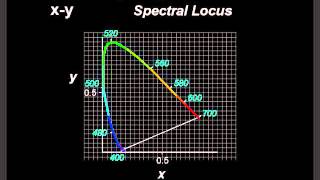
The Chromaticity Diagram

Vložit
- čas přidán 25. 06. 2015
- How colours are displayed on digital display devices. This video is designed to support lecturers in the classroom and aid students in their understanding. The video does not include narration as the explanation of the process is presented in purely visual terms in order to make the content more accessible.


This is one of the best descriptions of colour mixing using the CIE diagram on the internet. Thanks!
Whoever posted this, thank god you exist, and god bless you for what you have done! You have saved my ass on the science project I had to do.
Wasn't too sure about lack of voice over. But actually, very helpful video. Thanks!
Best description I've seen yet!
FINALLY!!! All the explanations never did it for me, but this does
Thank you! This was terrific. Finally understand "gamut".
it saves my time while preparing for exam. thank you
Amazing stuff. Thanks for sharing.
wow this is the proper explanation of Chromaticity diagram😊😍
great video
Great video and ngl that music slaps
awesome!
Very good.
If my monitor uses RGB how can I see the whole diagram? or are those not the real colors?
They're just approximations. The real colors would be "more intense" versions of what you see in the video.
Sorry for the late reply but you'd need a chromaticity diagram in real life which can in principle show all possible colors if you get a hold of good color pigments. Then you can draw a triangle inside the diagram to represent the computer monitor's color gamut and see how it is missing some colors.
The comment about pigments is misleading. Pigments/paint/printing relate to subtractive colour where colours are selectively absorbed from the illuminating light. The primaries for subtractive colour are Cyan, Mageneta and Yellow(i.e. the colours of ink used in printers). For additive colour (i.e mixing of light from different coloured sources) the primaries are Red, Green & Blue. Mixing additive primaries Red and Green together gives the additive secondary colour Yellow. Mixing all three additive primary colours together gives White. If we shine white light (made up of Red, Green & Blue) onto an object which absorbs all the Blue leaving just the Red & Green reflected we'd see the object as Yellow. By the same argument the other primary colours for subractive colour are Cyan = Green + Blue = White - Red , Magenta = Red + Blue = White - Green. The secondary colours of additive colour are the primaries of subtractive colour & vice versa. For subtractive colour mixing all three primaries (i.e. Cyan, Magenta and Yellow) gives black because a white light source (made up of Red, Green & Blue light) with all the Red, all the Green and all the Blue removed leaves no light i.e. Black. The reason printers use black ink rather than using a dot of each of the cyan, yellow and magenta ink is that black ink is cheaper and one dot stops the paper getting very soggy.
@@quadrplax They are indeed just approximations shown in the video for effect only. The colours outside the RGB gamut of any specific monitor cannot be shown by that monitor. Similarly there are colours that exist in nature which cannot be shown on a printed image using just CMY inks. Show an image with the same RGB values on two monitors which used different RGB gamuts and they will not look the same & each monitor would only be able to show a different subset of the chromaticity diagram colours. Colours outside the gamut are real colours though - you just need to use different light sources to produce them.
Thanks! Very interesting! How were we able to see the entire diagram in the video if our monitors can't produce all the colors in it?
It's a representation. Although if you had a super expensive monitor that could reproduce all of the colors of the diagram accurately, the difference would be small. Screens make a good job at creating colors using only three of them.
@@user4241 ah cool. Thank you
Cool
Simply Awesome. Thank you so much!
Clear cut explaination
how is gamma used?!? good video but I was expecting a gamma/luminance counterpart
think its literally just darker or brighter at a single spot, has nothing to do with choosing a color
I wonder why the science is so much complicated... if we have a monitor or light source that can produce all the colors at the apex of the triangle ie. 750 and 380 can't it produce all the colors in between the visible spectrum ?
Sorry for sounding so dumb. but curious.
Then you'd only be able to represent the colors on the line between the points corresponding to 750nm and 380nm on the chromaticity diagram. The key is that the possible colors you can create given a fixed set of generating colors is given by the convex hull containing the generators. With two generators, you only get a line, but with three generators, you get a triangle.
Ah, maybe you're wondering why colors add in this way. It all has to do with how we perceive color. Our eyes have three cones (L, M, S) which are sensitive in the 750nm to 380nm range but each have a different peak response roughly corresponding to red, green, and blue frequencies. Now all the possible colors you could see are represented by the set of all possible responses of these three cones together. The response of a cone can be represented by a positive real number (because it can't detect negative response). Geometrically, this perception space has the form of the positive octant of the three dimensional vector space R3. Combining two responses is more or less additive, so this can be represented by vector addition in R3 and you can take only positive linear combinations of vectors in this space because, again, there is no negative response. Now we can disregard brightness information to form the chroma space by projecting the vectors onto a surface of constant magnitude. This chroma space is now the positive octant of the surface of the unit sphere. Since we can only take positive linear combinations of vectors in the original space, the resultant gets projected into the convex hull of the projections of the original vectors in the chroma space.
P.S. we can measure the response of the cone triplet to all pure frequency light. This draws a path in the 3D perception space which gets projected onto a path in the 2D chroma space. The convex hull of this path is the chromaticity diagram you see in the video! People have further projected this sphere surface octant onto a flat plane to describe it more easily and then colors in the chromaticity diagram are represented by two numbers (x and y).
@@redjr242 Wow! what a great answer!
So dark green for example is not a color? Cause I cannot see it there.
This diagram ignores brightness/luminocity. For that you need a third axis, the Z axis. It technically goes inside the diagram.
what a music
Brilliant video, just wish it was a littler slower for my slow brain!
The pause button is your friend!
This is a "beautiful" video.
What do x and y represent??? This didn't explain anything.
check this series, explains how it got developped from the basics. czcams.com/video/iDsrzKDB_tA/video.html
This video uses the CIE Colour model. x & y are the normalised chromaticity co-ordinates used in this colour model . The values for x & y give a unique point on the diagram for chromaticity (colour). Using x & y along with a value related to the luminocity (brightness) gives a unique set of 3 numerical values to fully describe any "colour".