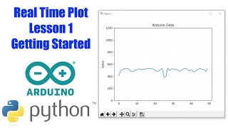
Plotting real-time data using Python
Vložit
- čas přidán 6. 09. 2024
- Learn how to plot real time data using Python. Here, we plot the live CPU usage percentage of PC using matplotlib.
Code here: gist.github.co...
------------------------------------------------------------
Explore my tutorials: nikhilkumarsin...
More awesome topics covered here:
WhatsApp Bot using Twilio and Python : tinyurl.com/y9...
Serverless Rest API using AWS and Python : tinyurl.com/y8...
Creating Chat Application using Flask, Socket.IO & mongoDB : tinyurl.com/y8...
Curses in Python : tinyurl.com/y8...
Discovering Hidden APIs : tinyurl.com/y7...
RegEx in Python : tinyurl.com/y8...
Python for Data Science : tinyurl.com/yd...
Introduction to Pandas : tinyurl.com/yc...
Introduction to Matplotlib : tinyurl.com/y8...
Introduction to Numpy : tinyurl.com/yc...
Functional Programming in Python : tinyurl.com/yb...
Python Package Publishing : tinyurl.com/ya...
Multithreading in Python : tinyurl.com/yc...
Multiprocessing in Python : tinyurl.com/y8...
Parallel Programming in Python : tinyurl.com/ya...
Concurrent Programming in Python : tinyurl.com/y9...
Dataclasses in Python : tinyurl.com/y8...
Exploring CZcams Data API : tinyurl.com/y7...
Just For Fun : tinyurl.com/y9...
Exploring AWS : tinyurl.com/yd...
Jupyter Notebook (Tips, Tricks and Hacks) : tinyurl.com/y8...
Decorators in Python : tinyurl.com/y7...
Inside Python : tinyurl.com/yd...
Exploring datetime : tinyurl.com/y9...
Collections in Python : tinyurl.com/yb...
Networking : tinyurl.com/y9...
Computer Vision for noobs : tinyurl.com/y8...
Python for web : tinyurl.com/y8...
Awesome Linux Terminal : tinyurl.com/y8...
Intermediate Python : tinyurl.com/ya...
Tips, tricks, hacks and APIs : tinyurl.com/y9...
Optical Character Recognition : tinyurl.com/yb...
Facebook Messenger Bot Tutorial : tinyurl.com/y9...
Facebook: / indianpythonista
Github: www.github.com...
Twitter: / nikhilksingh97
------------------------------------------------------------
#python #matplotlib #real-time


Excellent video. I just used this to plot some PLC based data which I'm retrieving with a Raspberry Pi. thank you sir.
@SolisPLC i would like your help on something similar that i am working on
Hi, Sir. i would like to know if it's possible to Plot live update of temperature using a thermal probe connected to my laptop.
when I run it on jupyter oy python3 I can't get the output
Thank you for the excellent tutorial. I am using PyVISA for reading and plotting real-time data from instruments, and this was extremely helpful.
1. Is this better then matplotlib.animation?
2. Won't the list you are appending to become very large over time? If so should you manipulate the list instead of the x_axis?
one option faster than use Matplotlib is pyqtgraph.
yes, its better to have a list with constant dimensions and change its values.
@@santyramirez995 Thank you for your comment!! I did what you suggested and it worked perfectly.
Best Ploting Tutorial
Thank you very mouch for this great tutorial! I just wrote a pgm on the RPi 4 and plotted the data of an acceleration sensor (ADXL345). It works very well, till a certain amount of data is measured. Then it is starting to get slower and slower. Is there any way to "delete" previous data to keep it on high speed real time plotting?
Can u do this with time-series? (Live updates) thank you
Superb
Thankyou for telling how to plot live data. KIndly explain how to plot live data from websocket .
Very clear and to the point. Thank you for sharing.
Can you do another video by plotting Real-time Stock Data as candlestick chart like this, that will be more interesting !
Excellent video, could you plot with Japanese candles using numpy?
Can we do this with random numbers between 2 values ex (80,200)
How can I plot the same for a specific process id?
Good video,but is there anyway to get stock price data continuously through yfinance,and the graph will go plotting continuously ...
For example, when plotting 5 min chart, is it possible to make yfinance update the stock price data next 5 min continuously? And the graph plot the new data continuously. (Ps: similar like how tradingview works)
tried to run this under spyder3 ... I don't get a graph (did set iPython Console > Graphics > Backend to Auto)
Hi, Could you please tell how to reverse the specific setting which you have done, or rather can they create any problem if kept unchanged to normal.
Very nice tutorial from our buddy
This is amazing. Other tutorials had you recreate the entire graph each time, for which in complex situation you would have to convert functions with loops into yeild. But this solves that. Thank you!
Nice video...
I have a folder where new xlsx comes in every minute. Each xlsx spreadsheet has many tabs. I need to real time plot the data. How can I plot each new xlsx that comes and each tabs data. Thanks
Hey Thanks for your video. Could we plot a graph for velocity with time for a bubble rising in column in a similar way. I have tracked the bubble using MIL tracker and have calclated the velocity in fps as well. Need some help in thos regard. Thanks.
Is there any way to do the same but, with the plotly library?
I need the same animation, but with the interactive part. Thanks.
Thanks for The video! How can I use a slider in a real time graph like that using matplotlib? I'm trying to use a Button to pause the real time plotting and a slider to adjust x limits after pause real time plotting but I'm not getting sucess adjusting x limits. Do you have any solution for this problem?
Nice.
Thanks
how can i use this code in pure python3, i.e, without jupiter?
I tried unsuccessfully with matplotlib.animation.. I am also looking to see this coded in pure Python 3.
Here is my code that ran just fine without jupyter:
import time
import psutil
import matplotlib.pyplot as plt
fig = plt.figure()
ax = fig.add_subplot(111)
fig.show()
i = 0
x, y = [], []
while True:
x.append(i)
y.append(psutil.cpu_percent())
ax.plot(x, y, color = 'b')
fig.canvas.draw()
ax.set_xlim(left = max(0, i - 50), right = i + 50)
time.sleep(0.1)
i += 1
It's basically just his code minus the calls for running using %matplotlib notebook and the rcParams setting.
If you are having issues with the window not opening, run this:
import matplotlib
print matplotlib.rcParams['backend']
It will likely print Agg which is a non GUI backend. Install Tkinter and it should work
Hi how will I use this for emg sensors?
Cool. Sir but when i do this in jupyter notebook and scroll up and down it sort of distorts the pot
how to plot real time data from a web site or a web app . to predict next values. . .
great.
Hello, thank you for this video, it's a great job !!
I would just ask if it's possible to do the same with subplots where I plot four time series in four different charts simultaneously ?
Awesome! Thanks...
can we make it faster?
oh man you save me
thanks for such a nice video
how can we create the continuous series for a time in second and plot it
How to make animated economy statistics?
Awesome!
Does this embedded into webpage?
impressive!!
but is it possible to combine with flask ??
I will try to make a tutorial on it soon.
Cool! Thanks for posting this video!
your awesome ...thanks for this video !
sir how can we display this plt in html page
Works fine well done!
very helpful, thanks a lot!
Nice video and explanations!
impressive!!. helps a lot, thanks
super useful
thanks
Whats is max sample rate for this code? God work.
Thanks a lot how about x axis is Time how can I deal with that please help format is string
In real time plots, the x-axis is the time which has passed since plot started. We do not use the absolute time there (unless required for representation purposes). If you have time in string format and want to show in x-axis, you can use xticks function in matplotlib. (czcams.com/video/O9H_AGjnjNk/video.html)
The above suggestion is when the time intervals are the same b/w all datetime samples. If that is not the case, try this: stackoverflow.com/questions/9627686/plotting-dates-on-the-x-axis-with-pythons-matplotlib
Indian Pythonista thanks for making my life easy
thanks bro , i am getting an error as
"matplotlib is currently using a non-GUI backend, so cannot show the figure"
the graph doesnot appear but once i stops programm running it shows graph.
I am working on spyder and i commented the macro you used because it was giving me invalid syntax
The current implementation is for jupyter notebook. With some small changes, you can use it with simple python scripts as well. Use this: gist.github.com/nikhilkumarsingh/142b29604acba61e8cb1b997bbb8dd3c
Can i run this kind of run time programs on Spyder. I am getting a static graph always. It's not moving be it a slider or be it a scrollbar
Hi, I had exactly the same problem, I made some modifications to make it work, but in essence it does the same than code of this video.
Notes:
- Spyder´s prompt can´t show the real time plotting, you have to run it in another python interpreter to watch it updating.
- 'interval' argument defines in millisecond the time of refresh.
Code:
import matplotlib.pyplot as plt
import matplotlib.animation as animation
import psutil
fig = plt.figure()
ax = fig.add_subplot(1,1,1)
x, y = [], []
def animate(i):
x.append(i)
y.append(psutil.cpu_percent())
ax.plot(x, y, color='b')
fig.canvas.draw()
ax.set_xlim(left=max(0, i-50), right=i+50)
ani = animation.FuncAnimation(fig, animate, interval=100)
plt.show()
@@santyramirez995 maybe I think we need to integrate it with some kind of front end to make it dynamic. Not sure how, as of now, but there is also one more option of using plotly
@@santyramirez995 This worked perfect. Thanks a lot
How can I get memory usage like this one ?
could you please help me to plot real time data from file that updated every second, thank's
hello i wanted to ask about a wav file (sound).. is it possible to plot time vs frequency data and save it to a text file?
Yes
Amazing!
File "CPUgrph.py", line 5
plt.rcParams['animation.html] = 'jshtml'
^
SyntaxError: invalid syntax
what is this whole line about?
you forgot an ' at the end in ['animation.html]
I tried it, my process crashes after 3-4 seconds pass. Any reason why I get program is not responding error ?
I am getting same error, too :(
U saved my day!
Good job, thanks ;)
Which OS are you using
Do you have one to plot live stock market data in real time? Thanks.
It is not that difficult. All you need is data in correct form.
this is cool ! thanks~
thnkz!
How to generate random data points in one second and plot them in real time ?
use random module..
It works for a while, but right before it gets to the moving graph part, it says aborted (disconnected). The 0 part of the x axis doesn't shift. I copy pasted the code from your link below to ensure it wasn't a typo. Maybe it's graphics issue with my PC?
gist.github.com/nikhilkumarsingh/142b29604acba61e8cb1b997bbb8dd3c
Can you share the complete error message here?
Can I make a similar one for Bar graphs
Yes! I am planning to make a video about it soon. Till then, you can search for "animated bar graphs"
@@IndianPythonista
Thanks
Please make it soon
when I searched animated bar graph for python no results was displayed only they show how to make that animated graph you already show in this video
cool..
stops after sometime
This no longer works
you have a bad microphone
This no longer work UNLESS you add "fig.canvas.flush_events()" after "fig.canvas.draw()"
Bro you literally saved my life
how can we view previous data from the live graph?
I don't think you can go back in a live graph (but I might be wrong. I'm not very good at matplotlib yet. I'm still just learning it. 😊)
Here's another option: create two subplots and only set xlim for one of them. For example:
fig = plt.figure()
ax1 = fig.add_subplot(211)
ax2 = fig.add_subplot(212)
fig.show()
i = 0
x, y = [], []
while True:
x.append(i)
y.append(psutil.cpu_percent())
ax1.plot(x, y, color='g')
ax2.plot(x, y, color='b')
fig.canvas.draw()
ax2.set_xlim(left=max(0, i-50), right=i+50)
time.sleep(0.1)
i += 1
thanks