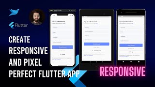
How to Make Responsive Flutter Apps, Pixel Perfect

Vložit
- čas přidán 28. 07. 2024
- Using scale to make it responsive
Join the Design 2 Flutter Challenge at: / challenge_1_social_med...
Download start project here: github.com/happyharis/social_...
Join the Discord Group: discord.learnfluttercode.com
👉 Subscribe to our weekly Flutter newsletter:
learnfluttercode.com/newsletter
📱 Pre Sign Up to Learn Flutter App :
learnfluttercode.com/app
Check out our website - learnfluttercode.com/
🔥 Check out our courses -
🖼 Learn Flutter Code Instagram:
/ learn.flutter.code
🖼 Learn Flutter Code Facebook:
/ learn.flutter.code
Haris's LinkedIn - / haris-samingan-7889b9140
Haris's Twitter - / thehappyharis
⏰ Timeline:
00:00 - Introduction
05:37 - Breakdown of User Stats UI
06:07 - Spread Operator
08:46 - Test with iPhone Pro Max 11
13:50 - Summary - Věda a technologie


This is a great series. Learned quite a lot. I wish these types of videos continued.
i was searching for these explanation for months. I'm glad you came with it
Thanks great explanation
That perfect pixel plugin is pure gold 🪙
Thanks for sharing, excellent video 👌
Thank you!
More responsive videos please 🙏🏿
Can we calculate mockupWidth and mockupHeight dynamic because you have set this for only iPhone 11 pro but I need pixel perfect in all devices.
great tutorial
Safearea has a minimum parameter which could technically be used instead of padding.
do you have any idea how flutter handles this while maintaining image quality? does it apply an antialiasing algorithm?
also, do you know if this is good performance-wise or not?
thank you
It will work for sizebox heigth or any heigth parameter how can we use it for heigth of widget for responsive ness
What is the add-on used to only remark the error line with it message instead of the entire widget?
its perfect design but what we do other phone resolution ?
interested! subscribe, thanks dude this video really help full 👍🏻
Background music?
The same ratio in text /mocup then * width
To the test scale width /mocup
How to adjust that picture according to our screen , so that it fits according to our screen height and width
Try to use Fittedbox it might help
You can use fit: BoxFit.fill or BoxFit.cover (this is better option), and FittedBox is most likely to use with Text widgets.
👍👍🔥
God bless you
Adding padding before scaffold results in black bars from all the sides. any solutions?
u should follow scaffold - safe area (top:false , bottom:false) - padding - etc...
This scale factor like text scaling should be called Adaptive not Responsive.
iPhone 12 pro works fine, but not iPhone 12 pro max.. ouch!
i didn't like, cause u need exactly the size of the screens.. it would be nice if just take the dispositive viewports and make the calculus automaticly
do you have any resource that explains how to do that??
Didn’t like the pixel perfect approach… It doesn’t look professional
May I know what are the other ways to achieve this. Any url?
Hh