Stop Using Pixels/Rems/Percentages To Define Widths In CSS

Vložit
- čas přidán 29. 06. 2024
- 🌎 Find Me Here:
My Blog: blog.webdevsimplified.com
My Courses: courses.webdevsimplified.com
Patreon: / webdevsimplified
Twitter: / devsimplified
Discord: / discord
GitHub: github.com/WebDevSimplified
CodePen: codepen.io/WebDevSimplified
#Shorts


Kyle nice short but comon man the title was really clickbaity. Theres no way you are actually recommending to stop using pixels / rem / % for width.
I think he meant you should stop using that for exact size.
It is clickbaity, this is what CZcams has become. Dont hate the player, hate the game.
@@Al_Gonzo who makes what the game is if not the players? :S
@@RodrigoDAgostino the admins? Heads of youtube?
@@Al_Gonzo do admins or heads of YT put a gun to every youtuber’s head and force them to abide by the click-baity guidelines? Yeah, I didn’t think so
Liked the content, disliked the title
Sad clickbait title. Views over informative titles from an educational channel 🤦♂️
Money && Views > Quality of Information
@@ibrahimal4342 without this title maybe you would have never seen this video, so its content
designer gives you a layout.
kyle: theres no way i can do this anymore
Better title: Define widths easily with fit-content
Well then u would never click to watch the full short if he did that
Wow! I stopped using pixels, rem and percentages and now none of my websites scale properly!
The problem with fit-content, max-content, min-content or auto is that if you want to do animations or transitions on the width or height, it doesn't work.
calc(max-content - 100px) ?
@@dziugazz Using pixels with calculations is pretty bad, as you don't have any context for what the content width is.
calc works though, so I'll give you that.
@@dziugazz I think it would be better to use calc(max-content - 10%) imo since you don't know the exact size of all screens were you'll website will be displayed
@@CottidaeSEAI agree with the pixels part but doesn’t CSS know the exact width all the time ? We don’t if we don’t inspect it but pretty sure CSS does calculations, no ?
@@cedrictheveneau9141 width: 100% depends on parent. If parent has no width, your calculation will be off. Unless things have changed recently, using max-content in calc is not possible either.
I like most of your videos because simplicity, straight to the point. But this title of video make me feel intimidated. Kyle, please don’t like the other CZcamsrs who tend to not using existing features and you should do this instead.
You just introducing another feature, but it doesn’t mean we need to stop using px, rem, %, etc.
gonna cry?
@@peter-jb gonna piss your pants maybe?
Found that while this is a crazy cool feature it often does not work on IOS devices and safari - still waiting for the browser to unify under one banner… would make front end dev so much easier lol
Agreed. I'm struggling with building responsive websites. Media queries are tedious and way too much work.
So another "Sthap using X" bs
I need some child of wrap flex container to take all of its width
Which one would it be? Auto? Max?
Or maybe, just maybe, a 100%?
What if I need children of a flex container to take equal parts disregarding their content?
What if I need a fixed table layout?
Bad title
@@ChaoticNeutralMatt of course it is. Because when someone is searching for helpful information, rarely they google for "how to stop using percentages in CSS"
For the last point, I’d suggest grid
Don’t forget that your tag is in display block by default and uses all the available space…
Theoretically you should never have to set a width by yourself as if you use the proper display type everything should be automatically defined
Though it takes some time to get the hang of it, I’ll give it a shot at some point to see if it’s actually doable in an actual project
really enjoying these shorts series. straight to the point and really useful
Also very useful minmax() function. You can set minimum width when content is small and max when it is large.
Can you do a video about deploying a MERN App or Hosting in general? Would be awesome. Maybe about AWS.
@@mr.darkheart2979 At least nothing helpful or something straight forward. There are some videos about hosting but either they are talking like 50 minutes around the point without explaining the essentials or they present a third party platform which runs the app over their own domain.
@@mr.darkheart2979 Vercel, and Heroku are pretty good 👍🏽
I NEEDED a short like this!!
Awesome video. I had been lost in this feature for an incredibly long time. And you explained it perfectly in seconds.🙏
Keep making these CSS short videos because they are really useful.
Awesome content Kyle... Loving the Shorts
Really appreciate your content Dev! Always delivered clearly and calmly. Great work my man, please keep this up! 🤝
i love that guitar intro. it has literally conditioned me to remember all the teachings on this channel and alert my brain for more. You should throw that in prior to these tiny short form videos
Nice! I want more of these lesser known css rules
I honestly need more examples of when these things would actually be useful, because one of the only cases where I find it useful is for text.
finally straight to the point content
straight-content 🤣
PS I really love these shorts that you are making . . . Thank you.
Summary:
The best is fit and you should use it
Thanks, you cleared it all in just one short 👍
Great short and all, but the video never explained the title. Could probably change it into something like "Cool CSS Scaling Features"
I wanted to lean just some few things in java script but it just so important that I must know it if I really want to be a dev, I wish you post a video on java script full course I will appreciate that am a big fan of your, I watch almost every single video of your I have seen thus far, since mid 2020
I wasn't sure about your channel when I first subbed. Really glad I did though.
I'm a back end dev who only ever does CSS when I can't bribe someone else to do it for me lol.
Your videos have been really helpful. I keep putting off learning CSS from scratch cause it's so huge now.
his hairstyle gives it away, tbh he is one of the best webdev teacher on yt
Thanks so much Kyle love the work you put into making videos every one of your videos are a blessing 💙 you too are a blessing 😁
yes
@@The-Dev-Ninja you're a blessing too Happy New Year 💙
very well explained, thanks!
Thanks for breaking down these new CSS properties.
Loving these shorts, super helpful information 😁
fit content is amazing! i use it to center absolute divs all the time
Thank you, Kyle!! I didn't know what min, max, fit-content is before untill watched this video
This is will be very useful if your doing responsive design or adding footer
I want to understand all of the spacing and ordering of CSS but Idk where to find the best short guides. This video is less than 1 minute and explained a bunch of things regarding content sizes
You explain it very cool
I like using media queries, it might seem tedious to manually define a rem value for each screen size but then everything can look just as you want it to look.
Thanks for this
You're amazing Kyle😍😍🙏🏽🙏🏽🙏🏽
Useful example, thankie
Title is kinda misleading but I must admit the content is actually solving a problem I hD
Thank you for this 🙂
Appreciate the content, here. Thank you.
Thanks! I always asked myself what was the difference!
Amazing thanks ❤
Wow, thanks so much for this
I'm not a front-end developer, but I really like to watch his channel videos.
What about image? For example in a portfolio website about section where there is some text and image side by side, it’s very difficult to adjust both column.
Really helpful
Cool, didn't know these! Though caniuse says it's still -moz-fit-content for Firefox.
*PLEASE* stop using click bait titles to recommend stupid things to people learning to code.
Telling up and coming coders that they should completely get rid of certain skills and code from their toolbox is so irresponsible of you.
Please, instead, encourage learners to understand the “use case” and pros and cons of each.
Absolutely no aspect of coding should be completely disregarded unless the code spec itself deprecates or excludes it.
Dont know why, but i always need to check if the video speed is ok o.O
Thanks!
Never needed this. Display block and inline-block covers everything I wanted to do
You’re telling me that your entire CSS doesn’t contain a single percentage, rem or pixel? Hard to believe.
I am enjoying these concise vids. You really make the topics simplified. Thank you.
Thanks 👍
For the reaspn shown by max-content they could have provided a :clipped selector
I'LL NEVER GIVE UP MY REMS
Thanks now i know what i have to use
What it is?
VERY NICE!
Such a nice video. ❤️🇧🇩
good job
Click-baity or not, it is an interesting perspective to take into account.
Is there a way to use this in a table so each column is as wide as it’s widest cell?
Hey its the DOOM on potatoes guy!!
Font size based on parent container that's what I want in CSS but for now we have to use JavaScript
What about em units? They are relative to the parent container font size
Is it possible to size a parent / sibling element based on the size of a nested child element? I’m implementing a custom drop down menu using ul, li, div, button, and would like the min width of the button that opens the dropdown to be the width of the largest li child.
How do we make that resizable text box ?
Very nice
Any idea how to size a font so that the text always fits on N lines of content?
bro being handsome af
But does it work in internet explorer 4?
how you resize the container with mouse?
How does he made resizable container??
how do u control the size of the container?
Fantastic
Is this property well-supported? Last I checked it doesn't work in all contexts
You didn't answer the question why we should stop using px/rem/%. You just explained us how the *-content works, that's it.
Can this be used inside a grid div?
Whats the difference between fit and auto?
The big Q is how to use it with text-overfow: ellipsis?
Is the auto work on all browsers
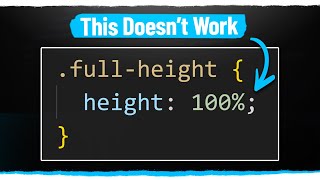
I think there was updates last year that may be fixed it on full
Love ♥️and Respect from India 🇮🇳
Differences between auto and fit-content?
auto takes up all the space while fit-content takes up what's needed I guess.
Then what's the difference between fit and auto?
I don't think that's gonna end, I'm more of a percentage, I don't it sucks but fixed sized pixels are worst as I think
Vw units for the win IMO
Problem with this is it's not supported in all browsers or atleast only new versions support it
Some websites are so bad that they use the max content while not allowing phone users to scroll to the right making the text mostly unreadable. Garbage design sometimes.
The only downside of these values is if your company requires you to support IE11
how about browser compatibility?
mmmm... so, inline-block elements are fit-content by default?
How he is moving divs with with mouse
What's the difference between AUTO and FIT content?
auto doesn’t work for my canvas for some reason
nice video but can you tell me how are you resizing the div?
resize: both;
overflow: auto;
He must be using Java script
Thanks bro. This helps a lot
Usefull
I love you