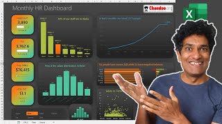
How to make an Interactive & Beautiful Excel Dashboard in 5 Steps

Vložit
- čas přidán 30. 07. 2024
- Dashboards are a highly sought after skill in business analytics. In this comprehensive and detailed video, learn how to create a beautiful & functional business KPI (metric) dashboard using Microsoft Excel in less than 30 minutes.
Prior skills needed:
Basic familiarity with Excel (watch this tutorial: • How to use Microsoft E... )
How to create a pivot table (watch this tutorial: • How to use Pivot Table... )
How to create slicers (watch this tutorial: • How to use Excel Slice... )
📁 Sample Files:
Please download the blank data & outline file here:
chandoo.org/wp/how-to-create-...
💥 Download completed workbook:
The full dashboard is now part of my Excel School Dashboards program. If you join the course, you will unlock this + 50 more Excel workbooks and 32+hours of videos on all things Excel.
Visit chandoo.org/wp/excel-school-p... to sign up.
📈📊 More Videos on Dashboards:
Project Dashboard with Excel - • Make an awesome Projec...
Website Metrics Dashboard with Excel - • Make an Excel Dashboar...
Beautiful Sales Dashboard with Excel - • How to create a fully ...
HR Dashboard with Excel - • Make an Amazing HR Das...
Dashboards Playlist - • How to Make Excel Dash...
~
Video Timestamps:
================
0:00 - Introduction to the Dynamic Business Dashboard
1:07 - The Blank Data File & our data
1:52 - How to design the dashboard?
3:50 - Setting up the Pivot Tables & DAX
7:35 - Preparing the Dashboard
10:40 - Adding the Bar chart with Top 5 Products
15:01 - Adding the trends
19:22 - Sales Person Table Report
23:48 - Adding conditional formats
25:00 - Tidying up the formatting
26:46 - More things you can add
~
#excel #dashboard - Věda a technologie


Thanks again, Professor... for all the skills I learned from you.... Our office had been subjected to ISO Audit last month... My project was the only only one rated as COMMENDABLE in our sector because I was able to present an automated Worksheet and interactive Dashboard. I would like to take this opportunity to express my gratitude coz most of the technique I used came from you. You had been part of that presentation.... The tricks I used seemed to be entirely new to them... They did not expect it from someone like me..... For several times, I had been set aside when there's promotion in the office. But - because of that presentation, I was able to redeem myself... I earned their respect.... as my immediate Boss is now planning to adopt the automation that I designed in our sector.
Thank you very much.... There are a lot of us who do not have the luxury of time and resources to go back to university to study all these stuff. But because of the lectures of ONLINE PROFESSORs - we are able to catch up. Thanks again and more power!.. May our Almighty GOD BLESS you MORE... You are a gifted TEACHER... as you have the ability to simplify complicated topics.... You may not know it, but you touch our lives.... you inspired us to learn even more...
Shout out to all ONLINE PROFESSORs!.
Wow. What a lovely testimonial. Thank you for learning from me and making a difference. I wish you more success and awesomeness Silvestre. 😍
@@chandoo_ sir please provide some live practical projects for intermediate excel users
The background music really makes the learning process so enjoyable and the overall mood of the video so calm
Wow!!! What a great tutorial… Learnt bits and pieces from you…. Hats off!!! Thanks for posting it! Much appreciated!
Thanks again, Professor!... With this technique, I can update my knowledge in Excel dashboard...
You are welcome Ben :)
Very explicit and easy to follow video. Thanks so much for sharing.
Thanks, Chandoo G. I just completed a similar dashboard today but have learned a few things from your video.
Great dashboard, thanks Chandoo!
great video & good choice for background music too, thanks so much!
Thanks for the great demo and lovely background music, too.
Thanks for these tips. I will be implementing it. Your videos and tips have been so very helpful for me. Thanks again.
Thanks, you make me look easy!
Very good. Thank you.
Hey chandoo....What a poetic way of explanation it is...
Thanks sir. 🙏
Chandoo Bhai,
You are my Excel hero.
Great work as always..!!
Highly aprreciated
Thanks sir for this informative session.. 💕
If you are facing a problem in getting data from the pivot table, to dashboard you should turn off getpivotdata , to turn off that please search on internet you will get the answer
Thank you
Can't Thank you enough brother. Will be joining your excel school from my other ID.
Chandoo, I Cannot thanks enough! Love all your videos.
Glad you like them!
Hi Chandoo! Love your work. Could you possibly tell me how you specifically make that freeform shape that shows the cells? Thank you
Thanks Master
Emanna cheppavaaa...
Anna
I will impress my boss for sure..
MVP 🎉❤
awesome!👌
An excellent video on Pivot based Dash Boards. 👍👍👍
Glad you liked it!
Thanks Sir
Hi chandoo Anna
Hope your doing well!
Well I have been following your channel from last 6 months and I learned a lot from your videos. When I first saw you I thought your from hyderabad or Andhra pradesh but I didn't saw your playlist that time, few days back when i checked your complete playlist when I saw some videos in telugu I was shocked my guess was right anyway thanks for the such informative videos..
Thanks Chandoo for most valuable information. Need your help to make forecasting video having multiple formula
I find only one video of forecasting which is having one formula.
As always learned a lot....I liked the Super Jedi poster in the background 👌
Thank you. I fell in love with that poster the moment I saw it. :)
I am using MS365 enterprise version (so all the bells ans whistles). Whilst I was replicating the exercise, I noticed that the table header will always be available even if I scrolled down. (I would have liked to share a snippet, but am not sure how I can in the comments).
great video! please tell us how to create dynamic titles like you did in this video
Awesome work
Thanks a lot 😊
One issue with linking the shape to the pivot data, if the filter makes the pivot table change its dimension. The value will loose its identity or show blank. Do you have any other way to link the value so it is shown the correct one each time no matter what filters I use.
Hi Chandoo... First of all: many thanks for your very clear, but also fun to watch tutorials. I have learned a lot already! Dashboards and pivottables are all very new to me, but I am starting to see 'the light' tnx to you. However...
When I reference a cell from the pivot table in a dashboard textbox, I get an error message, telling me that I have to name my cells. While you just click and select the cell you want te refer to in the pivot table. What am I doing wrong? Have I missed a step in setting up my pivot tables?
Thanks for your amazing and clear videos. I do have one format I wish to have in my dashboard, maybe you can help with that?
So in this video you made shapes with the sum of sales for example. Is it possible to get the latest month of data in that shape? So for instance I now want the number of sales in April in there, but when the number of May is filled, I want that to be there? Would love to hear from you.
You can do the below:
Make a pivot with date (months) on the row labels and totalsales in the values.
Sort the date column in latest on top order.
Now, your latest month will always be in row #1 of the pivot. Refer to this in the dashboard.
When you have new data, refresh your pivots. The latest month will bubble to top and your dashboard gets updated automatically.
Hello Chandoo, I have a table with Property, Rent and Date Change. The property have different rents to reflect rent increases over time. I want to take the latest rent for property A and put it in the Tenancy table. The start date of the new tenancy will check the Rent table and take the latest rent for this property. If the rent has not increased at the start date then it takes the last rent figure. I am using index and match with max function, but it is not working. Is there a solution you can suggest?
Hi
Can anyone help me with this
I pasted the pivot table as link and if i use slicer on that table
Data not in filtered range showing 0 values
How to prevent 0
I have a consultation: can I do w dashboard about quantitative data? I might need to show you the vision that I have. I just dont know if Excel can help me with that. How can I share with you the images of my vision so you can tell me if it is doable or I am just wasting my time?
Hi Chandoo! Thank you very much for sharing your skills, I am really learning a lot and able to apply in my work. You are a good teacher and explains clearly.
I have a question regarding dashboard and charts. What if I need to refresh the data source every month and reuse the charts, how should I do it easily? Thanks in advamce.
At 8:26 , not able to link text box with value in pivot table.
It is showing "Formula missing a range reference or defined name."
Could anyone help
Thank you for this beautiful dashboard
Hi There I am Going through the Dashboard I have Some doubts can you please Explain me
My pleasure 😊
@@chandoo_ Really Thanks Anna For Your Reply TOTAL PROFITS & Profits % Is also Mentioned in the Dashboard, I want to calculate the Loss Total & loss %. I have got the Answer by using SUMIFS Formula and Percentage Formula But is there any way to get this by using Pivot Table. So that We can get an Idea Which Categories of Products got little bit More Loss.
I am A Completely Beginner in Excel & I want Quick Start my Carrer in Data Analytics Industry Your Videos Helped me a lot Thanks Anna From the Bottom of my Heart. ♥️
Once Again Really Thanks for spending your Valuable time to Read this Comment. Love You Chandoo Anna From AP.
You are welcome Pavan.
"TOTAL Profit" will show a negative value if there is loss. I am not sure what you mean by showing total profit & total loss. You can't have both for any situation. Only one.
But if you want to count how many incidents (shipments) had loss or what was the total of such incidents, you can use CALCULATE() to count or add such things. You can search up how to do this. All the best.
@@chandoo_ Thanks Anna For Your Quick Response 😍
Hello Chandoo, Can you please help me to create a Employee Skill Set Dashboard? It should record count of employees for each skill, Employee wise skill rating and certification status for each.
Anyone know what's that simple formula to change Title like that according to the product?
Can we connect this dashboard with live dataset/ Stream data??
have connected power bi desktop with oracle database and when i try to load data from oracle db to power bi it loads only 4285 rows i expect to load 7lakh rows into power bi desktop
Hi My whole dashboard is not inter connected through charts plz suggest the solution. Product and category slicer doesn't work
While getting the "Sum of Sales" from the Pivot table, it says "This formula is missing a range reference or a defined name". What to do, sir?
There is no option of add this data to the data model in Microsoft tenant account so how can i get the add measure option
at 8:37 when i press enter i get an error " THIS FORMULA IS MISSING A RANGE REFERENCE OR A DEFINED NAME" anyone know why
19:50 - Chandoo, is there a way we can have vertical scrollbar on the table kind of report ?
You can. See this page for some ideas - chandoo.org/wp/create-kpi-dashboards-excel-1/
Hello Chandoo sir ji. Namoste sir ji. How are you sir ? How is your dental condition? Sir it is need not to say that your video carries a lot of value. I learn a lot of things from your video. Really you are a awesome teacher. Our respected teacher. You are gifted to me as a Gods angel. Because your video manytimes save my life. Thank you so much sir. God is allways with you. Sir one humble request to u sir is it possible to send your video Titled by Top 30 Advance Excel tips practice file. Then it would be better to do practice. Thank you sir. Allways be happy n healthy. Be emotionally n economically powerful. God bless you. Pls take care of yourself. We respect you a lot. Thank you. Stay blessed.
Hello. Thank for such informative video. Could you please explain how can we resolve that issue where we are getting 0 values for another category of products.
The easy solution is to just select the product after selecting a category.
The better solution requires setting up a back-up category level pivot and using IF formulas.
@@chandoo_ Big fan of our videos. Can you please direct us how to make back-up category level pivot using the IF formulas. Thanks
Hello Chandoo, Can you please create a project status dashboard?
Hi, Im from Brasil, i liked your video, you have good tecnics from learning. you have one more subscribe.....tks.
In this Video I Can't Download The Practice File ? Please Help me!!!!
I really need to know the difference between reporting and dashboard !
How We can Caculate total Loss Happened For Different Categories of Products Can Some please Explain me
I am unable to download a file for Practice
why i could not get the number to the text box ?
Hi chandoo can you explain what Microsoft powerapps?
And future of powerapps
Around 9:17 - Let's add some labels ... then something mysterious, and the labels appeared. Can you explain.
It's called a jump cut. I just assumed you are familiar with Excel charting stuff like adding labels, changing colours already.
You mean add a separate text box for the label @@chandoo_
can any body help how to do it 22:48
Cell reference in text box is not working in 2013 version
I am unable to link the sum of sales. It showing error even after trying many a times
You need to disable "generate getpivotdata" option. Select any of your pivot tables, go to Pivot Table analyze ribbon and use the "options" area to disable this. Try after that.
It worked! Thank you so much. I really enjoyed learning. your teaching method is really explanatory. @@chandoo_
sir how to contact you?
Why not just use powerBI?
For many reasons:
Power BI needs seperate license costs
Power BI is an overkill in many situations
Not everyone knows how to use it
Excel is more readily available in many organizations
The techniques in this video work with most major versions of Excel (since 2007)
@@chandoo_ fair! thx
Thank you sir