7 Essential Typography Tips in Affinity Publisher

Vložit
- čas přidán 9. 09. 2024
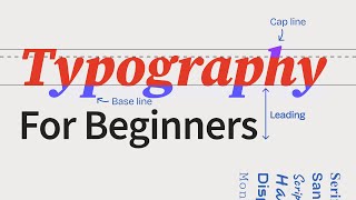
- In this video, I’ll show you seven quick and easy ways to improve your typography skills in Affinity Publisher 2. We’ll cover tracking vs. kerning, punctuation, and the strategic use of white space to enhance the appearance and readability of your text. Be sure to stick around to the end where I’ll reveal one of my favorite design tips that no one talks about.
Affiliate disclosure: The links below are affiliate links. If you make a purchase I’ll receive a small commission at no extra cost to you.
👉 Favorite place for fonts and assets:
Creative Market bit.ly/4eSJUD6
👉 Email marketing software for designers:
Flodesk flodesk.com/c/...
👉 What I’m reading at the moment:
Make Your Own Rules amzn.to/4cTXtAi
👉 Learn more about typography:
Thinking With Type amzn.to/4f3n9fO
Universal Principles amzn.to/4cZiLwn
Type Matters amzn.to/4cCrJA4
Why Fonts Matter amzn.to/4cEV3Wm
Designing With Type amzn.to/3Lm6Hth
👉 Tech I use to make my videos:
Sony ZV-E10 camera amzn.to/4cXarNH
Sigma 16mm lens amzn.to/46hwL2F
Shure SM7B mic amzn.to/46860xl
👉 Where I get my music::
Epidemic Sound bit.ly/4cwgl8G
#affinity #affinitypublisher #typography


Super useful!! thanks!
Love to hear that! Thanks for commenting.
Love all your videos. I found them super helpful! Clear to the point. And great voice, easy to follow. The details really matter. Thanks so much for creating such great content!
Thanks, Sabrina! That's super encouraging to hear.
Hi, thanks for this video. I found it very informative and it is a gem to keep. Greetings from Panama.
Awesome! I have bin a graphic designer my hole life (currently 50). Finaly someone who knows what he is doing. I am in the transition from InDesign to Publisher (used Quark, than Indesign now Publisher). I whish there where the same shortcuts though.
Hey, I remember Quark! (I'm 45.) I know what you mean about the shortcuts. I’ll see if I can find any info on that. I'm relatively new to Affinity too. Glad you found it useful.
Thanks, Ryan. Some great tips here. One thing I noticed, however, was your space between paragraphs. I was taught that you only added space between paragraphs when choosing to NOT indent the first line of each paragraph (everything left-aligned). If you are indenting the first line of each paragraph, there really isn’t a need to put extra space between paragraphs to show where one ends and the next begins. The indent does that for you. Of course, that was a long time ago. Have typography rules changed so that your way is standard now? Always interested in learning new things.
I think you are spot-on. There isn't a need for that extra space between paragraphs if you have that indent, and it would probably look much better without it. Thanks for pointing that out.
Mais uma boa aula. No In design existe uma ferramenta que marca esses problemas de (muitos espaços entre caracter ou pouco) em tom amarelo, e conforme a cor mais escura ou clara assim podemos encontrar formas de corregir mais rápido. Este programa já estudei e não tem essa opção. Lamento. Também penso que existe um scrip para encontrar os duplos espaços. Será que dá para este programa. Sou apenas um amador que publica os seus livros de memórias com 73 anos. Obrigado por sua atenção.
Not that I am aware of. I agree, that would certainly make things easier.
So all my life its actually been l-eh-ding and not l-ee-ding? 💀
💀💀
Music is ridiculous.